How to frame, develop, and implement a strategy - the Bookend Workshop Model - Starfish Taylor /*
You can add your own CSS here.
Click the help icon above to learn more.
*/
/*#header.text-dark {
background: rgba(255, 2 55, 255, 0.9);
}
#header .header-bg {
background: rgba(255, 255, 255, 0.9);
}*/
.so-widget-sow-post-carousel .sow-carousel-wrapper {
width: 100%;
}
.so-widget-sow-post-carousel .sow-carousel-container {
width: 100% !important;
max-width: 100% !important;
}
.so-widget-sow-post-carousel-default-971e41e9e54d .sow-carousel-wrapper ul.sow-carousel-items li.sow-carousel-item {
width: 255px;
margin: 0 10px;
box-shadow: 0 8px 18px 0 rgba(192, 192, 192, 0.5);
background: #fff;
border: 1px solid #ccc !important;
padding: 20px 10px;
min-height: 300px;
}
.sow-carousel-wrapper ul.sow-carousel-items li.sow-carousel-item h3 {
line-height: 30px !important;
}
.so-widget-sow-post-carousel-default-971e41e9e54d .sow-carousel-wrapper ul.sow-carousel-items li.sow-carousel-item .sow-carousel-thumbnail a, .so-widget-sow-post-carousel-default-971e41e9e54d .sow-carousel-wrapper ul.sow-carousel-items li.sow-carousel-item .sow-carousel-thumbnail a span.overlay {
width: auto !important;
}
.sow-carousel-wrapper ul.sow-carousel-items li.sow-carousel-item h3 a {
font-size: 22px;
}
.single-post .category-portfolio .five.columns {
display: none;
}
.single-post .category-portfolio .row .eleven {
width: 100%;
/* text-align: center; */
}
.single-post .category-portfolio .feature-img.page-banner {
display: none !important;
}
.single-post .category-portfolio .panel-grid .port-had h1.sow-headline {
color: #000!important;
}
.tag-graphic-facilitation .gfield input, .tag-graphic-facilitator .gfield input {
width: 100% !important;
}
.single-post .category-portfolio .panel-grid h2.sow-headline, .single-post .category-portfolio .panel-grid h1.sow-headline {
color: #000!important;
}
.single-post .category-graphics .panel-grid h2.sow-headline{color: #d11d5b !important;}
@font-face {
font-family: 'Lato';
font-display: auto;
}
/*body { color: #383838 !important; font-family: 'Lato'; font-size: 1em; font-style: normal; font-stretch: normal; font-weight: 400 !important; letter-spacing: 0.2px; line-height: 1.38 !important;}*/
ol li { border-top: none !important; border-bottom: none !important; text-align: left; font-family: Lato; font-size: 18px !important; font-weight: normal; font-style: normal; font-stretch: normal;
line-height: 1.38; letter-spacing: 0.2px; color: #383838; }
h4 { color:#ff037c;}
h4 a { color:#c5114f !important;;}
h4 a:hover { color:#273d98 !important;;}
h2 { margin:0px 0px;}
p { color: #383838 !important; font-family: 'Lato'; font-size: 18px !important; font-style: normal; font-stretch: normal; font-weight: 400 !important; letter-spacing: 0.2px; line-height: 1.38 !important; text-align: left;}
.full-width h1.headline {
display:none !important;
}
.headline.img-headline { text-transform:uppercase;}
/*.full-width.post-area.full-width {
max-width:1168px;
}*/
.hm-sub-heading { font-size: 20px; font-family: 'Lato'; font-style: normal; font-stretch: normal; font-weight: 400 !important; line-height: 1.6; letter-spacing: 0.3px; color: #616161; text-align: left;}
.bar-heading { color: #d11d5b; text-align: center; font-family: DroidSerif; font-size: 28px; font-weight: bold; font-style: normal; font-stretch: normal; line-height: 0.93; letter-spacing: 0.31px; text-align: center; }
.bar-sub-heading { text-align: center; font-size: 20px; color: #383838 !important; font-family: 'Lato'; font-weight: normal; font-style: normal; font-stretch: normal; line-height: 1.6 !important; letter-spacing: 0.3px; }
table {font-family: open sans,Arial,Helvetica,sans-serif;}
table td { border: 1px solid #e4e4e4; text-align: center;}
.slideshow .headline { padding-bottom:0px !important; margin:0 auto !important; font-size: 4.6em; padding-top:12%;}
.slideshow .information { margin-top: 10px !important; }
li#post-1911 div.excerpt h2 { letter-spacing: -2px; padding-top: 30px; padding-bottom: 30px;}
/*.container a:hover, .container a:focus, .container a:active, .footer-widgets a:hover, footer-widgets a:focus, footer-widgets a:active, #wrap .widget ul.menu li a:hover, #wrap .widget ul.menu li ul.sub-menu li a:hover, #wrap .widget ul.menu .current_page_item a, #wrap .widget ul.menu .current-menu-item a {
color: #d01d5b !important;
}*/
.container a, .container a:link, .container a:visited, .footer-widgets a, .footer-widgets a:link, .footer-widgets a:visited, #wrap .widget ul.menu li a {
color: #273d98;
}
/*#wrap .menu li li a:focus, #wrap .menu li li a:hover, #wrap .menu li li a:active {
color: #ffffff !important;
background-color:#D31C5C !important;
}
#wrap .menu li li a, #wrap .menu li li a:link, #wrap .menu li li a:hover {
color: #fff !important;
}*/
#wrap .menu li li a {
color: #333 !important; /*Sumenu link color stands here*/
}
#wrap .menu li li a:hover, #wrap .menu li li a:active {
color: #fff !important; /*Sumenu link color stands here*/
background-color:#D31C5C !important;
}
#pg-4-3 > .panel-row-style { padding: 5% 5% 5% 5%; }
/*#wrap .menu li li a:focus, #wrap .menu li li a:hover, #wrap .menu li li a:active {
color: #333333 !important;
}*/
#pl-4 .so-panel { margin-bottom: 0px; }
#pl-2327 .so-panel { margin-bottom: 0px; }
/* max-width changed from 960 to 1168 by Peter 20/Mar */
/*a.feature-img.radius-top {
padding-top: 18px;
}*/
.cl-flipbox-front {
padding:15px !important;
height:auto !important;
}
div.cl-flipbox-back-h a span {
font-size: 12px;
}
div.flexslider, div.loading {
background:rgba(38, 60, 152, .8) !important;
}
h4.cl-flipbox-front-title {
margin:0px !important;
font-size: 1.2em;
}
div#masthead p.site-title {
display:none !important;
}
div#pg-4-8 p, div#pg-17-3 p, div#pg-19-2 p {
line-height:18px !important;
}
div#pg-4-10 textarea {
height:100px !important;
}
div.cl-popup-box-content div.panel-grid-cell {
width: calc(33.3333% - ( 0.66666666666667 * 10px ) );
}
div#page-21 li.category-portfolio {
border-top:none !important;
border-bottom:none !important;
}
div#pl-4 .widget li, div#pl-4 .widget li:last-child {
border-bottom:none !important;
}
div#page-21 a.feature-img {
padding-top:none !important;
}
div#page-21 div.sd-content li {
border-top:none !important;
}
div.panel-widget-style-for-21-0-0-0 {
/*margin-top:100px !important;*/
margin-top:0 auto !important;
}
.contact-form input[type=submit] {
-ms-box-sizing: border-box;
-moz-box-sizing: border-box;
-webkit-box-sizing: border-box;
box-sizing: border-box;
font-size: 1em;
padding: 1em 2em;
background: #d21c5c;
background: -webkit-gradient(linear, left bottom, left top, color-stop(0, #a51648), color-stop(1, #d21c5c));
background: -ms-linear-gradient(bottom, #a51648, #d21c5c);
background: -moz-linear-gradient(center bottom, #a51648 0%, #d21c5c 100%);
background: -o-linear-gradient(#d21c5c, #a51648);
filter: progid:DXImageTransform.Microsoft.gradient(startColorstr='#d21c5c', endColorstr='#a51648', GradientType=0);
border: 1px solid;
border-color: #971442 #8e133e #811139 #8e133e;
color: #ffffff !important;
-webkit-border-radius: 0.25em;
-moz-border-radius: 0.25em;
border-radius: 0.25em;
-webkit-box-shadow: inset 0 1px 0 rgba(255,255,255,0.2), 0 1px 2px rgba(0,0,0,0.065);
-moz-box-shadow: inset 0 1px 0 rgba(255,255,255,0.2), 0 1px 2px rgba(0,0,0,0.065);
box-shadow: inset 0 1px 0 rgba(255,255,255,0.2), 0 1px 2px rgba(0,0,0,0.065);
text-shadow: 0 1px 0 rgba(0, 0, 0, 0.05);
}
.pushbutton-wide{ width:50% !important; margin:0 auto;}
ul.slides a.more-link {
-ms-box-sizing: border-box;
-moz-box-sizing: border-box;
-webkit-box-sizing: border-box;
box-sizing: border-box;
font-size: 1em;
display:inline-block;
margin:0 auto;
/*padding: 1em 2em 1em 2em;*/
/*background: #ff9900;*/
background: #ff9b08;
background: -webkit-gradient(linear,left bottom,left top,color-stop(0,#d47e00),color-stop(1,#ff9b08));
background: -ms-linear-gradient(bottom,#d47e00,#ff9b08);
background: -moz-linear-gradient(center bottom,#d47e00 0%,#ff9b08 100%);
background: -o-linear-gradient(#ff9b08,#d47e00);
/*filter: progid:DXImageTransform.Microsoft.gradient(startColorstr='#ff9900', endColorstr='#cc7a00', GradientType=0);*/
filter: progid:DXImageTransform.Microsoft.gradient(startColorstr='#ff9b08',endColorstr='#d47e00',GradientType=0);
border: 1px solid;
border-top-color: currentcolor;
border-right-color: currentcolor;
border-bottom-color: currentcolor;
border-left-color: currentcolor;
/*border-color: #bd7100 #b36b00 #a36200 #b36b00;*/
border-color: #c57500 #ba6f00 #ab6600 #ba6f00;
color: #ffffff !important;
text-align:center;
font-family: open sans,Arial,Helvetica,sans-serif;
font-weight: 400;
line-height: 1.9;
text-decoration: none !important;
-webkit-border-radius: .25em;
-moz-border-radius: .25em;
border-radius: .25em;
-webkit-box-shadow: inset 0 1px 0 rgba(255,255,255,.2),0 1px 2px rgba(0,0,0,.065);
-moz-box-shadow: inset 0 1px 0 rgba(255,255,255,.2),0 1px 2px rgba(0,0,0,.065);
box-shadow: inset 0 1px 0 rgba(255,255,255,.2),0 1px 2px rgba(0,0,0,.065);
text-shadow: 0 1px 0 rgba(0,0,0,.05);
height:42px;
/*padding-top:10px;*/
}
ul.slides a.more-link:hover { color:#343434 !important; text-decoration: none !important;
background: #ff9f12;
background: -webkit-gradient(linear,left bottom,left top,color-stop(0,#de8400),color-stop(1,#ff9f12));
background: -ms-linear-gradient(bottom,#de8400,#ff9f12);
background: -moz-linear-gradient(center bottom,#de8400 0%,#ff9f12 100%);
background: -o-linear-gradient(#ff9f12,#de8400);
filter: progid:DXImageTransform.Microsoft.gradient(startColorstr='#ff9f12',endColorstr='#de8400',GradientType=0);
border-color: #cf7b00 #c57500 #b56c00 #c57500;
}
.so-widget-sow-button-atom-a77237adc0a1 .ow-button-base a:hover {
color: #343434 !important; text-decoration: none !important;
}
.so-widget-sow-button-atom-a77237adc0a1 .ow-button-base a.ow-button-hover:hover {
background: #ff9f12;
background: -webkit-gradient(linear,left bottom,left top,color-stop(0,#de8400),color-stop(1,#ff9f12));
background: -ms-linear-gradient(bottom,#de8400,#ff9f12);
background: -moz-linear-gradient(center bottom,#de8400 0%,#ff9f12 100%);
background: -o-linear-gradient(#ff9f12,#de8400);
filter: progid:DXImageTransform.Microsoft.gradient(startColorstr='#ff9f12',endColorstr='#de8400',GradientType=0);
border-color: #cf7b00 #c57500 #b56c00 #c57500;
color:#343434 !important; text-decoration: none !important;
}
.text-white p {
text-shadow: 0 1px 0 rgba(0, 0, 0, 0.05);
color: rgba(255,255,255,1) !important;
}
.textwidget .contact-form input[type=email], .textwidget .contact-form input[type=text], .textwidget .contact-form input[type=url], .textwidget .contact-form textarea, .contact-form input[type=submit] {
width:100%;
}
body.home .post-area.wide {
padding-top:0px;
}
div#pl-746 h3.widget-title {
font-size:1.1em;
font-weight:bold;
}
body.blog h1.img-headline {
top:65% !important;
}
/*h1.sow-headline, div.page-banner h1.img-headline {
font-size:2.2em;
overflow: hidden;
text-overflow: ellipsis;
height: 1.5em;
}*/
div#pl-28 {
/*margin-top: -45px;*/
}
div.sharedaddy {
margin-top: 20px;
}
.widget li, .widget li:last-child {
border-top:none !important;
border-bottom:none !important;
}
a.feature-img.page-banner::before {
background-color:rgba(0, 0, 0, 0) !important;
}
/*
You can add your own CSS here.
Click the help icon above to learn more.
*/
.full-width h1.headline {
display:none !important;
}
.full-width.post-area.full-width {
max-width:1168px;
/* max-width changed from 960 to 1168 by Peter 20/Mar */
}
/*a.feature-img.radius-top {
padding-top: 18px;
}*/
.cl-flipbox-front {
padding:15px !important;
height:auto !important;
}
div.cl-flipbox-back-h a span {
font-size: 12px;
}
div.flexslider, div.loading {
background:rgba(38, 60, 152, .8) !important;
}
h4.cl-flipbox-front-title {
margin:0px !important;
font-size: 1.2em;
}
div#masthead p.site-title {
display:none !important;
}
div#pg-4-8 p, div#pg-17-3 p, div#pg-19-2 p {
line-height:18px !important;
}
div#pg-4-10 textarea {
height:100px !important;
}
div.cl-popup-box-content div.panel-grid-cell {
width: calc(33.3333% - ( 0.66666666666667 * 10px ) );
}
div#page-21 li.category-portfolio {
border-top:none !important;
border-bottom:none !important;
}
div#pl-4 .widget li, div#pl-4 .widget li:last-child {
border-bottom:none !important;
}
div#page-21 a.feature-img {
padding-top:none !important;
}
div#page-21 div.sd-content li {
border-top:none !important;
}
div.panel-widget-style-for-21-0-0-0 {
/*margin-top:100px !important;*/
margin-top:0 auto !important;
}
div.sow-cta-wrapper div.so-widget-sow-button-flat-e72a51798a2b {
width:100%;
}
.contact-form input[type=submit] {
-ms-box-sizing: border-box;
-moz-box-sizing: border-box;
-webkit-box-sizing: border-box;
box-sizing: border-box;
font-size: 1em;
padding: 1em 2em;
background: #d21c5c;
background: -webkit-gradient(linear, left bottom, left top, color-stop(0, #a51648), color-stop(1, #d21c5c));
background: -ms-linear-gradient(bottom, #a51648, #d21c5c);
background: -moz-linear-gradient(center bottom, #a51648 0%, #d21c5c 100%);
background: -o-linear-gradient(#d21c5c, #a51648);
filter: progid:DXImageTransform.Microsoft.gradient(startColorstr='#d21c5c', endColorstr='#a51648', GradientType=0);
border: 1px solid;
border-color: #971442 #8e133e #811139 #8e133e;
color: #ffffff !important;
-webkit-border-radius: 0.25em;
-moz-border-radius: 0.25em;
border-radius: 0.25em;
-webkit-box-shadow: inset 0 1px 0 rgba(255,255,255,0.2), 0 1px 2px rgba(0,0,0,0.065);
-moz-box-shadow: inset 0 1px 0 rgba(255,255,255,0.2), 0 1px 2px rgba(0,0,0,0.065);
box-shadow: inset 0 1px 0 rgba(255,255,255,0.2), 0 1px 2px rgba(0,0,0,0.065);
text-shadow: 0 1px 0 rgba(0, 0, 0, 0.05);
}
.text-white p {
text-shadow: 0 1px 0 rgba(0, 0, 0, 0.05);
color: rgba(255,255,255,1) !important;
}
.textwidget .contact-form input[type=email], .textwidget .contact-form input[type=text], .textwidget .contact-form input[type=url], .textwidget .contact-form textarea, .contact-form input[type=submit] {
width:100%;
}
body.home .post-area.wide {
padding-top:0px;
}
div#pl-746 h3.widget-title {
font-size:1.1em;
font-weight:bold;
}
body.blog h1.img-headline {
top:65% !important;
}
div.sharedaddy {
margin-top: 20px; margin-left:48px;
}
/*.siteorigin-widget-tinymce ul li { list-style-type: square !important; }
.textwidget ul li { list-style-type: square !important;}*/
.widget li { display:list-item; list-style: inherit; margin: 6px 15px 0;}
.widget ul, .widget li { list-style-type: disc; }
/*.widget ul, .widget li { list-style-type: circle !important; padding-left:20px; }*/
#panel-2327-2-1-2 ul li { list-style-type:none; list-style-image: url('https://www.starfishtaylor.com/wp-content/uploads/2018/04/ok-sign-png.png'); }
#panel-2327-4-1-3 ol li { list-style-type:number !important;}
#panel-2327-12-1-0 ol li { list-style-type:number !important;}
/*.widget li, .widget li:last-child { border-top:none !important; border-bottom:none !important; text-align: left; font-family: Lato; font-size: 16px; font-weight: normal; font-style: normal; font-stretch: normal; line-height: 1.38; letter-spacing: 0.2px; color: #383838; }*/
a.feature-img.page-banner h2 {
text-shadow:2px 2px 15px rgba(0, 0, 0, 0.8) !important;
}
div#page-318 div.feature-img.page-banner h1 {
display: none;
}
div#page-318 div.feature-img.page-banner::before {
background-color:rgba(0, 0, 0, 0) !important;
}
li#post-1911 div.excerpt h2{
letter-spacing:-2px;
padding-top:30px;
font-size:30px;
}
li#post-1911 div.excerpt h4{
font-size:18px;
}
div.feature-img.page-banner h1 {
font-size:3em;
padding-top:50px;
}
/* ----------- iPhone 4 and 4S ----------- */
/* Portrait and Landscape */
@media only screen
and (min-device-width: 320px)
and (max-device-width: 480px)
and (-webkit-min-device-pixel-ratio: 2) {
.headline.img-headline { font-size:45px !important;}
}
/* Portrait */
@media only screen
and (min-device-width: 320px)
and (max-device-width: 480px)
and (-webkit-min-device-pixel-ratio: 2)
and (orientation: portrait) {
.headline.img-headline { font-size:45px !important;}
}
/* Landscape */
@media only screen
and (min-device-width: 320px)
and (max-device-width: 480px)
and (-webkit-min-device-pixel-ratio: 2)
and (orientation: landscape) {
.headline.img-headline { font-size:45px !important;}
}
/* ----------- iPhone 5, 5S, 5C and 5SE ----------- */
/* Portrait and Landscape */
@media only screen
and (min-device-width: 320px)
and (max-device-width: 568px)
and (-webkit-min-device-pixel-ratio: 2) {
.headline.img-headline { font-size:45px !important;}
}
/* Portrait */
@media only screen
and (min-device-width: 320px)
and (max-device-width: 568px)
and (-webkit-min-device-pixel-ratio: 2)
and (orientation: portrait) {
.headline.img-headline { font-size:45px !important;}
}
/* Landscape */
@media only screen
and (min-device-width: 320px)
and (max-device-width: 568px)
and (-webkit-min-device-pixel-ratio: 2)
and (orientation: landscape) {
.headline.img-headline { font-size:45px !important;}
}
/* ----------- iPhone 6, 6S, 7 and 8 ----------- */
/* Portrait and Landscape */
@media only screen
and (min-device-width: 375px)
and (max-device-width: 667px)
and (-webkit-min-device-pixel-ratio: 2) {
.headline.img-headline { font-size:45px !important;}
}
/* Portrait */
@media only screen
and (min-device-width: 375px)
and (max-device-width: 667px)
and (-webkit-min-device-pixel-ratio: 2)
and (orientation: portrait) {
.headline.img-headline { font-size:45px !important;}
}
/* Landscape */
@media only screen
and (min-device-width: 375px)
and (max-device-width: 667px)
and (-webkit-min-device-pixel-ratio: 2)
and (orientation: landscape) {
.headline.img-headline { font-size:45px !important;}
}
/* ----------- iPhone 6+, 7+ and 8+ ----------- */
/* Portrait and Landscape */
@media only screen
and (min-device-width: 414px)
and (max-device-width: 736px)
and (-webkit-min-device-pixel-ratio: 3) {
.headline.img-headline { font-size:45px !important;}
}
/* Portrait */
@media only screen
and (min-device-width: 414px)
and (max-device-width: 736px)
and (-webkit-min-device-pixel-ratio: 3)
and (orientation: portrait) {
.headline.img-headline { font-size:45px !important;}
}
/* Landscape */
@media only screen
and (min-device-width: 414px)
and (max-device-width: 736px)
and (-webkit-min-device-pixel-ratio: 3)
and (orientation: landscape) {
.headline.img-headline { font-size:45px !important;}
}
/* ----------- iPhone X ----------- */
/* Portrait and Landscape */
@media only screen
and (min-device-width: 375px)
and (max-device-width: 812px)
and (-webkit-min-device-pixel-ratio: 3) {
.headline.img-headline { font-size:45px !important;}
}
/* Portrait */
@media only screen
and (min-device-width: 375px)
and (max-device-width: 812px)
and (-webkit-min-device-pixel-ratio: 3)
and (orientation: portrait) {
.headline.img-headline { font-size:45px !important;}
}
/* Landscape */
@media only screen
and (min-device-width: 375px)
and (max-device-width: 812px)
and (-webkit-min-device-pixel-ratio: 3)
and (orientation: landscape) {
.headline.img-headline { font-size:45px !important;}
}
@media handheld, only screen and (max-width: 319px) {
.home-slider .slideshow .slides li, .home-slider .slideshow .loading {
min-height: 400px;
}
.slideshow .headline { font-size: 3.4em;}
}
@media handheld, only screen and (max-width: 479px) {
.home-slider .slideshow .slides li, .home-slider .slideshow .loading {
min-height: 400px;
}
.slideshow .headline { font-size: 3.4em;}
}
@media handheld, only screen and (max-width: 767px) {
.home-slider .slideshow .content { padding:0;}
#header .header-bg {
background:rgba(255,255,255,0) !important;
}
p.site-title {
display:none;
}
span.header-bg {
display:none !important;
}
#pg-4-3 > .panel-row-style { padding: 10% 5% 10% 5%; }
}
@media handheld, only screen and (max-width: 1024px) {
li#post-1911 div.excerpt {
display: block !important;
}
li#post-1911 h2.headline {
font-size:36px;
padding-top:30px;
}
ul.slides a.more-link {
/* display:block;
width:30%;
left:35%;
right:35%;
padding:10px 10px 10px 10px;*/
margin: 0;
}
li#post-1911 div.excerpt h2{
display:block !important;
letter-spacing:-1px;
padding-top:30px;
font-size:20px;
}
li#post-1911 div.excerpt h4{
font-size:14px;
}
div#panel-4-0-0-0 h2 {
font-size:30px;
}
#pg-4-3 > .panel-row-style { padding: 10% 5% 10% 5%; }
}
@media handheld, only screen and (max-width: 766px) {
li#post-1911 div.excerpt {
display: block !important;
}
li#post-1911 h2.headline {
font-size:28px;
padding-top:30px;
}
ul.slides a.more-link {
/*display:block;
width:30%;
left:35%;
right:35%;
padding:10px 10px 10px 10px;*/
margin:0;
}
li#post-1911 div.excerpt h2{
display:block !important;
letter-spacing:-1px;
padding-top:30px;
font-size:15px;
}
li#post-1911 div.excerpt h4{
font-size:10px;
}
div#panel-4-0-0-0 h2 {
font-size:26px;
}
#pg-4-3 > .panel-row-style { padding: 10% 5% 10% 5%; }
}
@media handheld, only screen and (max-width: 640px) {
li#post-1911 div.excerpt {
display: block !important;
}
li#post-1911 h2.headline {
font-size:16px;
padding-top:20px;
}
ul.slides a.more-link {
/*display:block;
width:70%;
left:15%;
font-size:14px;*/
margin:0;
}
li#post-1911 div.excerpt h2{
display:block !important;
letter-spacing:0px;
padding-top:25px;
padding-bottom:10px;
margin-bottom:0px;
font-size:12px;
}
li#post-1911 div.excerpt h4{
font-size:10px;
}
div#panel-4-0-0-0 h2 {
font-size:22px;
}
#pg-4-3 > .panel-row-style { padding: 10% 5% 10% 5%; }
}
.Mask { /* width: 457px; height: 257px;*/ object-fit: contain; border-radius: 2px; background-color: #ffffff; box-shadow: 0 8px 18px 0 rgba(192, 192, 192, 0.5); }
.shape-ok { list-style-type:none; list-style-image: url('https://www.starfishtaylor.com/wp-content/uploads/2018/06/shape-ok.png'); font-family: Lato; font-size: 20px; font-weight: 600; font-stretch: normal; font-style: normal; line-height: 1.6; letter-spacing: 0.3px; }
/*.menu-footer-menu-container { width:100%;}
.footer-menu { width: 100%; overflow: hidden;}
#menu-footer-menu .footer-menu ul { border-bottom:2px #eeeeee; }
#menu-footer-menu .footer-menu ul li { border-bottom:2px #cccccc; }
#menu-footer-menu .footer-menu ul li a { color:#d11d5b; }
#menu-footer-menu .footer-menu ul li a:hover { color:#273d98; }*/
/*.menu-footer-menu-container .footer-menu ul { color:#383838; text-align:center; display:inline !important;}
#menu-footer-menu ul li { float: left;}
.footer-menu ul li a { color:#d11d5b;}
.footer-menu ul li a:hover{ color:#273d98;}*/
.abt { float:left; width:16%; text-align:left; }
.abt a { padding: 8px 0 8px 0; margin-top:7px; display:block; width:100%; text-decoration:none; }
.abt a:hover { color:#d11d5b; }
.servi { float:left; width:19%; text-align:left; }
.servi a { padding: 8px 0 8px 0; margin-top:7px; display:block; width:100%; text-decoration:none; }
.servi a:hover { color:#d11d5b; }
.portfoli { float:left; width:14%; text-align:left; }
.portfoli a { padding: 8px 0 8px 0; margin-top:7px; display:block; width:100%; text-decoration:none;}
.portfoli a:hover { color:#d11d5b; }
.blogres { float:left; width:19%; text-align:left; }
.blogres a { padding: 8px 0 8px 0; margin-top:7px; display:block; width:100%; text-decoration:none;}
.blogres a:hover { color:#d11d5b; }
.contac { float:left; width:15%; text-align:left; }
.contac a { padding: 8px 0 8px 0; margin-top:7px; display:block; width:100%; text-decoration:none;}
.contac a:hover { color:#d11d5b; }
.socialio { float:left; width:17%; text-align:left; }
.socialio a { padding:2px; margin-top:7px; display:block; }
.socialio a:hover { color:#d11d5b; }
.lio-ico { float:left; width:100%; text-align:left; }
.lio-ico a { padding: 0px 24px 2px 0; margin-top:7px; display:inline; }
.lio-ico a:hover { color:#d11d5b; }
#facebook { left: 0px; width: 24px; background: url('https://www.starfishtaylor.com/wp-content/uploads/2020/02/social-sprites.png') 0 0; background-repeat: no-repeat; }
#twitter { left: 24px; width: 24px; background: url('https://www.starfishtaylor.com/wp-content/uploads/2020/02/social-sprites.png') -24px 0; background-repeat: no-repeat; }
#linkedin { left: 48px; width: 24px; background: url('https://www.starfishtaylor.com/wp-content/uploads/2020/02/social-sprites.png') -48px 0; background-repeat: no-repeat; }
#instagram { left: 72px; width: 24px; background: url('https://www.starfishtaylor.com/wp-content/uploads/2020/02/social-sprites.png') -72px 0; background-repeat: no-repeat; }
#youtube { left: 96px; width: 24px; background: url('https://www.starfishtaylor.com/wp-content/uploads/2020/02/social-sprites.png') -96px 0; background-repeat: no-repeat; }
.footer-information {
padding: 48px 70px;
}
/*.social-nav { width:100%;}
.social-nav, ul {text-align:center;}
.social-nav, ul li { float:left;}
.social-nav, ul li a { color:#d11d5b;}
.social-nav, ul li a:hover { color:#273d98;}*/
/*.social-nav { width:100%;}
.social-nav, .facebook { background: url("https://www.starfishtaylor.com/wp-content/uploads/2018/06/facebook-mn.png") no-repeat fixed center;}
.social-nav, .facebook a:hover { background: url("https://www.starfishtaylor.com/wp-content/uploads/2018/06/facebook-hv.png") no-repeat fixed center;}
.social-nav, .twitter { background: url("https://www.starfishtaylor.com/wp-content/uploads/2018/06/twitter-mn.png") no-repeat fixed center;}
.social-nav, .twitter a:hover { background: url("https://www.starfishtaylor.com/wp-content/uploads/2018/06/twitter-hv.png") no-repeat fixed center;}
.social-nav, .linkedin { background: url("https://www.starfishtaylor.com/wp-content/uploads/2018/06/linkedin-mn.png") no-repeat fixed center;}
.social-nav, .linkedin a:hover { background: url("https://www.starfishtaylor.com/wp-content/uploads/2018/06/linkedin-hv.png") no-repeat fixed center;}
.social-nav, .instagram { background: url("https://www.starfishtaylor.com/wp-content/uploads/2018/06/instagram-mn.png") no-repeat fixed center;}
.social-nav, .instagram a:hover { background: url("https://www.starfishtaylor.com/wp-content/uploads/2018/06/instagram-hv.png") no-repeat fixed center;}
.social-nav, .youtube { background: url("https://www.starfishtaylor.com/wp-content/uploads/2018/06/youtube-mn.png") no-repeat fixed center;}
.social-nav, .youtube a:hover { background: url("https://www.starfishtaylor.com/wp-content/uploads/2018/06/youtube-hv.png") no-repeat fixed center;}*/
.fa { padding: 5px; font-size: 20px; width: 20px; text-align: center; text-decoration: none; margin: 5px 2px; border-radius: 50%; }
.fa:hover { opacity: 0.7; background:#d11d5b; }
.fa-facebook { background: #575757; color: white; }
.fa-twitter { background: #575757; color: white; }
.fa-twitter::before { content: "\f099"; }
.fa-linkedin { background: #575757; color: white; }
.fa-instagram { background: #575757; color: white; }
.fa-youtube { background: #575757; color: white; }
/*#header.header-large #logo-title { padding-left: 10%; }*/
/*#header.header-large { background: rgba(255, 255, 255, 0.9); }*/
#navigation { text-transform:none; font-family: Lato; font-size: 16px; font-weight: bold; font-style: normal; font-stretch: normal; line-height: normal; letter-spacing: 0.5px; color: #575757; margin-right: 5%; }
.menu a { line-height: normal; letter-spacing: 0.5px; }
.menu ul ul, ul.menu ul { width: 250px; }
#header.text-dark { border-bottom: none; z-index: 1000; }
#header #logo { /*margin-left: 18%;*/ margin-left: 6%;}
#header #logo-title { padding-left: 0px;}
.fl-node-5b1121c1a9f3d .fl-row-content { max-width: 1464px; }
#header.text-dark .menu a:hover,
#header.text-dark .menu a:active,
#header.text-dark .menu a:focus { color:#d11d5b;}
/*.content { max-width: 1920px; padding: 0; }*/
/*.no-thumb { padding-top: 160px !important; }
.full-width.post-area.full-width { max-width: 1168px; }*/
.ttgroup { width:100%; height:auto;}
.ttgroupa { width: 47%; height:auto; min-height:485px; background-color: #ffffff; box-shadow: 0 8px 18px 0 rgba(192, 192, 192, 0.5); margin: 14px 14px; padding: 25px; float: left;}
.ttgroupb { width: 47%; height: auto; min-height:485px; background-color: #ffffff; box-shadow: 0 8px 18px 0 rgba(192, 192, 192, 0.5); margin: 14px 14px; padding: 25px; float: right;}
.tggroup { width:100%; height:auto;}
.tggroupa { width: 457px; height:auto; min-height:485px; background-color: #ffffff; box-shadow: 0 8px 18px 0 rgba(192, 192, 192, 0.5); margin: 14px 14px; padding: 25px; float: left;}
.tggroupb { width: 457px; height: auto; min-height:485px; background-color: #ffffff; box-shadow: 0 8px 18px 0 rgba(192, 192, 192, 0.5); margin: 14px 14px; padding: 25px; float: right;}
.cprt { padding-top:27px; padding-bottom:27px; color:#616161; font-family: Lato; font-size:14px; font-style:normal; font-weight:normal; font-stretch:normal; letter-spacing:0.2px; background-color:#f8f8f8;text-align:center;padding:10px;margin-top:7px;}
form input[type="url"], form input[type="tel"], form input[type="email"], form input[type="text"], form input[type="password"], form input[type="number"] {
width: 100%;
}
.container .gform_wrapper input.button { display: inline-block; background: #d11d5b; position: relative; color: #ffffff; color: rgba(255, 255, 255, 255) !important; font-family: Lato; font-size: 18px; font-weight: bold; font-style: normal; font-stretch: normal; line-height: normal; letter-spacing: 0.3px; text-align: center; text-transform: none; border: 1px solid #c5114f; -webkit-border-radius: 4px; width: 100% !important; }
.container .gform_wrapper input.button:hover { color: #fff !important; text-decoration: none; border: 1px solid #273d98; cursor: pointer; -webkit-appearance: none; background: #273d98; }
select { color: rgba(0, 0, 0, 0.5); width: 100%; }
a.more-link { background:#d11d5b; color: #ffffff !important; font-family: Lato; font-size: 16px; font-weight: normal; font-style: normal; font-stretch: normal; border-radius: 4px; border: 2px solid #d11d5b; text-transform:none; }
.more-link:hover { background:#273d98; color: #ffffff !important; text-decoration: none; border: 2px solid #273d98; }
#searchsubmit { background:#d11d5b; color: #ffffff !important; border: 2px solid #d11d5b; font-family: Lato; font-size: 16px; font-weight: normal; font-style: normal; font-stretch: normal; line-height: 1.8; text-transform: none; border-radius: 4px;}
#searchsubmit:hover { background:#273d98; color: #ffffff !important; text-decoration: none; border: 2px solid #273d98;}
#searchform #s { border: 2px solid #d11d5b; border-radius: 4px;}
.so-widget-sow-button-flat-f8f94d1dab85 .ow-button-base a.ow-button-hover:hover { background: #273d98; text-decoration:none; }
.ow-button-base a { box-sizing: border-box; font-size: 1em; padding: 1em 2em; background: #d11d5b; color: #fff !important; border: 1px solid #d11d5b; border-width: 1px 0; border-radius: .25em; text-shadow: 0 1px 0 rgba(0,0,0,.05); }
.ow-button-base a.ow-button-hover:hover { color: #fff; background:#273d98 !important ; text-decoration:none; }
/*.so-widget-sow-button-flat-bb83e0871698 .ow-button-base a.ow-button-hover:hover {
background: #e02264;
border-bottom-color: #cd1c59;
color: #fff;
}*/
.no-thumb { padding-top: 60px !important; }
.gform_wrapper .top_label input.medium { width: calc(100% - 8px);}
.gform_wrapper .top_label select.medium { width: calc(100% - 8px);}
.sow-cta-base .sow-cta-text .sow-cta-subtitle { text-transform: none; }
.cl-counter { color:#d11d5b; text-align: center; }
.cl-counter-value { font-size: 30px !important; }
.cl-counter-title { font-size: 14px !important; color:#383838; }
h6 { font-family: Lato; font-size: 20px; text-align:center; font-weight: normal; font-style: normal; font-stretch: normal; line-height: 1.6; letter-spacing: 0.3px; color: #616161;}
.sidebar h6, .footer h6 { text-align:left; }
.role { font-family: Lato; font-size: 16px; text-align:center; font-weight: normal !important; font-style: normal !important; font-stretch: normal; line-height: normal !important; letter-spacing: 0.2px; color: #d11d5b !important; }
.role-des { font-family: Lato; font-size: 16px; font-weight: normal; font-style: normal; font-stretch: normal; line-height: 1.38; letter-spacing: 0.2px; color: #616161; text-align:center; }
/*.fl-node-5b2288b13550a { width: 98%; }*/
.article > p:first-child { font-size: 16px !important; }
@media only screen and (max-width:620px) {
/* For mobile phones: */
.abt, .servi, .portfoli, .blogres, .contac, .socialio, .lio-ico {
width:100%; text-align:center;
}
.ttgroupa { width: 100%; text-align:center; box-shadow: none; margin: 0 auto; padding: 10px;}
.ttgroupb { width: 100%; text-align:center; box-shadow: none; margin: 0 auto; padding: 10px;}
}
@media only screen
and (min-device-width: 320px)
and (max-device-width: 480px)
and (-webkit-min-device-pixel-ratio: 2) {
.column-oa { width:100%; height:auto; margin-bottom:20px; float: left !important; }
.column-ob { width:100%; height:auto; margin-top: 30px; float: left !important;}
.column-obc { width:100%; height:40px; float: left !important;}
.column-oc { width:100%; height:auto; float: left !important;}
.row-ohb { padding: 0px 27px 27px 27px; }
.column-od { width:100%; height:auto; margin-top: 30px; float: left !important;}
.more-info { width: 165px !important; margin: 20px auto !important;}
.learn-more-2 { float:none; text-align: center; }
.tggroupa { width: 75%; height: auto; }
.tggroupb { width: 75%; height: auto; }
wlw-form .gform_body { width: 100%; }
.wlw-form .gform_footer { width: 100%; }
.hero-pop-txt { width: 230px; height: auto;}
}
@media only screen
and (min-device-width: 768px)
and (max-device-width: 1024px)
and (-webkit-min-device-pixel-ratio: 1) {
.column-oa { width:100%; height:auto; margin-bottom:20px; float: left !important; }
.column-ob { width:100%; height:auto; margin-top: 30px; float: left !important;}
.column-obc { width:100%; height:40px; float: left !important;}
.column-oc { width:100%; height:auto; float: left !important;}
.row-ohb { padding: 0px 27px 27px 27px; }
.column-od { width:100%; height:auto; margin-top: 30px; float: left !important;}
.more-info { width: 165px !important; margin: 20px auto !important;}
.learn-more-2 { float:none; text-align: center; }
.tggroupa { width: 75%; height: auto; }
.tggroupb { width: 75%; height: auto; float:left; }
wlw-form .gform_body { width: 100%; }
.wlw-form .gform_footer { width: 100%; }
}
.wp-block-button__link { -webkit-border-radius: 4px; }
.wp-block-button__link:hover{ text-decoration:none; background-color: #273d98 !important;}
#pgc-2327-14-1 {background-color: #d11d5b; padding: 3% 0% 3% 0%;}
.excerpt { width: 360px; border-radius: 2px; background-color: #ffffff; object-fit: contain; box-shadow: 0 8px 18px 0 rgba(192, 192, 192, 0.5);}
/*.excerpt, .title { font-family: Lato; font-size: 26px; font-weight: 600; font-style: normal; font-stretch: normal; line-height: 1.54; letter-spacing: 0.4px; color: #383838; }*/
/*.excerpt, .title, p { color: #383838 !important; font-family: 'Lato'; font-size: 1em; font-style: normal; font-stretch: normal; font-weight: 400 !important; letter-spacing: 0.2px; line-height: 1.38 !important; text-align:left; padding: 15px 21px 25px 15px; }*/
/*.excerpt, .title, p { color: #383838 !important; font-family: 'Lato'; font-size: 16px; font-style: normal; font-stretch: normal; font-weight: 400 !important; letter-spacing: 0.2px; line-height: 1.38 !important; text-align:left; }*/
.excerpt h2 { font-family: Lato; font-size: 26px !important; font-weight: 600; font-style: normal; font-stretch: normal; line-height: 1.54; letter-spacing: 0.4px; color: #383838; padding-left:15px; padding-right:21px; }
.excerpt p { font-family: Lato; font-size: 16px; font-weight: normal; font-style: normal; font-stretch: normal; line-height: 1.38; letter-spacing: 0.2px; color: #575757; padding-left:15px; padding-right:21px; }
.excerpt p a { font-family: Lato; font-size: 20px; font-weight: bold; font-style: normal; font-stretch: normal; line-height: normal; letter-spacing: 0.3px; text-align: center; color:#d11d5b !important; }
.excerpt p a:hover { text-decoration: underline; }
.optxt{ color: #616161 !important; font-size: 18px; font-weight: normal !important; line-height: 1.78 !important; letter-spacing: 0.3px;}
/*.sow-carousel-title a.sow-carousel-previous { width:38px; height:25px; background: url("https://www.starfishtaylor.com/wp-content/uploads/2018/06/pre-grey.png") no-repeat fixed center; }
.sow-carousel-title a.sow-carousel-previous:hover { background: url("https://www.starfishtaylor.com/wp-content/uploads/2018/06/pre-pink.png") no-repeat fixed center; }
.sow-carousel-title a.sow-carousel-next { width:38px; height:25px; background: url("https://www.starfishtaylor.com/wp-content/uploads/2018/06/nex-grey.png") no-repeat fixed center; }
.sow-carousel-title a.sow-carousel-next:hover { background: url("https://www.starfishtaylor.com/wp-content/uploads/2018/06/nex-pink.png") no-repeat fixed center; }*/
/*.sow-carousel-wrapper ul.sow-carousel-items li.sow-carousel-item .sow-carousel-thumbnail a:hover { object-fit: contain; opacity: 0.8; border-radius: 2px;
background-image: linear-gradient(306deg, var(--dusk-blue), var(--carolina-blue)); }
.sow-carousel-wrapper ul.sow-carousel-items li.sow-carousel-item .sow-carousel-thumbnail .excerpt:hover { object-fit: contain; border-radius: 2px; background-image: linear-gradient(216deg, var(--dusk-blue), var(--carolina-blue)); }*/
/*.excerptoverlay { position: absolute; top: 0; bottom: 0; left: 0; right: 0; width: 360px; height: 257px; opacity: 0; transition: .5s ease; background-color: #008CBA; }*/
/*.excerptoverlay { position: absolute; top: 0; bottom: 0; left: 0; right: 0; width: 360px; height: 100%; opacity: 0; transition: .5s ease; background-color: #008CBA; }
.excerpt:hover .excerptoverlay { opacity: 0.5; }*/
/*.excerpt:hover .excerpt { background-image: linear-gradient(216deg, var(--dusk-blue), var(--carolina-blue)); }
.excerpt:hover .excerpt h2 { color: #ffffff !important; }
.excerpt:hover .excerpt p { color: #ffffff; }
.excerpt:hover .excerpt p a { color: #ffffff; }*/
/*.text { color: white; font-size: 20px; position: absolute; top: 50%; left: 50%; -webkit-transform: translate(-50%, -50%); -ms-transform: translate(-50%, -50%); transform: translate(-50%, -50%); text-align: center; }*/
.sow-carousel-wrapper ul.sow-carousel-items li.sow-carousel-item .sow-carousel-thumbnail a span.overlay { background: #273d98; !important; }
.sow-carousel-wrapper ul.sow-carousel-items li.sow-carousel-item .sow-carousel-thumbnail a:hover span { opacity: .2 !important; }
/*.sow-carousel-wrapper ul.sow-carousel-items li.sow-carousel-item .excerpt span .overlay { width:360px; height:250px; background: #273d98; display: block; opacity: 0; position: static; transition: all .35s ease;}
.sow-carousel-wrapper ul.sow-carousel-items li.sow-carousel-item .excerpt:hover span .overlay { opacity: .2 !important; }*/
.fl-node-5b2288b1354bb { width: 0% !important;; }
.fl-node-5b2288b13550a { width: 100% !important; }
.fl-node-5b2288b135558 { width: 0% !important;; }
.fl-node-5b22815fd2b49 { width: 0%; }
#gform_wrapper_10 { margin: 0;}
.wlw-form { width: 555px; height: 75px; object-fit: contain; }
.wlw-form .gform_body { float: left; width: 80%; height:60px;}
.wlw-form .gform_footer { clear: none; width: 20%; height:54px; float: left; padding: 0; margin:0; }
.wlw-form .gform_wrapper .gform_footer { padding: 0; margin: 0;}
.gform_wrapper .gform_footer input.button { -webkit-border-radius: 4px; background: #d11d5b; color: #ffffff; font-family: 'Lato'; font-style: normal; letter-spacing: 0.3px; font-stretch: normal; font-size: 18px; font-weight: bold; line-height: normal; padding: 12px 24px; border: 1px solid #c5114f; text-align: center; text-decoration: none; text-shadow: none;}
/*.test {display: inline-block; }*/
.gform_wrapper .gform_footer input.button, .gform_wrapper .gform_footer input[type="submit"] { width: 100px; height:54px;}
.gform_wrapper .gform_footer input.button, .gform_wrapper .gform_footer input[type="text"] { width: 100px; height:54px;}
.gform_wrapper .gform_footer input.button:hover { background: #273d98; color: #ffffff;}
#gform_wrapper_10 .gform_heading{ display:none;}
body .gform_wrapper ul li.gfield { margin-top: 0; padding-top: 0; }
.gform_wrapper ul.gform_fields li.gfield { padding-right: 0; }
.gform_wrapper li.hidden_label input { margin-top: 0px; }
.wlw-form input[type="text"] { padding: 5px 10px; height: 58px; border:none; border-radius: 0px;}
body .gform_wrapper .top_label div.ginput_container { margin-top: 0px; }
/*.wlw-form input[type="text"]{ width: 390px !important; height: 54px; }
.wlw-form input[type="submit"] { width: 165px !important; height: 54px;}*/
/*.sow-carousel-title a.sow-carousel-next { display: block; float: right; overflow: hidden; margin-left: 2px; margin-top: 3px; font-size: 0px; width: 38px; text-align: center; height: 25px; background-color:none !important; background-image: url(https://www.starfishtaylor.com/wp-content/uploads/2018/06/nex-pink.png);}
.sow-carousel-title a.sow-carousel-previous { display: block; float: right; overflow: hidden; margin-left: 2px; margin-top: 3px; font-size: 0px; width: 38px; text-align: center; height: 25px; background: background-color:none !important; background-image: url(https://www.starfishtaylor.com/wp-content/uploads/2018/06/pre-pink.png);}*/
.sow-carousel-title a.sow-carousel-next { color:#d11d5b !important; background: none !important; width:38px !important; height:25px !important; font-size: 18px !important;}
.sow-carousel-title a.sow-carousel-previous { color:#d11d5b !important; background: none !important; width:38px !important; height:25px !important; font-size: 18px !important;}
.sow-carousel-title a:hover.sow-carousel-next { color:#273d98 !important; }
.sow-carousel-title a:hover.sow-carousel-previous { color:#273d98 !important; }
.widget { margin-bottom: 50px; }
blockquote p { font-weight:bold !important; font-style:italic; }
blockquote { color: #383838 !important; font-family: 'Lato'; font-size: 16px; font-style:italic; font-stretch: normal; font-weight: bold !important; letter-spacing: 0.2px; line-height: 1.38 !important; text-align: left; }
.white { color:#ffffff !important;}
.headline { color:#383838 !important; font-size: 52px !important; font-weight: 700 !important; line-height: 1.3 !important; }
.headline.img-headline { color: #fff !important; font-size: 52px; font-weight: 700 !important; line-height: 1.3 !important; text-transform: none !important; }
.at-sft-brd { border-bottom: 1px solid #e7e7e7;}
.del-cus-pd { margin:0px !important; padding:0px!important; }
.widget ul, .widget li .shap-ok { list-style-type:none; padding-left:15px; list-style-image: url('https://www.starfishtaylor.com/wp-content/uploads/2018/06/shape-ok.png'); }
.Mask-2 { /* width: 457px; height: 257px;*/ object-fit: contain; border-radius: 2px; background-color: #ffffff; box-shadow: 0 8px 18px 0 rgba(192, 192, 192, 0.5); padding:30px 20px 30px 20px;}
.oa-head { color: #d11d5b; font-family: Lato,sans-serif; font-weight: 700; font-size: 20px; letter-spacing: .2px; line-height: 1.0 !important; margin-top: 1.5 !important; text-align: left; }
.mr-tp { margin-top:50px;}
.img-vid { background-image: url('https://www.starfishtaylor.com/wp-content/uploads/2019/07/icon-vid-24x18.jpg'); background-repeat: no-repeat; background-size: auto; padding-left:65px; padding-top:0px; padding-bottom:0px;}
.img-cam { background-image: url('https://www.starfishtaylor.com/wp-content/uploads/2019/07/icon-cam-24x18.jpg'); background-repeat: no-repeat; background-size: auto; padding-left:65px; padding-top:0px; padding-bottom:0px; }
.img-fol { background-image: url('https://www.starfishtaylor.com/wp-content/uploads/2019/07/icon-fold-24x18.jpg'); background-repeat: no-repeat; background-size: auto; padding-left:65px; padding-top:0px; padding-bottom:0px; }
.portfolio .post-holder { background: #fff; }
.portfolio .post-holder .excerpt { width: auto; }
.column-oa { float: left; width: 457px; height: 257px; object-fit: contain; border-radius: 2px; background-color: #ffffff; box-shadow: 0 8px 18px 0 rgba(192, 192, 192, 0.5); }
.column-ob { float: left; width: 457px; height: 257px; object-fit: contain; border-radius: 2px; background-color: #ffffff; box-shadow: 0 8px 18px 0 rgba(192, 192, 192, 0.5); }
.column-obc { width:100%; height:91px;}
.column-oc { float: left; width: 457px; height: 257px; object-fit: contain; border-radius: 2px; background-color: #ffffff; box-shadow: 0 8px 18px 0 rgba(192, 192, 192, 0.5); }
.column-od { float: left; width: 457px;; height: 200px; object-fit: contain; border-radius: 2px; }
.op-photo{ float:left; margin:auto; padding-left:25px;}
.op-head{ color:#d11d5b; font-family: Lato, sans-serif; font-weight: 700; font-size: 20px; letter-spacing: 0.2px; text-align: left; margin:auto 25px; padding-left:72px;}
.optxta { color: #616161 !important; font-size: 18px; font-weight: normal !important; line-height: 1.78 !important; letter-spacing: 0.3px; padding:20px !important;}
.row-oa:after { content: ""; display: table; clear: both; }
.row-ob:after { content: ""; display: table; clear: both; }
.row-oh { width:100%; height:44px; padding: 20px 0;}
.row-ohp { padding:0px 27px 27px 27px;}
.row-ohb { padding:27px 52px 0px 27px;}
.row-ohc { padding:5px 40px 0px 27px;}
.learn-more { float: left; padding-left: 27px;}
.learn-more a { width:165px; height:54px; text-align: center; max-width: 100%; display:inline-block; padding: 0px 24px; margin-top: 35px; border: 1px solid #c5114f; -webkit-border-radius: 4px; font-size: 16px; line-height: 16px; color: #fff; background: #d11d5b; text-decoration: none; text-shadow: none; box-sizing: border-box; webkit-transition: all .25s ease-in-out; font-family: 'Lato'; font-style: normal; font-stretch: normal; letter-spacing: 0.2px;}
.learn-more a:hover { background: #273d98; border: 1px solid #1b318c; }
.our-projects { font-family: Lato; font-size: 20px; font-weight: normal; font-stretch: normal; font-style: normal; line-height: 1.6; letter-spacing: 0.3px; color: #383838;}
.action-vid { float: left;}
.action-vid a { width:165px; height:54px; text-align: center; max-width: 100%; display:inline-block; padding: 0px 24px; margin-top: 0px; border: 1px solid #c5114f; -webkit-border-radius: 4px; font-size: 16px; line-height: 16px; color: #fff; background: #d11d5b; text-decoration: none; text-shadow: none; box-sizing: border-box; webkit-transition: all .25s ease-in-out; font-family: 'Lato'; font-style: normal; font-stretch: normal; letter-spacing: 0.2px;}
.action-vid a:hover { background: #273d98; border: 1px solid #1b318c; }
.learn-more-2 { float: left;}
.learn-more-2 a { width:165px; height:54px; text-align: center; max-width: 100%; display:inline-block; padding: 0px 24px; margin-top: 0px; border: 1px solid #c5114f; -webkit-border-radius: 4px; font-size: 16px; line-height: 16px; color: #fff; background: #d11d5b; text-decoration: none; text-shadow: none; box-sizing: border-box; webkit-transition: all .25s ease-in-out; font-family: 'Lato'; font-style: normal; font-stretch: normal; letter-spacing: 0.2px;}
.learn-more-2 a:hover { background: #273d98; border: 1px solid #1b318c; }
.sow-carousel-container { width:1100px !important; max-width:1100px !important ;}
.hero-pop-txt { width: 560px; height: auto;margin: 0 auto !important}
.sumo-form-wrapper button { color:#ffffff !important;}
ul li { font-size:18px !important;}
.article > p:first-child { font-size: 18px !important;}
.post-views { display:none;}
#section-1,#section-2,#section-3,#section-4,#section-5,#section-6,#section-7,#section-8 { display:none;}
.loadb { display:inherit !important;}
button.more-link { background: #d11d5b; color: #ffffff !important; font-family: Lato; font-size: 16px; font-weight: normal; font-style: normal; font-stretch: normal; border-radius: 4px; border: 2px solid #d11d5b; text-transform: none; }
.elementor-11035 .elementor-element.elementor-element-e160739:not(.elementor-motion-effects-element-type-background){
background-color: #ffffff;
background-image: none;
}
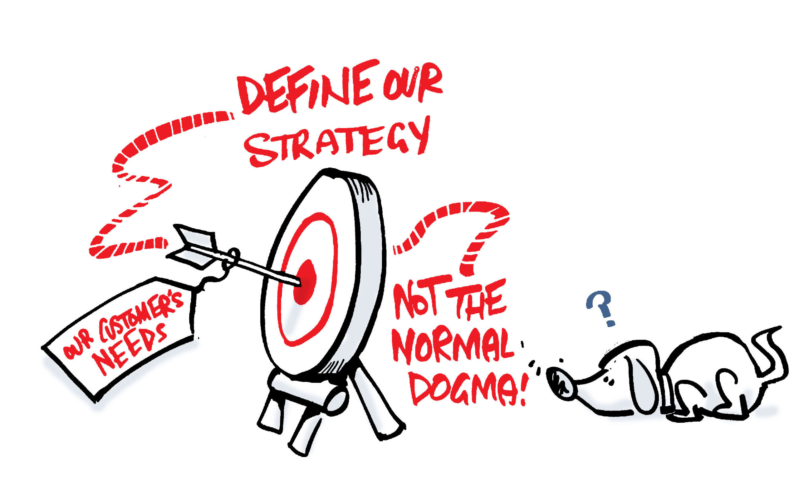
How to frame, develop, and implement a strategy – the Bookend Workshop Model Businesses today pour big money into solutions proffered by consulting firms. According to market watchers like Inc.com and Statista , the management consulting industry was worth between $250–$300 billion in 2019. And that figure is only expected to grow. That investment represents a market need for in-depth analysis and business solutions. It also represents an opening for the “how”—how does a business develop the initial framework for a new strategy and then implement the much-researched, expensive, hard-earned strategy built by consulting companies? That can be more complex.
It all begins with… A problem or an opportunity—this is the starting point for a company. It is simple enough. With either a raised challenge or the change to do more, what the company most has are questions. Lots and lots of questions. If the starting point is a problem , the company might need advice on how to grapple with a change in its industry. The business could need advice on how to handle a new regulation, an industry mandate, or perhaps a pervasive negative company culture that cannot be shaken. If the company is presented with an opportunity , the business management is maybe thinking of entering a new market, venturing some business risk, acquiring a new component, or pairing up with a partner. In either case, the common denominator is a question: how should our strategy look?
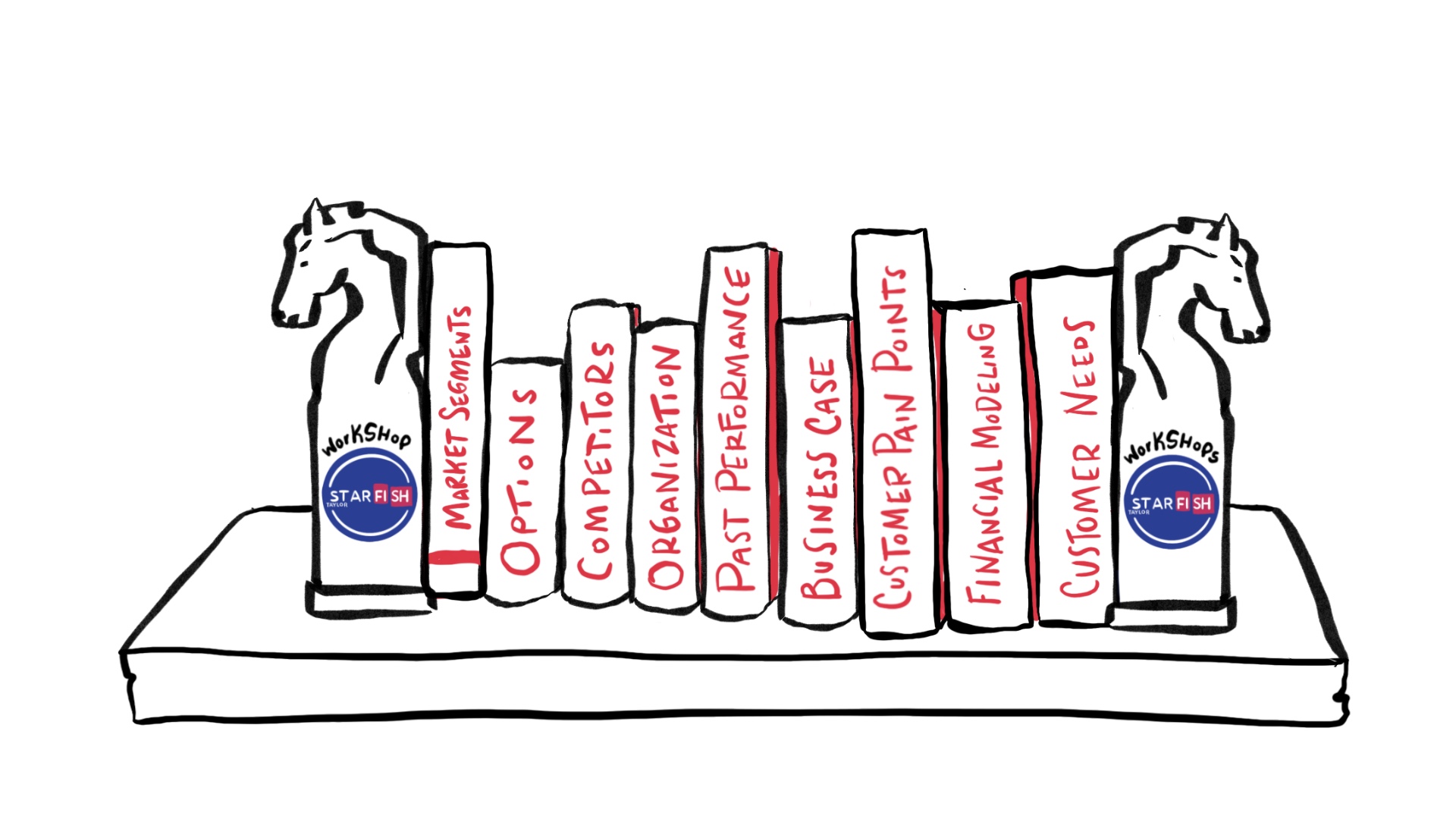
Introducing…the bookend workshop model for strategy! The bookend workshop model for strategy gets its name from the obvious holding place adorning libraries and offices around the world. Bookends. They can be cute, quirky, noble, or old-fashioned. Maybe they’re utilitarian, expensive, or somewhere in-between. On a practical level, bookends keep things firmly in place and prevent whatever is in between—from books to papers—from sliding around. In a broader consideration, a bookend denotes a definitive beginning and end , which has the job of holding in the middle.
The bookend workshop model strategy builds on this basic understanding. It offers a starting point for the firm as it confronts its new challenge or opportunity and frames the main elements of strategy. Then comes the middle—the plan and weighty information with research, analysis, and modeling. The bookend strategy closes out with the second—and by definition last—bookend. This second component is a definitive plan and closure to go forward with the strategy and implementation into the world.

Your business’s starting point: the first bookend to frame your strategy With bookends, as with certain types of business analysis, you start by stopping. The first bookend is a literal stopping point—it keeps the first piece of information from sliding onto the shelf. In Starfish Taylor’s bookend workshop strategy, we also advocate starting by stopping. Stopping allows a business to take stock; it’s an assessment of sorts, a place marker of discovery to determine where you are, where you’re going, and the different ways you could achieve that. Starfish Taylor usually brings together between 20–30 of a company’s key leadership group to attend the first bookend workshop over 2–3 days. In these days, we explore and discover the trajectory of a company’s plan. Why do they feel compelled to pursue this challenge or opportunity now ? What is to be gained? What could possibly go wrong? What sort of assets are available, and how might those be used? By taking the time to slow down and properly ascertain what your business is bringing into the new strategy, you can plan more robustly and avoid unnecessary waste and pitfalls down the line. It’s the axiom of “a stitch in time saves nine down the line”.
What makes up the middle? Here’s the heavy material. On a library shelf, this would be the books. Maybe big, dusty Encyclopedias Britannica, or a few volumes of Shakespeare. Something you don’t want clunking around on the shelves or tumbling onto the floor. In the business world, the middle part represents material no less weighty and important: the strategy you have paid for and rely on for your business’s next steps. This is the whitepaper from one of the big consulting companies, or another firm, assessing the risks, opportunities, challenges, and assets available to you. And it’s what is contained within the two outer edges. But you need something to stop the information from sliding away, some sense of closure. Because for all the money and time, what a white paper or consultancy does not provide you is how you and your business is to go about implementing the strategy. How do you take a 300 slide PowerPoint, process it, convert it, and turn it over to operations for real practice?
The end is just a new beginning: the second bookend Try to avoid thinking about the second bookend as the “end”—because in reality, it is just the beginning. It is the beginning of you and your business implementing a new strategy that has been rigorously researched and rationally argued in a much-valued document. Starfish Taylor’s workshop facilitation brings together the best and brightest minds in an organization to precisely map out your journey forward and establish a plan to best go forward with an agree-upon objective. This is no difference: the objective is successfully implementing the white paper, and our bookend session is designed to get the job done so you can walk away with a plan of action.
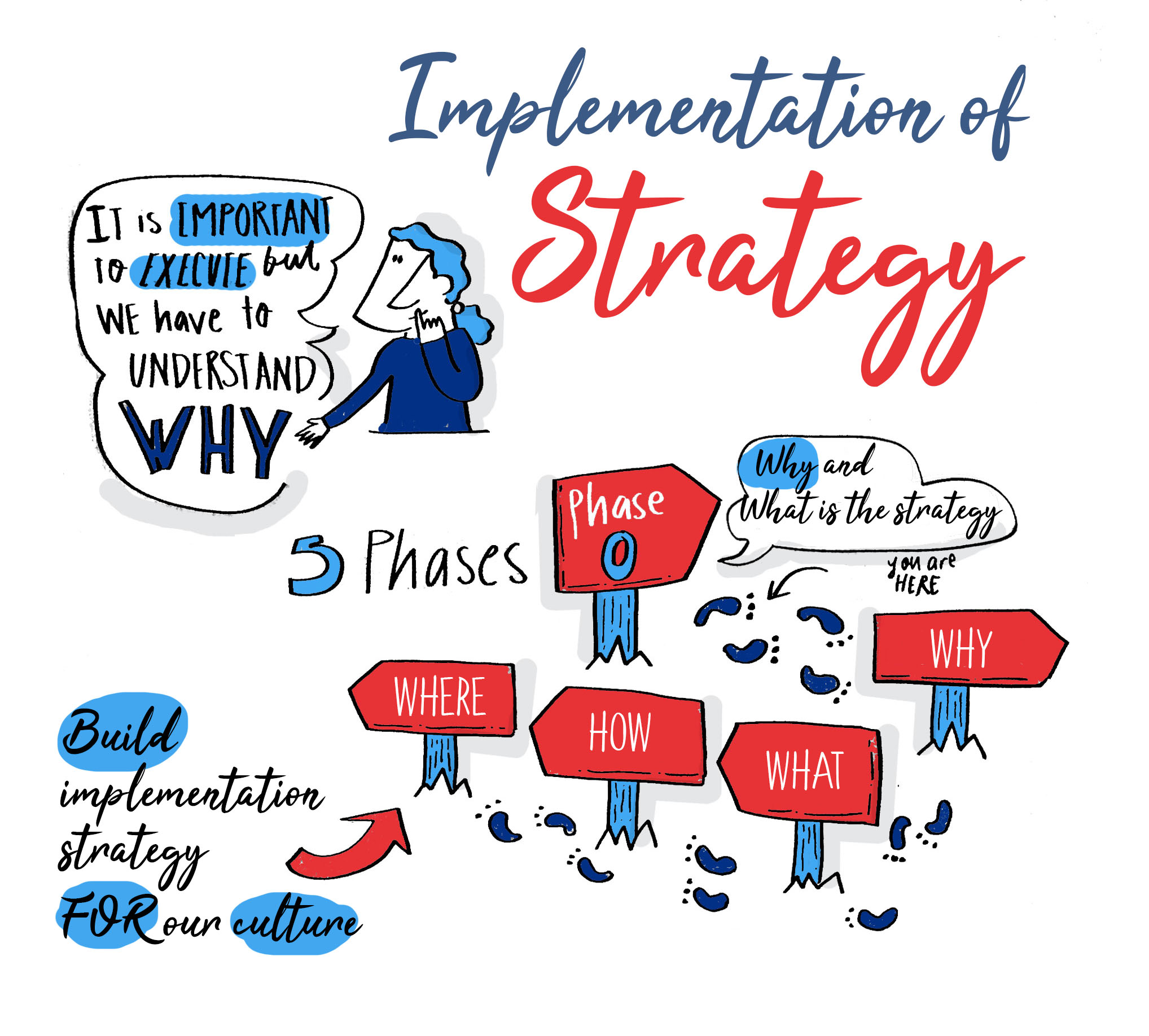
The value in Starfish Taylor’s bookend workshop model for strategy There are two types of engagements we see at Starfish Taylor. The first type are those who come to us before they start their consulting analysis; the second are those who find us after they already have a directive in hand. We suggest you be the first category.
Here’s why.
The group who comes to us before the process has started gets full advantage of the benefits mentioned in the first bookend. That company gets to slow down to speed up by reflecting and assessing before the consulting process has started. The management can identify and anticipate the challenges, pain points, and options they have available before they take on board the high-cost consultants. Those business leaders can take better stock of the bigger picture, which helps create a more complete roadmap to implement the strategy down the road. Because once the strategy is handed down to the company, the leaders and implementation team has a paper trail to refer back to—all the materials from the first bookend session. These are materials Starfish Taylor collects, compiles, and can reference to confirm consistency or detect deviation from an initial outlook. And that information is valuable to implementing the strategy and for applying those lessons to future scenarios.
But all is not lost if a company finds us after the strategy has been developed, without completing the first bookend. In fact, many companies come to us at that point precisely because they’ve got a handy, valuable strategy but have no idea how to put it into place without abandoning other goals, processes, and company cultures. Starfish Taylor is a pro when it comes to helping our clients realize their own brainpower and potential. We know you want a clear path to putting the strategy into reality, and we are here to help.
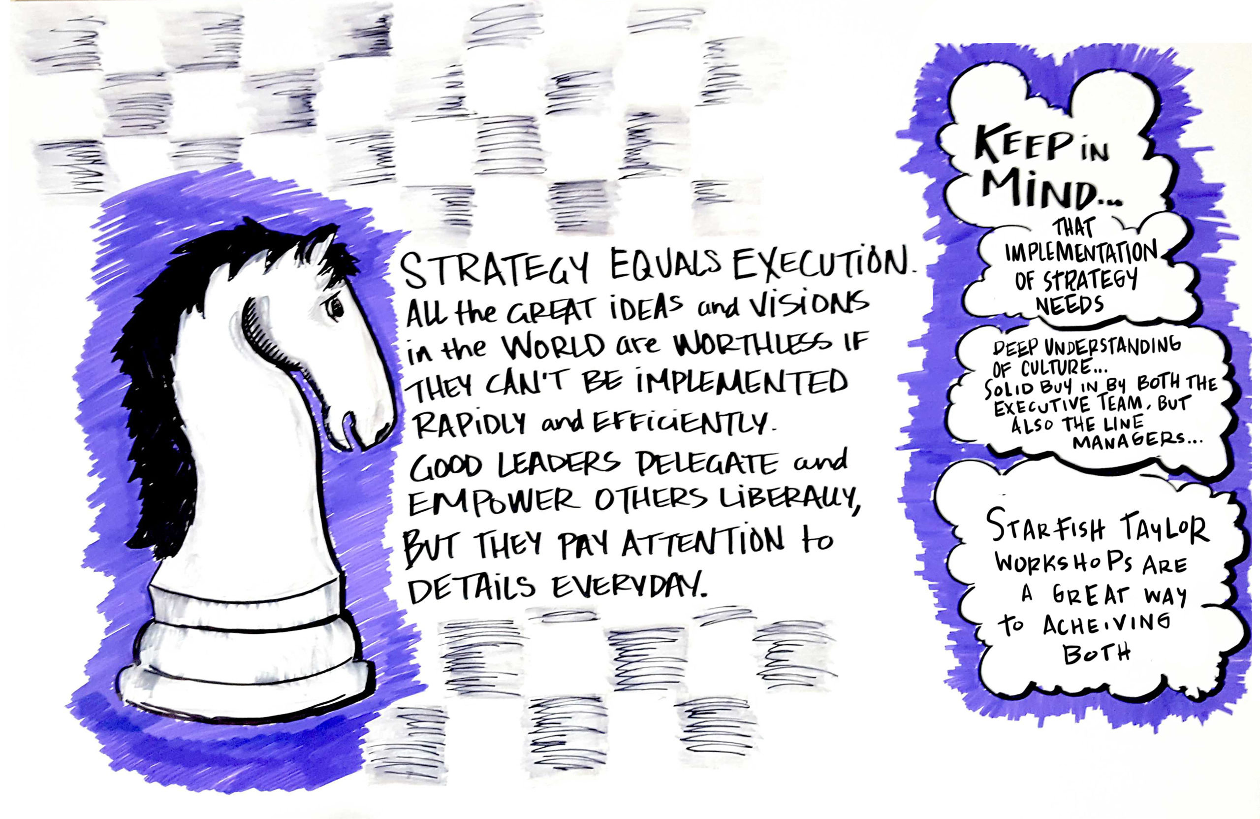
Keep in mind that the implementation of strategy needs a deep understanding of your company’s culture. It can be exciting and intimidating to be pressing for a new way forward—either despite a challenge or because of an opportunity. The monetary value of consultancy represents the effort and time invested to find the ideal scenario for the future. But it can be difficult to put that valuable piece of paper into practice. You don’t know where to start. And until you and your business are putting new methods into action, the words just represent abstract concepts. Starfish Taylor, with its proven methods and extensive experience with workshop facilitation, is ready to help you make a well-researched strategy a reality. Because we all know actions speak louder than words. And we’re here to help propel you into action.
Two days is not much time to have 50 thought leaders meet for the first time, coalesce and create a collective vision of a possible future. Peter, Chris and the team facilitated a diverse group of our industry ecosystem to understand how we can affect system level change and transformation. The trust, consensus and cooperation built in such a short time has given us a jump start in shaping the future. Bravo Starfish Taylor! –
Flora Moon , Sustainability Practice Director , Expressworks International LLC
Post Views: 3,974