Build a new Customer Experience - Starfish Taylor /*
You can add your own CSS here.
Click the help icon above to learn more.
*/
/*#header.text-dark {
background: rgba(255, 2 55, 255, 0.9);
}
#header .header-bg {
background: rgba(255, 255, 255, 0.9);
}*/
.so-widget-sow-post-carousel .sow-carousel-wrapper {
width: 100%;
}
.so-widget-sow-post-carousel .sow-carousel-container {
width: 100% !important;
max-width: 100% !important;
}
.so-widget-sow-post-carousel-default-971e41e9e54d .sow-carousel-wrapper ul.sow-carousel-items li.sow-carousel-item {
width: 255px;
margin: 0 10px;
box-shadow: 0 8px 18px 0 rgba(192, 192, 192, 0.5);
background: #fff;
border: 1px solid #ccc !important;
padding: 20px 10px;
min-height: 300px;
}
.sow-carousel-wrapper ul.sow-carousel-items li.sow-carousel-item h3 {
line-height: 30px !important;
}
.so-widget-sow-post-carousel-default-971e41e9e54d .sow-carousel-wrapper ul.sow-carousel-items li.sow-carousel-item .sow-carousel-thumbnail a, .so-widget-sow-post-carousel-default-971e41e9e54d .sow-carousel-wrapper ul.sow-carousel-items li.sow-carousel-item .sow-carousel-thumbnail a span.overlay {
width: auto !important;
}
.sow-carousel-wrapper ul.sow-carousel-items li.sow-carousel-item h3 a {
font-size: 22px;
}
.single-post .category-portfolio .five.columns {
display: none;
}
.single-post .category-portfolio .row .eleven {
width: 100%;
/* text-align: center; */
}
.single-post .category-portfolio .feature-img.page-banner {
display: none !important;
}
.single-post .category-portfolio .panel-grid .port-had h1.sow-headline {
color: #000!important;
}
.tag-graphic-facilitation .gfield input, .tag-graphic-facilitator .gfield input {
width: 100% !important;
}
.single-post .category-portfolio .panel-grid h2.sow-headline, .single-post .category-portfolio .panel-grid h1.sow-headline {
color: #000!important;
}
.single-post .category-graphics .panel-grid h2.sow-headline{color: #d11d5b !important;}
@font-face {
font-family: 'Lato';
font-display: auto;
}
/*body { color: #383838 !important; font-family: 'Lato'; font-size: 1em; font-style: normal; font-stretch: normal; font-weight: 400 !important; letter-spacing: 0.2px; line-height: 1.38 !important;}*/
ol li { border-top: none !important; border-bottom: none !important; text-align: left; font-family: Lato; font-size: 18px !important; font-weight: normal; font-style: normal; font-stretch: normal;
line-height: 1.38; letter-spacing: 0.2px; color: #383838; }
h4 { color:#ff037c;}
h4 a { color:#c5114f !important;;}
h4 a:hover { color:#273d98 !important;;}
h2 { margin:0px 0px;}
p { color: #383838 !important; font-family: 'Lato'; font-size: 18px !important; font-style: normal; font-stretch: normal; font-weight: 400 !important; letter-spacing: 0.2px; line-height: 1.38 !important; text-align: left;}
.full-width h1.headline {
display:none !important;
}
.headline.img-headline { text-transform:uppercase;}
/*.full-width.post-area.full-width {
max-width:1168px;
}*/
.hm-sub-heading { font-size: 20px; font-family: 'Lato'; font-style: normal; font-stretch: normal; font-weight: 400 !important; line-height: 1.6; letter-spacing: 0.3px; color: #616161; text-align: left;}
.bar-heading { color: #d11d5b; text-align: center; font-family: DroidSerif; font-size: 28px; font-weight: bold; font-style: normal; font-stretch: normal; line-height: 0.93; letter-spacing: 0.31px; text-align: center; }
.bar-sub-heading { text-align: center; font-size: 20px; color: #383838 !important; font-family: 'Lato'; font-weight: normal; font-style: normal; font-stretch: normal; line-height: 1.6 !important; letter-spacing: 0.3px; }
table {font-family: open sans,Arial,Helvetica,sans-serif;}
table td { border: 1px solid #e4e4e4; text-align: center;}
.slideshow .headline { padding-bottom:0px !important; margin:0 auto !important; font-size: 4.6em; padding-top:12%;}
.slideshow .information { margin-top: 10px !important; }
li#post-1911 div.excerpt h2 { letter-spacing: -2px; padding-top: 30px; padding-bottom: 30px;}
/*.container a:hover, .container a:focus, .container a:active, .footer-widgets a:hover, footer-widgets a:focus, footer-widgets a:active, #wrap .widget ul.menu li a:hover, #wrap .widget ul.menu li ul.sub-menu li a:hover, #wrap .widget ul.menu .current_page_item a, #wrap .widget ul.menu .current-menu-item a {
color: #d01d5b !important;
}*/
.container a, .container a:link, .container a:visited, .footer-widgets a, .footer-widgets a:link, .footer-widgets a:visited, #wrap .widget ul.menu li a {
color: #273d98;
}
/*#wrap .menu li li a:focus, #wrap .menu li li a:hover, #wrap .menu li li a:active {
color: #ffffff !important;
background-color:#D31C5C !important;
}
#wrap .menu li li a, #wrap .menu li li a:link, #wrap .menu li li a:hover {
color: #fff !important;
}*/
#wrap .menu li li a {
color: #333 !important; /*Sumenu link color stands here*/
}
#wrap .menu li li a:hover, #wrap .menu li li a:active {
color: #fff !important; /*Sumenu link color stands here*/
background-color:#D31C5C !important;
}
#pg-4-3 > .panel-row-style { padding: 5% 5% 5% 5%; }
/*#wrap .menu li li a:focus, #wrap .menu li li a:hover, #wrap .menu li li a:active {
color: #333333 !important;
}*/
#pl-4 .so-panel { margin-bottom: 0px; }
#pl-2327 .so-panel { margin-bottom: 0px; }
/* max-width changed from 960 to 1168 by Peter 20/Mar */
/*a.feature-img.radius-top {
padding-top: 18px;
}*/
.cl-flipbox-front {
padding:15px !important;
height:auto !important;
}
div.cl-flipbox-back-h a span {
font-size: 12px;
}
div.flexslider, div.loading {
background:rgba(38, 60, 152, .8) !important;
}
h4.cl-flipbox-front-title {
margin:0px !important;
font-size: 1.2em;
}
div#masthead p.site-title {
display:none !important;
}
div#pg-4-8 p, div#pg-17-3 p, div#pg-19-2 p {
line-height:18px !important;
}
div#pg-4-10 textarea {
height:100px !important;
}
div.cl-popup-box-content div.panel-grid-cell {
width: calc(33.3333% - ( 0.66666666666667 * 10px ) );
}
div#page-21 li.category-portfolio {
border-top:none !important;
border-bottom:none !important;
}
div#pl-4 .widget li, div#pl-4 .widget li:last-child {
border-bottom:none !important;
}
div#page-21 a.feature-img {
padding-top:none !important;
}
div#page-21 div.sd-content li {
border-top:none !important;
}
div.panel-widget-style-for-21-0-0-0 {
/*margin-top:100px !important;*/
margin-top:0 auto !important;
}
.contact-form input[type=submit] {
-ms-box-sizing: border-box;
-moz-box-sizing: border-box;
-webkit-box-sizing: border-box;
box-sizing: border-box;
font-size: 1em;
padding: 1em 2em;
background: #d21c5c;
background: -webkit-gradient(linear, left bottom, left top, color-stop(0, #a51648), color-stop(1, #d21c5c));
background: -ms-linear-gradient(bottom, #a51648, #d21c5c);
background: -moz-linear-gradient(center bottom, #a51648 0%, #d21c5c 100%);
background: -o-linear-gradient(#d21c5c, #a51648);
filter: progid:DXImageTransform.Microsoft.gradient(startColorstr='#d21c5c', endColorstr='#a51648', GradientType=0);
border: 1px solid;
border-color: #971442 #8e133e #811139 #8e133e;
color: #ffffff !important;
-webkit-border-radius: 0.25em;
-moz-border-radius: 0.25em;
border-radius: 0.25em;
-webkit-box-shadow: inset 0 1px 0 rgba(255,255,255,0.2), 0 1px 2px rgba(0,0,0,0.065);
-moz-box-shadow: inset 0 1px 0 rgba(255,255,255,0.2), 0 1px 2px rgba(0,0,0,0.065);
box-shadow: inset 0 1px 0 rgba(255,255,255,0.2), 0 1px 2px rgba(0,0,0,0.065);
text-shadow: 0 1px 0 rgba(0, 0, 0, 0.05);
}
.pushbutton-wide{ width:50% !important; margin:0 auto;}
ul.slides a.more-link {
-ms-box-sizing: border-box;
-moz-box-sizing: border-box;
-webkit-box-sizing: border-box;
box-sizing: border-box;
font-size: 1em;
display:inline-block;
margin:0 auto;
/*padding: 1em 2em 1em 2em;*/
/*background: #ff9900;*/
background: #ff9b08;
background: -webkit-gradient(linear,left bottom,left top,color-stop(0,#d47e00),color-stop(1,#ff9b08));
background: -ms-linear-gradient(bottom,#d47e00,#ff9b08);
background: -moz-linear-gradient(center bottom,#d47e00 0%,#ff9b08 100%);
background: -o-linear-gradient(#ff9b08,#d47e00);
/*filter: progid:DXImageTransform.Microsoft.gradient(startColorstr='#ff9900', endColorstr='#cc7a00', GradientType=0);*/
filter: progid:DXImageTransform.Microsoft.gradient(startColorstr='#ff9b08',endColorstr='#d47e00',GradientType=0);
border: 1px solid;
border-top-color: currentcolor;
border-right-color: currentcolor;
border-bottom-color: currentcolor;
border-left-color: currentcolor;
/*border-color: #bd7100 #b36b00 #a36200 #b36b00;*/
border-color: #c57500 #ba6f00 #ab6600 #ba6f00;
color: #ffffff !important;
text-align:center;
font-family: open sans,Arial,Helvetica,sans-serif;
font-weight: 400;
line-height: 1.9;
text-decoration: none !important;
-webkit-border-radius: .25em;
-moz-border-radius: .25em;
border-radius: .25em;
-webkit-box-shadow: inset 0 1px 0 rgba(255,255,255,.2),0 1px 2px rgba(0,0,0,.065);
-moz-box-shadow: inset 0 1px 0 rgba(255,255,255,.2),0 1px 2px rgba(0,0,0,.065);
box-shadow: inset 0 1px 0 rgba(255,255,255,.2),0 1px 2px rgba(0,0,0,.065);
text-shadow: 0 1px 0 rgba(0,0,0,.05);
height:42px;
/*padding-top:10px;*/
}
ul.slides a.more-link:hover { color:#343434 !important; text-decoration: none !important;
background: #ff9f12;
background: -webkit-gradient(linear,left bottom,left top,color-stop(0,#de8400),color-stop(1,#ff9f12));
background: -ms-linear-gradient(bottom,#de8400,#ff9f12);
background: -moz-linear-gradient(center bottom,#de8400 0%,#ff9f12 100%);
background: -o-linear-gradient(#ff9f12,#de8400);
filter: progid:DXImageTransform.Microsoft.gradient(startColorstr='#ff9f12',endColorstr='#de8400',GradientType=0);
border-color: #cf7b00 #c57500 #b56c00 #c57500;
}
.so-widget-sow-button-atom-a77237adc0a1 .ow-button-base a:hover {
color: #343434 !important; text-decoration: none !important;
}
.so-widget-sow-button-atom-a77237adc0a1 .ow-button-base a.ow-button-hover:hover {
background: #ff9f12;
background: -webkit-gradient(linear,left bottom,left top,color-stop(0,#de8400),color-stop(1,#ff9f12));
background: -ms-linear-gradient(bottom,#de8400,#ff9f12);
background: -moz-linear-gradient(center bottom,#de8400 0%,#ff9f12 100%);
background: -o-linear-gradient(#ff9f12,#de8400);
filter: progid:DXImageTransform.Microsoft.gradient(startColorstr='#ff9f12',endColorstr='#de8400',GradientType=0);
border-color: #cf7b00 #c57500 #b56c00 #c57500;
color:#343434 !important; text-decoration: none !important;
}
.text-white p {
text-shadow: 0 1px 0 rgba(0, 0, 0, 0.05);
color: rgba(255,255,255,1) !important;
}
.textwidget .contact-form input[type=email], .textwidget .contact-form input[type=text], .textwidget .contact-form input[type=url], .textwidget .contact-form textarea, .contact-form input[type=submit] {
width:100%;
}
body.home .post-area.wide {
padding-top:0px;
}
div#pl-746 h3.widget-title {
font-size:1.1em;
font-weight:bold;
}
body.blog h1.img-headline {
top:65% !important;
}
/*h1.sow-headline, div.page-banner h1.img-headline {
font-size:2.2em;
overflow: hidden;
text-overflow: ellipsis;
height: 1.5em;
}*/
div#pl-28 {
/*margin-top: -45px;*/
}
div.sharedaddy {
margin-top: 20px;
}
.widget li, .widget li:last-child {
border-top:none !important;
border-bottom:none !important;
}
a.feature-img.page-banner::before {
background-color:rgba(0, 0, 0, 0) !important;
}
/*
You can add your own CSS here.
Click the help icon above to learn more.
*/
.full-width h1.headline {
display:none !important;
}
.full-width.post-area.full-width {
max-width:1168px;
/* max-width changed from 960 to 1168 by Peter 20/Mar */
}
/*a.feature-img.radius-top {
padding-top: 18px;
}*/
.cl-flipbox-front {
padding:15px !important;
height:auto !important;
}
div.cl-flipbox-back-h a span {
font-size: 12px;
}
div.flexslider, div.loading {
background:rgba(38, 60, 152, .8) !important;
}
h4.cl-flipbox-front-title {
margin:0px !important;
font-size: 1.2em;
}
div#masthead p.site-title {
display:none !important;
}
div#pg-4-8 p, div#pg-17-3 p, div#pg-19-2 p {
line-height:18px !important;
}
div#pg-4-10 textarea {
height:100px !important;
}
div.cl-popup-box-content div.panel-grid-cell {
width: calc(33.3333% - ( 0.66666666666667 * 10px ) );
}
div#page-21 li.category-portfolio {
border-top:none !important;
border-bottom:none !important;
}
div#pl-4 .widget li, div#pl-4 .widget li:last-child {
border-bottom:none !important;
}
div#page-21 a.feature-img {
padding-top:none !important;
}
div#page-21 div.sd-content li {
border-top:none !important;
}
div.panel-widget-style-for-21-0-0-0 {
/*margin-top:100px !important;*/
margin-top:0 auto !important;
}
div.sow-cta-wrapper div.so-widget-sow-button-flat-e72a51798a2b {
width:100%;
}
.contact-form input[type=submit] {
-ms-box-sizing: border-box;
-moz-box-sizing: border-box;
-webkit-box-sizing: border-box;
box-sizing: border-box;
font-size: 1em;
padding: 1em 2em;
background: #d21c5c;
background: -webkit-gradient(linear, left bottom, left top, color-stop(0, #a51648), color-stop(1, #d21c5c));
background: -ms-linear-gradient(bottom, #a51648, #d21c5c);
background: -moz-linear-gradient(center bottom, #a51648 0%, #d21c5c 100%);
background: -o-linear-gradient(#d21c5c, #a51648);
filter: progid:DXImageTransform.Microsoft.gradient(startColorstr='#d21c5c', endColorstr='#a51648', GradientType=0);
border: 1px solid;
border-color: #971442 #8e133e #811139 #8e133e;
color: #ffffff !important;
-webkit-border-radius: 0.25em;
-moz-border-radius: 0.25em;
border-radius: 0.25em;
-webkit-box-shadow: inset 0 1px 0 rgba(255,255,255,0.2), 0 1px 2px rgba(0,0,0,0.065);
-moz-box-shadow: inset 0 1px 0 rgba(255,255,255,0.2), 0 1px 2px rgba(0,0,0,0.065);
box-shadow: inset 0 1px 0 rgba(255,255,255,0.2), 0 1px 2px rgba(0,0,0,0.065);
text-shadow: 0 1px 0 rgba(0, 0, 0, 0.05);
}
.text-white p {
text-shadow: 0 1px 0 rgba(0, 0, 0, 0.05);
color: rgba(255,255,255,1) !important;
}
.textwidget .contact-form input[type=email], .textwidget .contact-form input[type=text], .textwidget .contact-form input[type=url], .textwidget .contact-form textarea, .contact-form input[type=submit] {
width:100%;
}
body.home .post-area.wide {
padding-top:0px;
}
div#pl-746 h3.widget-title {
font-size:1.1em;
font-weight:bold;
}
body.blog h1.img-headline {
top:65% !important;
}
div.sharedaddy {
margin-top: 20px; margin-left:48px;
}
/*.siteorigin-widget-tinymce ul li { list-style-type: square !important; }
.textwidget ul li { list-style-type: square !important;}*/
.widget li { display:list-item; list-style: inherit; margin: 6px 15px 0;}
.widget ul, .widget li { list-style-type: disc; }
/*.widget ul, .widget li { list-style-type: circle !important; padding-left:20px; }*/
#panel-2327-2-1-2 ul li { list-style-type:none; list-style-image: url('https://www.starfishtaylor.com/wp-content/uploads/2018/04/ok-sign-png.png'); }
#panel-2327-4-1-3 ol li { list-style-type:number !important;}
#panel-2327-12-1-0 ol li { list-style-type:number !important;}
/*.widget li, .widget li:last-child { border-top:none !important; border-bottom:none !important; text-align: left; font-family: Lato; font-size: 16px; font-weight: normal; font-style: normal; font-stretch: normal; line-height: 1.38; letter-spacing: 0.2px; color: #383838; }*/
a.feature-img.page-banner h2 {
text-shadow:2px 2px 15px rgba(0, 0, 0, 0.8) !important;
}
div#page-318 div.feature-img.page-banner h1 {
display: none;
}
div#page-318 div.feature-img.page-banner::before {
background-color:rgba(0, 0, 0, 0) !important;
}
li#post-1911 div.excerpt h2{
letter-spacing:-2px;
padding-top:30px;
font-size:30px;
}
li#post-1911 div.excerpt h4{
font-size:18px;
}
div.feature-img.page-banner h1 {
font-size:3em;
padding-top:50px;
}
/* ----------- iPhone 4 and 4S ----------- */
/* Portrait and Landscape */
@media only screen
and (min-device-width: 320px)
and (max-device-width: 480px)
and (-webkit-min-device-pixel-ratio: 2) {
.headline.img-headline { font-size:45px !important;}
}
/* Portrait */
@media only screen
and (min-device-width: 320px)
and (max-device-width: 480px)
and (-webkit-min-device-pixel-ratio: 2)
and (orientation: portrait) {
.headline.img-headline { font-size:45px !important;}
}
/* Landscape */
@media only screen
and (min-device-width: 320px)
and (max-device-width: 480px)
and (-webkit-min-device-pixel-ratio: 2)
and (orientation: landscape) {
.headline.img-headline { font-size:45px !important;}
}
/* ----------- iPhone 5, 5S, 5C and 5SE ----------- */
/* Portrait and Landscape */
@media only screen
and (min-device-width: 320px)
and (max-device-width: 568px)
and (-webkit-min-device-pixel-ratio: 2) {
.headline.img-headline { font-size:45px !important;}
}
/* Portrait */
@media only screen
and (min-device-width: 320px)
and (max-device-width: 568px)
and (-webkit-min-device-pixel-ratio: 2)
and (orientation: portrait) {
.headline.img-headline { font-size:45px !important;}
}
/* Landscape */
@media only screen
and (min-device-width: 320px)
and (max-device-width: 568px)
and (-webkit-min-device-pixel-ratio: 2)
and (orientation: landscape) {
.headline.img-headline { font-size:45px !important;}
}
/* ----------- iPhone 6, 6S, 7 and 8 ----------- */
/* Portrait and Landscape */
@media only screen
and (min-device-width: 375px)
and (max-device-width: 667px)
and (-webkit-min-device-pixel-ratio: 2) {
.headline.img-headline { font-size:45px !important;}
}
/* Portrait */
@media only screen
and (min-device-width: 375px)
and (max-device-width: 667px)
and (-webkit-min-device-pixel-ratio: 2)
and (orientation: portrait) {
.headline.img-headline { font-size:45px !important;}
}
/* Landscape */
@media only screen
and (min-device-width: 375px)
and (max-device-width: 667px)
and (-webkit-min-device-pixel-ratio: 2)
and (orientation: landscape) {
.headline.img-headline { font-size:45px !important;}
}
/* ----------- iPhone 6+, 7+ and 8+ ----------- */
/* Portrait and Landscape */
@media only screen
and (min-device-width: 414px)
and (max-device-width: 736px)
and (-webkit-min-device-pixel-ratio: 3) {
.headline.img-headline { font-size:45px !important;}
}
/* Portrait */
@media only screen
and (min-device-width: 414px)
and (max-device-width: 736px)
and (-webkit-min-device-pixel-ratio: 3)
and (orientation: portrait) {
.headline.img-headline { font-size:45px !important;}
}
/* Landscape */
@media only screen
and (min-device-width: 414px)
and (max-device-width: 736px)
and (-webkit-min-device-pixel-ratio: 3)
and (orientation: landscape) {
.headline.img-headline { font-size:45px !important;}
}
/* ----------- iPhone X ----------- */
/* Portrait and Landscape */
@media only screen
and (min-device-width: 375px)
and (max-device-width: 812px)
and (-webkit-min-device-pixel-ratio: 3) {
.headline.img-headline { font-size:45px !important;}
}
/* Portrait */
@media only screen
and (min-device-width: 375px)
and (max-device-width: 812px)
and (-webkit-min-device-pixel-ratio: 3)
and (orientation: portrait) {
.headline.img-headline { font-size:45px !important;}
}
/* Landscape */
@media only screen
and (min-device-width: 375px)
and (max-device-width: 812px)
and (-webkit-min-device-pixel-ratio: 3)
and (orientation: landscape) {
.headline.img-headline { font-size:45px !important;}
}
@media handheld, only screen and (max-width: 319px) {
.home-slider .slideshow .slides li, .home-slider .slideshow .loading {
min-height: 400px;
}
.slideshow .headline { font-size: 3.4em;}
}
@media handheld, only screen and (max-width: 479px) {
.home-slider .slideshow .slides li, .home-slider .slideshow .loading {
min-height: 400px;
}
.slideshow .headline { font-size: 3.4em;}
}
@media handheld, only screen and (max-width: 767px) {
.home-slider .slideshow .content { padding:0;}
#header .header-bg {
background:rgba(255,255,255,0) !important;
}
p.site-title {
display:none;
}
span.header-bg {
display:none !important;
}
#pg-4-3 > .panel-row-style { padding: 10% 5% 10% 5%; }
}
@media handheld, only screen and (max-width: 1024px) {
li#post-1911 div.excerpt {
display: block !important;
}
li#post-1911 h2.headline {
font-size:36px;
padding-top:30px;
}
ul.slides a.more-link {
/* display:block;
width:30%;
left:35%;
right:35%;
padding:10px 10px 10px 10px;*/
margin: 0;
}
li#post-1911 div.excerpt h2{
display:block !important;
letter-spacing:-1px;
padding-top:30px;
font-size:20px;
}
li#post-1911 div.excerpt h4{
font-size:14px;
}
div#panel-4-0-0-0 h2 {
font-size:30px;
}
#pg-4-3 > .panel-row-style { padding: 10% 5% 10% 5%; }
}
@media handheld, only screen and (max-width: 766px) {
li#post-1911 div.excerpt {
display: block !important;
}
li#post-1911 h2.headline {
font-size:28px;
padding-top:30px;
}
ul.slides a.more-link {
/*display:block;
width:30%;
left:35%;
right:35%;
padding:10px 10px 10px 10px;*/
margin:0;
}
li#post-1911 div.excerpt h2{
display:block !important;
letter-spacing:-1px;
padding-top:30px;
font-size:15px;
}
li#post-1911 div.excerpt h4{
font-size:10px;
}
div#panel-4-0-0-0 h2 {
font-size:26px;
}
#pg-4-3 > .panel-row-style { padding: 10% 5% 10% 5%; }
}
@media handheld, only screen and (max-width: 640px) {
li#post-1911 div.excerpt {
display: block !important;
}
li#post-1911 h2.headline {
font-size:16px;
padding-top:20px;
}
ul.slides a.more-link {
/*display:block;
width:70%;
left:15%;
font-size:14px;*/
margin:0;
}
li#post-1911 div.excerpt h2{
display:block !important;
letter-spacing:0px;
padding-top:25px;
padding-bottom:10px;
margin-bottom:0px;
font-size:12px;
}
li#post-1911 div.excerpt h4{
font-size:10px;
}
div#panel-4-0-0-0 h2 {
font-size:22px;
}
#pg-4-3 > .panel-row-style { padding: 10% 5% 10% 5%; }
}
.Mask { /* width: 457px; height: 257px;*/ object-fit: contain; border-radius: 2px; background-color: #ffffff; box-shadow: 0 8px 18px 0 rgba(192, 192, 192, 0.5); }
.shape-ok { list-style-type:none; list-style-image: url('https://www.starfishtaylor.com/wp-content/uploads/2018/06/shape-ok.png'); font-family: Lato; font-size: 20px; font-weight: 600; font-stretch: normal; font-style: normal; line-height: 1.6; letter-spacing: 0.3px; }
/*.menu-footer-menu-container { width:100%;}
.footer-menu { width: 100%; overflow: hidden;}
#menu-footer-menu .footer-menu ul { border-bottom:2px #eeeeee; }
#menu-footer-menu .footer-menu ul li { border-bottom:2px #cccccc; }
#menu-footer-menu .footer-menu ul li a { color:#d11d5b; }
#menu-footer-menu .footer-menu ul li a:hover { color:#273d98; }*/
/*.menu-footer-menu-container .footer-menu ul { color:#383838; text-align:center; display:inline !important;}
#menu-footer-menu ul li { float: left;}
.footer-menu ul li a { color:#d11d5b;}
.footer-menu ul li a:hover{ color:#273d98;}*/
.abt { float:left; width:16%; text-align:left; }
.abt a { padding: 8px 0 8px 0; margin-top:7px; display:block; width:100%; text-decoration:none; }
.abt a:hover { color:#d11d5b; }
.servi { float:left; width:19%; text-align:left; }
.servi a { padding: 8px 0 8px 0; margin-top:7px; display:block; width:100%; text-decoration:none; }
.servi a:hover { color:#d11d5b; }
.portfoli { float:left; width:14%; text-align:left; }
.portfoli a { padding: 8px 0 8px 0; margin-top:7px; display:block; width:100%; text-decoration:none;}
.portfoli a:hover { color:#d11d5b; }
.blogres { float:left; width:19%; text-align:left; }
.blogres a { padding: 8px 0 8px 0; margin-top:7px; display:block; width:100%; text-decoration:none;}
.blogres a:hover { color:#d11d5b; }
.contac { float:left; width:15%; text-align:left; }
.contac a { padding: 8px 0 8px 0; margin-top:7px; display:block; width:100%; text-decoration:none;}
.contac a:hover { color:#d11d5b; }
.socialio { float:left; width:17%; text-align:left; }
.socialio a { padding:2px; margin-top:7px; display:block; }
.socialio a:hover { color:#d11d5b; }
.lio-ico { float:left; width:100%; text-align:left; }
.lio-ico a { padding: 0px 24px 2px 0; margin-top:7px; display:inline; }
.lio-ico a:hover { color:#d11d5b; }
#facebook { left: 0px; width: 24px; background: url('https://www.starfishtaylor.com/wp-content/uploads/2020/02/social-sprites.png') 0 0; background-repeat: no-repeat; }
#twitter { left: 24px; width: 24px; background: url('https://www.starfishtaylor.com/wp-content/uploads/2020/02/social-sprites.png') -24px 0; background-repeat: no-repeat; }
#linkedin { left: 48px; width: 24px; background: url('https://www.starfishtaylor.com/wp-content/uploads/2020/02/social-sprites.png') -48px 0; background-repeat: no-repeat; }
#instagram { left: 72px; width: 24px; background: url('https://www.starfishtaylor.com/wp-content/uploads/2020/02/social-sprites.png') -72px 0; background-repeat: no-repeat; }
#youtube { left: 96px; width: 24px; background: url('https://www.starfishtaylor.com/wp-content/uploads/2020/02/social-sprites.png') -96px 0; background-repeat: no-repeat; }
.footer-information {
padding: 48px 70px;
}
/*.social-nav { width:100%;}
.social-nav, ul {text-align:center;}
.social-nav, ul li { float:left;}
.social-nav, ul li a { color:#d11d5b;}
.social-nav, ul li a:hover { color:#273d98;}*/
/*.social-nav { width:100%;}
.social-nav, .facebook { background: url("https://www.starfishtaylor.com/wp-content/uploads/2018/06/facebook-mn.png") no-repeat fixed center;}
.social-nav, .facebook a:hover { background: url("https://www.starfishtaylor.com/wp-content/uploads/2018/06/facebook-hv.png") no-repeat fixed center;}
.social-nav, .twitter { background: url("https://www.starfishtaylor.com/wp-content/uploads/2018/06/twitter-mn.png") no-repeat fixed center;}
.social-nav, .twitter a:hover { background: url("https://www.starfishtaylor.com/wp-content/uploads/2018/06/twitter-hv.png") no-repeat fixed center;}
.social-nav, .linkedin { background: url("https://www.starfishtaylor.com/wp-content/uploads/2018/06/linkedin-mn.png") no-repeat fixed center;}
.social-nav, .linkedin a:hover { background: url("https://www.starfishtaylor.com/wp-content/uploads/2018/06/linkedin-hv.png") no-repeat fixed center;}
.social-nav, .instagram { background: url("https://www.starfishtaylor.com/wp-content/uploads/2018/06/instagram-mn.png") no-repeat fixed center;}
.social-nav, .instagram a:hover { background: url("https://www.starfishtaylor.com/wp-content/uploads/2018/06/instagram-hv.png") no-repeat fixed center;}
.social-nav, .youtube { background: url("https://www.starfishtaylor.com/wp-content/uploads/2018/06/youtube-mn.png") no-repeat fixed center;}
.social-nav, .youtube a:hover { background: url("https://www.starfishtaylor.com/wp-content/uploads/2018/06/youtube-hv.png") no-repeat fixed center;}*/
.fa { padding: 5px; font-size: 20px; width: 20px; text-align: center; text-decoration: none; margin: 5px 2px; border-radius: 50%; }
.fa:hover { opacity: 0.7; background:#d11d5b; }
.fa-facebook { background: #575757; color: white; }
.fa-twitter { background: #575757; color: white; }
.fa-twitter::before { content: "\f099"; }
.fa-linkedin { background: #575757; color: white; }
.fa-instagram { background: #575757; color: white; }
.fa-youtube { background: #575757; color: white; }
/*#header.header-large #logo-title { padding-left: 10%; }*/
/*#header.header-large { background: rgba(255, 255, 255, 0.9); }*/
#navigation { text-transform:none; font-family: Lato; font-size: 16px; font-weight: bold; font-style: normal; font-stretch: normal; line-height: normal; letter-spacing: 0.5px; color: #575757; margin-right: 5%; }
.menu a { line-height: normal; letter-spacing: 0.5px; }
.menu ul ul, ul.menu ul { width: 250px; }
#header.text-dark { border-bottom: none; z-index: 1000; }
#header #logo { /*margin-left: 18%;*/ margin-left: 6%;}
#header #logo-title { padding-left: 0px;}
.fl-node-5b1121c1a9f3d .fl-row-content { max-width: 1464px; }
#header.text-dark .menu a:hover,
#header.text-dark .menu a:active,
#header.text-dark .menu a:focus { color:#d11d5b;}
/*.content { max-width: 1920px; padding: 0; }*/
/*.no-thumb { padding-top: 160px !important; }
.full-width.post-area.full-width { max-width: 1168px; }*/
.ttgroup { width:100%; height:auto;}
.ttgroupa { width: 47%; height:auto; min-height:485px; background-color: #ffffff; box-shadow: 0 8px 18px 0 rgba(192, 192, 192, 0.5); margin: 14px 14px; padding: 25px; float: left;}
.ttgroupb { width: 47%; height: auto; min-height:485px; background-color: #ffffff; box-shadow: 0 8px 18px 0 rgba(192, 192, 192, 0.5); margin: 14px 14px; padding: 25px; float: right;}
.tggroup { width:100%; height:auto;}
.tggroupa { width: 457px; height:auto; min-height:485px; background-color: #ffffff; box-shadow: 0 8px 18px 0 rgba(192, 192, 192, 0.5); margin: 14px 14px; padding: 25px; float: left;}
.tggroupb { width: 457px; height: auto; min-height:485px; background-color: #ffffff; box-shadow: 0 8px 18px 0 rgba(192, 192, 192, 0.5); margin: 14px 14px; padding: 25px; float: right;}
.cprt { padding-top:27px; padding-bottom:27px; color:#616161; font-family: Lato; font-size:14px; font-style:normal; font-weight:normal; font-stretch:normal; letter-spacing:0.2px; background-color:#f8f8f8;text-align:center;padding:10px;margin-top:7px;}
form input[type="url"], form input[type="tel"], form input[type="email"], form input[type="text"], form input[type="password"], form input[type="number"] {
width: 100%;
}
.container .gform_wrapper input.button { display: inline-block; background: #d11d5b; position: relative; color: #ffffff; color: rgba(255, 255, 255, 255) !important; font-family: Lato; font-size: 18px; font-weight: bold; font-style: normal; font-stretch: normal; line-height: normal; letter-spacing: 0.3px; text-align: center; text-transform: none; border: 1px solid #c5114f; -webkit-border-radius: 4px; width: 100% !important; }
.container .gform_wrapper input.button:hover { color: #fff !important; text-decoration: none; border: 1px solid #273d98; cursor: pointer; -webkit-appearance: none; background: #273d98; }
select { color: rgba(0, 0, 0, 0.5); width: 100%; }
a.more-link { background:#d11d5b; color: #ffffff !important; font-family: Lato; font-size: 16px; font-weight: normal; font-style: normal; font-stretch: normal; border-radius: 4px; border: 2px solid #d11d5b; text-transform:none; }
.more-link:hover { background:#273d98; color: #ffffff !important; text-decoration: none; border: 2px solid #273d98; }
#searchsubmit { background:#d11d5b; color: #ffffff !important; border: 2px solid #d11d5b; font-family: Lato; font-size: 16px; font-weight: normal; font-style: normal; font-stretch: normal; line-height: 1.8; text-transform: none; border-radius: 4px;}
#searchsubmit:hover { background:#273d98; color: #ffffff !important; text-decoration: none; border: 2px solid #273d98;}
#searchform #s { border: 2px solid #d11d5b; border-radius: 4px;}
.so-widget-sow-button-flat-f8f94d1dab85 .ow-button-base a.ow-button-hover:hover { background: #273d98; text-decoration:none; }
.ow-button-base a { box-sizing: border-box; font-size: 1em; padding: 1em 2em; background: #d11d5b; color: #fff !important; border: 1px solid #d11d5b; border-width: 1px 0; border-radius: .25em; text-shadow: 0 1px 0 rgba(0,0,0,.05); }
.ow-button-base a.ow-button-hover:hover { color: #fff; background:#273d98 !important ; text-decoration:none; }
/*.so-widget-sow-button-flat-bb83e0871698 .ow-button-base a.ow-button-hover:hover {
background: #e02264;
border-bottom-color: #cd1c59;
color: #fff;
}*/
.no-thumb { padding-top: 60px !important; }
.gform_wrapper .top_label input.medium { width: calc(100% - 8px);}
.gform_wrapper .top_label select.medium { width: calc(100% - 8px);}
.sow-cta-base .sow-cta-text .sow-cta-subtitle { text-transform: none; }
.cl-counter { color:#d11d5b; text-align: center; }
.cl-counter-value { font-size: 30px !important; }
.cl-counter-title { font-size: 14px !important; color:#383838; }
h6 { font-family: Lato; font-size: 20px; text-align:center; font-weight: normal; font-style: normal; font-stretch: normal; line-height: 1.6; letter-spacing: 0.3px; color: #616161;}
.sidebar h6, .footer h6 { text-align:left; }
.role { font-family: Lato; font-size: 16px; text-align:center; font-weight: normal !important; font-style: normal !important; font-stretch: normal; line-height: normal !important; letter-spacing: 0.2px; color: #d11d5b !important; }
.role-des { font-family: Lato; font-size: 16px; font-weight: normal; font-style: normal; font-stretch: normal; line-height: 1.38; letter-spacing: 0.2px; color: #616161; text-align:center; }
/*.fl-node-5b2288b13550a { width: 98%; }*/
.article > p:first-child { font-size: 16px !important; }
@media only screen and (max-width:620px) {
/* For mobile phones: */
.abt, .servi, .portfoli, .blogres, .contac, .socialio, .lio-ico {
width:100%; text-align:center;
}
.ttgroupa { width: 100%; text-align:center; box-shadow: none; margin: 0 auto; padding: 10px;}
.ttgroupb { width: 100%; text-align:center; box-shadow: none; margin: 0 auto; padding: 10px;}
}
@media only screen
and (min-device-width: 320px)
and (max-device-width: 480px)
and (-webkit-min-device-pixel-ratio: 2) {
.column-oa { width:100%; height:auto; margin-bottom:20px; float: left !important; }
.column-ob { width:100%; height:auto; margin-top: 30px; float: left !important;}
.column-obc { width:100%; height:40px; float: left !important;}
.column-oc { width:100%; height:auto; float: left !important;}
.row-ohb { padding: 0px 27px 27px 27px; }
.column-od { width:100%; height:auto; margin-top: 30px; float: left !important;}
.more-info { width: 165px !important; margin: 20px auto !important;}
.learn-more-2 { float:none; text-align: center; }
.tggroupa { width: 75%; height: auto; }
.tggroupb { width: 75%; height: auto; }
wlw-form .gform_body { width: 100%; }
.wlw-form .gform_footer { width: 100%; }
.hero-pop-txt { width: 230px; height: auto;}
}
@media only screen
and (min-device-width: 768px)
and (max-device-width: 1024px)
and (-webkit-min-device-pixel-ratio: 1) {
.column-oa { width:100%; height:auto; margin-bottom:20px; float: left !important; }
.column-ob { width:100%; height:auto; margin-top: 30px; float: left !important;}
.column-obc { width:100%; height:40px; float: left !important;}
.column-oc { width:100%; height:auto; float: left !important;}
.row-ohb { padding: 0px 27px 27px 27px; }
.column-od { width:100%; height:auto; margin-top: 30px; float: left !important;}
.more-info { width: 165px !important; margin: 20px auto !important;}
.learn-more-2 { float:none; text-align: center; }
.tggroupa { width: 75%; height: auto; }
.tggroupb { width: 75%; height: auto; float:left; }
wlw-form .gform_body { width: 100%; }
.wlw-form .gform_footer { width: 100%; }
}
.wp-block-button__link { -webkit-border-radius: 4px; }
.wp-block-button__link:hover{ text-decoration:none; background-color: #273d98 !important;}
#pgc-2327-14-1 {background-color: #d11d5b; padding: 3% 0% 3% 0%;}
.excerpt { width: 360px; border-radius: 2px; background-color: #ffffff; object-fit: contain; box-shadow: 0 8px 18px 0 rgba(192, 192, 192, 0.5);}
/*.excerpt, .title { font-family: Lato; font-size: 26px; font-weight: 600; font-style: normal; font-stretch: normal; line-height: 1.54; letter-spacing: 0.4px; color: #383838; }*/
/*.excerpt, .title, p { color: #383838 !important; font-family: 'Lato'; font-size: 1em; font-style: normal; font-stretch: normal; font-weight: 400 !important; letter-spacing: 0.2px; line-height: 1.38 !important; text-align:left; padding: 15px 21px 25px 15px; }*/
/*.excerpt, .title, p { color: #383838 !important; font-family: 'Lato'; font-size: 16px; font-style: normal; font-stretch: normal; font-weight: 400 !important; letter-spacing: 0.2px; line-height: 1.38 !important; text-align:left; }*/
.excerpt h2 { font-family: Lato; font-size: 26px !important; font-weight: 600; font-style: normal; font-stretch: normal; line-height: 1.54; letter-spacing: 0.4px; color: #383838; padding-left:15px; padding-right:21px; }
.excerpt p { font-family: Lato; font-size: 16px; font-weight: normal; font-style: normal; font-stretch: normal; line-height: 1.38; letter-spacing: 0.2px; color: #575757; padding-left:15px; padding-right:21px; }
.excerpt p a { font-family: Lato; font-size: 20px; font-weight: bold; font-style: normal; font-stretch: normal; line-height: normal; letter-spacing: 0.3px; text-align: center; color:#d11d5b !important; }
.excerpt p a:hover { text-decoration: underline; }
.optxt{ color: #616161 !important; font-size: 18px; font-weight: normal !important; line-height: 1.78 !important; letter-spacing: 0.3px;}
/*.sow-carousel-title a.sow-carousel-previous { width:38px; height:25px; background: url("https://www.starfishtaylor.com/wp-content/uploads/2018/06/pre-grey.png") no-repeat fixed center; }
.sow-carousel-title a.sow-carousel-previous:hover { background: url("https://www.starfishtaylor.com/wp-content/uploads/2018/06/pre-pink.png") no-repeat fixed center; }
.sow-carousel-title a.sow-carousel-next { width:38px; height:25px; background: url("https://www.starfishtaylor.com/wp-content/uploads/2018/06/nex-grey.png") no-repeat fixed center; }
.sow-carousel-title a.sow-carousel-next:hover { background: url("https://www.starfishtaylor.com/wp-content/uploads/2018/06/nex-pink.png") no-repeat fixed center; }*/
/*.sow-carousel-wrapper ul.sow-carousel-items li.sow-carousel-item .sow-carousel-thumbnail a:hover { object-fit: contain; opacity: 0.8; border-radius: 2px;
background-image: linear-gradient(306deg, var(--dusk-blue), var(--carolina-blue)); }
.sow-carousel-wrapper ul.sow-carousel-items li.sow-carousel-item .sow-carousel-thumbnail .excerpt:hover { object-fit: contain; border-radius: 2px; background-image: linear-gradient(216deg, var(--dusk-blue), var(--carolina-blue)); }*/
/*.excerptoverlay { position: absolute; top: 0; bottom: 0; left: 0; right: 0; width: 360px; height: 257px; opacity: 0; transition: .5s ease; background-color: #008CBA; }*/
/*.excerptoverlay { position: absolute; top: 0; bottom: 0; left: 0; right: 0; width: 360px; height: 100%; opacity: 0; transition: .5s ease; background-color: #008CBA; }
.excerpt:hover .excerptoverlay { opacity: 0.5; }*/
/*.excerpt:hover .excerpt { background-image: linear-gradient(216deg, var(--dusk-blue), var(--carolina-blue)); }
.excerpt:hover .excerpt h2 { color: #ffffff !important; }
.excerpt:hover .excerpt p { color: #ffffff; }
.excerpt:hover .excerpt p a { color: #ffffff; }*/
/*.text { color: white; font-size: 20px; position: absolute; top: 50%; left: 50%; -webkit-transform: translate(-50%, -50%); -ms-transform: translate(-50%, -50%); transform: translate(-50%, -50%); text-align: center; }*/
.sow-carousel-wrapper ul.sow-carousel-items li.sow-carousel-item .sow-carousel-thumbnail a span.overlay { background: #273d98; !important; }
.sow-carousel-wrapper ul.sow-carousel-items li.sow-carousel-item .sow-carousel-thumbnail a:hover span { opacity: .2 !important; }
/*.sow-carousel-wrapper ul.sow-carousel-items li.sow-carousel-item .excerpt span .overlay { width:360px; height:250px; background: #273d98; display: block; opacity: 0; position: static; transition: all .35s ease;}
.sow-carousel-wrapper ul.sow-carousel-items li.sow-carousel-item .excerpt:hover span .overlay { opacity: .2 !important; }*/
.fl-node-5b2288b1354bb { width: 0% !important;; }
.fl-node-5b2288b13550a { width: 100% !important; }
.fl-node-5b2288b135558 { width: 0% !important;; }
.fl-node-5b22815fd2b49 { width: 0%; }
#gform_wrapper_10 { margin: 0;}
.wlw-form { width: 555px; height: 75px; object-fit: contain; }
.wlw-form .gform_body { float: left; width: 80%; height:60px;}
.wlw-form .gform_footer { clear: none; width: 20%; height:54px; float: left; padding: 0; margin:0; }
.wlw-form .gform_wrapper .gform_footer { padding: 0; margin: 0;}
.gform_wrapper .gform_footer input.button { -webkit-border-radius: 4px; background: #d11d5b; color: #ffffff; font-family: 'Lato'; font-style: normal; letter-spacing: 0.3px; font-stretch: normal; font-size: 18px; font-weight: bold; line-height: normal; padding: 12px 24px; border: 1px solid #c5114f; text-align: center; text-decoration: none; text-shadow: none;}
/*.test {display: inline-block; }*/
.gform_wrapper .gform_footer input.button, .gform_wrapper .gform_footer input[type="submit"] { width: 100px; height:54px;}
.gform_wrapper .gform_footer input.button, .gform_wrapper .gform_footer input[type="text"] { width: 100px; height:54px;}
.gform_wrapper .gform_footer input.button:hover { background: #273d98; color: #ffffff;}
#gform_wrapper_10 .gform_heading{ display:none;}
body .gform_wrapper ul li.gfield { margin-top: 0; padding-top: 0; }
.gform_wrapper ul.gform_fields li.gfield { padding-right: 0; }
.gform_wrapper li.hidden_label input { margin-top: 0px; }
.wlw-form input[type="text"] { padding: 5px 10px; height: 58px; border:none; border-radius: 0px;}
body .gform_wrapper .top_label div.ginput_container { margin-top: 0px; }
/*.wlw-form input[type="text"]{ width: 390px !important; height: 54px; }
.wlw-form input[type="submit"] { width: 165px !important; height: 54px;}*/
/*.sow-carousel-title a.sow-carousel-next { display: block; float: right; overflow: hidden; margin-left: 2px; margin-top: 3px; font-size: 0px; width: 38px; text-align: center; height: 25px; background-color:none !important; background-image: url(https://www.starfishtaylor.com/wp-content/uploads/2018/06/nex-pink.png);}
.sow-carousel-title a.sow-carousel-previous { display: block; float: right; overflow: hidden; margin-left: 2px; margin-top: 3px; font-size: 0px; width: 38px; text-align: center; height: 25px; background: background-color:none !important; background-image: url(https://www.starfishtaylor.com/wp-content/uploads/2018/06/pre-pink.png);}*/
.sow-carousel-title a.sow-carousel-next { color:#d11d5b !important; background: none !important; width:38px !important; height:25px !important; font-size: 18px !important;}
.sow-carousel-title a.sow-carousel-previous { color:#d11d5b !important; background: none !important; width:38px !important; height:25px !important; font-size: 18px !important;}
.sow-carousel-title a:hover.sow-carousel-next { color:#273d98 !important; }
.sow-carousel-title a:hover.sow-carousel-previous { color:#273d98 !important; }
.widget { margin-bottom: 50px; }
blockquote p { font-weight:bold !important; font-style:italic; }
blockquote { color: #383838 !important; font-family: 'Lato'; font-size: 16px; font-style:italic; font-stretch: normal; font-weight: bold !important; letter-spacing: 0.2px; line-height: 1.38 !important; text-align: left; }
.white { color:#ffffff !important;}
.headline { color:#383838 !important; font-size: 52px !important; font-weight: 700 !important; line-height: 1.3 !important; }
.headline.img-headline { color: #fff !important; font-size: 52px; font-weight: 700 !important; line-height: 1.3 !important; text-transform: none !important; }
.at-sft-brd { border-bottom: 1px solid #e7e7e7;}
.del-cus-pd { margin:0px !important; padding:0px!important; }
.widget ul, .widget li .shap-ok { list-style-type:none; padding-left:15px; list-style-image: url('https://www.starfishtaylor.com/wp-content/uploads/2018/06/shape-ok.png'); }
.Mask-2 { /* width: 457px; height: 257px;*/ object-fit: contain; border-radius: 2px; background-color: #ffffff; box-shadow: 0 8px 18px 0 rgba(192, 192, 192, 0.5); padding:30px 20px 30px 20px;}
.oa-head { color: #d11d5b; font-family: Lato,sans-serif; font-weight: 700; font-size: 20px; letter-spacing: .2px; line-height: 1.0 !important; margin-top: 1.5 !important; text-align: left; }
.mr-tp { margin-top:50px;}
.img-vid { background-image: url('https://www.starfishtaylor.com/wp-content/uploads/2019/07/icon-vid-24x18.jpg'); background-repeat: no-repeat; background-size: auto; padding-left:65px; padding-top:0px; padding-bottom:0px;}
.img-cam { background-image: url('https://www.starfishtaylor.com/wp-content/uploads/2019/07/icon-cam-24x18.jpg'); background-repeat: no-repeat; background-size: auto; padding-left:65px; padding-top:0px; padding-bottom:0px; }
.img-fol { background-image: url('https://www.starfishtaylor.com/wp-content/uploads/2019/07/icon-fold-24x18.jpg'); background-repeat: no-repeat; background-size: auto; padding-left:65px; padding-top:0px; padding-bottom:0px; }
.portfolio .post-holder { background: #fff; }
.portfolio .post-holder .excerpt { width: auto; }
.column-oa { float: left; width: 457px; height: 257px; object-fit: contain; border-radius: 2px; background-color: #ffffff; box-shadow: 0 8px 18px 0 rgba(192, 192, 192, 0.5); }
.column-ob { float: left; width: 457px; height: 257px; object-fit: contain; border-radius: 2px; background-color: #ffffff; box-shadow: 0 8px 18px 0 rgba(192, 192, 192, 0.5); }
.column-obc { width:100%; height:91px;}
.column-oc { float: left; width: 457px; height: 257px; object-fit: contain; border-radius: 2px; background-color: #ffffff; box-shadow: 0 8px 18px 0 rgba(192, 192, 192, 0.5); }
.column-od { float: left; width: 457px;; height: 200px; object-fit: contain; border-radius: 2px; }
.op-photo{ float:left; margin:auto; padding-left:25px;}
.op-head{ color:#d11d5b; font-family: Lato, sans-serif; font-weight: 700; font-size: 20px; letter-spacing: 0.2px; text-align: left; margin:auto 25px; padding-left:72px;}
.optxta { color: #616161 !important; font-size: 18px; font-weight: normal !important; line-height: 1.78 !important; letter-spacing: 0.3px; padding:20px !important;}
.row-oa:after { content: ""; display: table; clear: both; }
.row-ob:after { content: ""; display: table; clear: both; }
.row-oh { width:100%; height:44px; padding: 20px 0;}
.row-ohp { padding:0px 27px 27px 27px;}
.row-ohb { padding:27px 52px 0px 27px;}
.row-ohc { padding:5px 40px 0px 27px;}
.learn-more { float: left; padding-left: 27px;}
.learn-more a { width:165px; height:54px; text-align: center; max-width: 100%; display:inline-block; padding: 0px 24px; margin-top: 35px; border: 1px solid #c5114f; -webkit-border-radius: 4px; font-size: 16px; line-height: 16px; color: #fff; background: #d11d5b; text-decoration: none; text-shadow: none; box-sizing: border-box; webkit-transition: all .25s ease-in-out; font-family: 'Lato'; font-style: normal; font-stretch: normal; letter-spacing: 0.2px;}
.learn-more a:hover { background: #273d98; border: 1px solid #1b318c; }
.our-projects { font-family: Lato; font-size: 20px; font-weight: normal; font-stretch: normal; font-style: normal; line-height: 1.6; letter-spacing: 0.3px; color: #383838;}
.action-vid { float: left;}
.action-vid a { width:165px; height:54px; text-align: center; max-width: 100%; display:inline-block; padding: 0px 24px; margin-top: 0px; border: 1px solid #c5114f; -webkit-border-radius: 4px; font-size: 16px; line-height: 16px; color: #fff; background: #d11d5b; text-decoration: none; text-shadow: none; box-sizing: border-box; webkit-transition: all .25s ease-in-out; font-family: 'Lato'; font-style: normal; font-stretch: normal; letter-spacing: 0.2px;}
.action-vid a:hover { background: #273d98; border: 1px solid #1b318c; }
.learn-more-2 { float: left;}
.learn-more-2 a { width:165px; height:54px; text-align: center; max-width: 100%; display:inline-block; padding: 0px 24px; margin-top: 0px; border: 1px solid #c5114f; -webkit-border-radius: 4px; font-size: 16px; line-height: 16px; color: #fff; background: #d11d5b; text-decoration: none; text-shadow: none; box-sizing: border-box; webkit-transition: all .25s ease-in-out; font-family: 'Lato'; font-style: normal; font-stretch: normal; letter-spacing: 0.2px;}
.learn-more-2 a:hover { background: #273d98; border: 1px solid #1b318c; }
.sow-carousel-container { width:1100px !important; max-width:1100px !important ;}
.hero-pop-txt { width: 560px; height: auto;margin: 0 auto !important}
.sumo-form-wrapper button { color:#ffffff !important;}
ul li { font-size:18px !important;}
.article > p:first-child { font-size: 18px !important;}
.post-views { display:none;}
#section-1,#section-2,#section-3,#section-4,#section-5,#section-6,#section-7,#section-8 { display:none;}
.loadb { display:inherit !important;}
button.more-link { background: #d11d5b; color: #ffffff !important; font-family: Lato; font-size: 16px; font-weight: normal; font-style: normal; font-stretch: normal; border-radius: 4px; border: 2px solid #d11d5b; text-transform: none; }
.elementor-11035 .elementor-element.elementor-element-e160739:not(.elementor-motion-effects-element-type-background){
background-color: #ffffff;
background-image: none;
}
Build a new Customer Experience
A multinational company approached Starfish Taylor with a goal: they wanted to build a new customer experience to disrupt the market before somebody else did. And they asked Starfish Taylor to design and facilitate all their workshops for the 2+year project.
Market context for the company’s goal In today’s consumer market, research stresses the importance of customer experience (CX), which customers use to differentiate among competing brands. CX quality is a competitive asset. Customer experience is a significant determinant of brand loyalty, customer recommendation, and the willingness for a customer to overlook any company missteps. In such a dynamic marketplace, each of these factors represents strength to any business. The company that approached Starfish Taylor wanted to tap into their current culture and system to better develop their CX potential.
Customer Experience starts with the customer and understanding their journey Our delivery To meet our client’s vision, Starfish Taylor designed and facilitated a series of Discovery Workshops in several countries of the customer’s global presence. One was in the UK, where we incorporated participants from all aspects of the business—from sales, to call centers, to production plants, to shipping and logistics, to accounting and to their business leaders. The Discovery Workshop drew on Starfish Taylor’s knowledge of CX and the need to align company culture, business values, and outcomes while keeping the customer’s experience front and center.
Starfish Taylor’s approach was to design an event that delivered on the company’s objectives. This was accomplished in three phases: The Planning and Design Phase : Starfish Taylor spent time with our client to deeply understand the challenge they were approaching and what they need to get out of the workshop to move forward. This particular workshop offered a series of unique design challenges. Our primary challenge was to develop a way for participants to engage in a really short time frame while procuring the information needed for the overall CX program. This led to two smaller challenges: First , our client already had a customer journey maps in digital format, but they needed to bring the customer journey alive to test its accuracy in local context and then add or compare local experience to the larger global context. Second , the client needed participants to engage and collaborate together on terms that were abstract to them in a lingo they did not engage with daily—high-level interaction with process-centric information—to get feedback on the key points of the discovery workshop. The design challenge was thinking through some really big things, but we were able to work with the customer and bring them to life in the event. The Event Phase : During the Discovery Workshop, we encouraged participants to own the problems and find solutions through humor, creativity, and experience. Key moments in the discovery workshop included: Customer Journey Maps ; Pain Points ; Moments of Truth ; Risk Maps ; and Alignment with the global vision (especially where local priorities were different). Part of the design phase was considering how to bring the elements of customer journey to life. In the event, teams projected the current state through a series of “skits” and brainstormed how business would look if the customer centric vision was realized. These skits kept participants engaged and gave a real-life idea of the possibilities we were considering. To work around the problem of abstract language, we utilized learning moments , which introduced participants to concepts using common experience external information (e.g., a flight and restaurant experience). During the workshop, Starfish Taylor maintained a 3rd party ability to step back to offer input and advice. The Momentum Phase : Following the Discovery Workshop, Starfish Taylor provided the client with a Media Package containing the workshop materials in a format to consolidate information as they continued on discovery workshops in other countries. This template approach allowed the customer to reference back to the wider global risks alongside local context, for customer experience. Customer Centricity Workshops put participants into the shoes of their customers Result The Discovery Workshop delivered a number of core objectives, including alignment on the previously built global customer journey maps; an exhaustive list of pain points along the customer journey; the moments of truth for the customer that were priorities for the UK; a risk map; the areas of disconnect between the global customer journey maps and UK business; and a comprehensive understanding from the participants about the customer experience terminology. The UK group also came to understand the things they could improve immediately in local customer experience—“quick wins” for the UK teams to accelerate their plans for regional-based customer support. We also had a lot of fun.
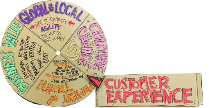
Visualizing discussions helps build a common understanding of the main ideas Conclusion
Companies are increasingly aware of the importance of customer experience has in long-term profit strategy. The multinational company in this case study knew what they wanted to achieve but needed to discover what sort of knowledge they had, and how that knowledge could be applied to create a roadmap to achieve their goal. Starfish Taylor facilitated that discovery process by creating a workshop using a Design Thinking approach, with our proven methods, to deliver a memorable workshop participant experience, and met the customer’s objectives.
Post Views: 3,749