Family Vacation Icebreaker: Compromising Customer Needs, Creating the Ideal - Starfish Taylor /*
You can add your own CSS here.
Click the help icon above to learn more.
*/
/*#header.text-dark {
background: rgba(255, 2 55, 255, 0.9);
}
#header .header-bg {
background: rgba(255, 255, 255, 0.9);
}*/
.so-widget-sow-post-carousel .sow-carousel-wrapper {
width: 100%;
}
.so-widget-sow-post-carousel .sow-carousel-container {
width: 100% !important;
max-width: 100% !important;
}
.so-widget-sow-post-carousel-default-971e41e9e54d .sow-carousel-wrapper ul.sow-carousel-items li.sow-carousel-item {
width: 255px;
margin: 0 10px;
box-shadow: 0 8px 18px 0 rgba(192, 192, 192, 0.5);
background: #fff;
border: 1px solid #ccc !important;
padding: 20px 10px;
min-height: 300px;
}
.sow-carousel-wrapper ul.sow-carousel-items li.sow-carousel-item h3 {
line-height: 30px !important;
}
.so-widget-sow-post-carousel-default-971e41e9e54d .sow-carousel-wrapper ul.sow-carousel-items li.sow-carousel-item .sow-carousel-thumbnail a, .so-widget-sow-post-carousel-default-971e41e9e54d .sow-carousel-wrapper ul.sow-carousel-items li.sow-carousel-item .sow-carousel-thumbnail a span.overlay {
width: auto !important;
}
.sow-carousel-wrapper ul.sow-carousel-items li.sow-carousel-item h3 a {
font-size: 22px;
}
.single-post .category-portfolio .five.columns {
display: none;
}
.single-post .category-portfolio .row .eleven {
width: 100%;
/* text-align: center; */
}
.single-post .category-portfolio .feature-img.page-banner {
display: none !important;
}
.single-post .category-portfolio .panel-grid .port-had h1.sow-headline {
color: #000!important;
}
.tag-graphic-facilitation .gfield input, .tag-graphic-facilitator .gfield input {
width: 100% !important;
}
.single-post .category-portfolio .panel-grid h2.sow-headline, .single-post .category-portfolio .panel-grid h1.sow-headline {
color: #000!important;
}
.single-post .category-graphics .panel-grid h2.sow-headline{color: #d11d5b !important;}
@font-face {
font-family: 'Lato';
font-display: auto;
}
/*body { color: #383838 !important; font-family: 'Lato'; font-size: 1em; font-style: normal; font-stretch: normal; font-weight: 400 !important; letter-spacing: 0.2px; line-height: 1.38 !important;}*/
ol li { border-top: none !important; border-bottom: none !important; text-align: left; font-family: Lato; font-size: 18px !important; font-weight: normal; font-style: normal; font-stretch: normal;
line-height: 1.38; letter-spacing: 0.2px; color: #383838; }
h4 { color:#ff037c;}
h4 a { color:#c5114f !important;;}
h4 a:hover { color:#273d98 !important;;}
h2 { margin:0px 0px;}
p { color: #383838 !important; font-family: 'Lato'; font-size: 18px !important; font-style: normal; font-stretch: normal; font-weight: 400 !important; letter-spacing: 0.2px; line-height: 1.38 !important; text-align: left;}
.full-width h1.headline {
display:none !important;
}
.headline.img-headline { text-transform:uppercase;}
/*.full-width.post-area.full-width {
max-width:1168px;
}*/
.hm-sub-heading { font-size: 20px; font-family: 'Lato'; font-style: normal; font-stretch: normal; font-weight: 400 !important; line-height: 1.6; letter-spacing: 0.3px; color: #616161; text-align: left;}
.bar-heading { color: #d11d5b; text-align: center; font-family: DroidSerif; font-size: 28px; font-weight: bold; font-style: normal; font-stretch: normal; line-height: 0.93; letter-spacing: 0.31px; text-align: center; }
.bar-sub-heading { text-align: center; font-size: 20px; color: #383838 !important; font-family: 'Lato'; font-weight: normal; font-style: normal; font-stretch: normal; line-height: 1.6 !important; letter-spacing: 0.3px; }
table {font-family: open sans,Arial,Helvetica,sans-serif;}
table td { border: 1px solid #e4e4e4; text-align: center;}
.slideshow .headline { padding-bottom:0px !important; margin:0 auto !important; font-size: 4.6em; padding-top:12%;}
.slideshow .information { margin-top: 10px !important; }
li#post-1911 div.excerpt h2 { letter-spacing: -2px; padding-top: 30px; padding-bottom: 30px;}
/*.container a:hover, .container a:focus, .container a:active, .footer-widgets a:hover, footer-widgets a:focus, footer-widgets a:active, #wrap .widget ul.menu li a:hover, #wrap .widget ul.menu li ul.sub-menu li a:hover, #wrap .widget ul.menu .current_page_item a, #wrap .widget ul.menu .current-menu-item a {
color: #d01d5b !important;
}*/
.container a, .container a:link, .container a:visited, .footer-widgets a, .footer-widgets a:link, .footer-widgets a:visited, #wrap .widget ul.menu li a {
color: #273d98;
}
/*#wrap .menu li li a:focus, #wrap .menu li li a:hover, #wrap .menu li li a:active {
color: #ffffff !important;
background-color:#D31C5C !important;
}
#wrap .menu li li a, #wrap .menu li li a:link, #wrap .menu li li a:hover {
color: #fff !important;
}*/
#wrap .menu li li a {
color: #333 !important; /*Sumenu link color stands here*/
}
#wrap .menu li li a:hover, #wrap .menu li li a:active {
color: #fff !important; /*Sumenu link color stands here*/
background-color:#D31C5C !important;
}
#pg-4-3 > .panel-row-style { padding: 5% 5% 5% 5%; }
/*#wrap .menu li li a:focus, #wrap .menu li li a:hover, #wrap .menu li li a:active {
color: #333333 !important;
}*/
#pl-4 .so-panel { margin-bottom: 0px; }
#pl-2327 .so-panel { margin-bottom: 0px; }
/* max-width changed from 960 to 1168 by Peter 20/Mar */
/*a.feature-img.radius-top {
padding-top: 18px;
}*/
.cl-flipbox-front {
padding:15px !important;
height:auto !important;
}
div.cl-flipbox-back-h a span {
font-size: 12px;
}
div.flexslider, div.loading {
background:rgba(38, 60, 152, .8) !important;
}
h4.cl-flipbox-front-title {
margin:0px !important;
font-size: 1.2em;
}
div#masthead p.site-title {
display:none !important;
}
div#pg-4-8 p, div#pg-17-3 p, div#pg-19-2 p {
line-height:18px !important;
}
div#pg-4-10 textarea {
height:100px !important;
}
div.cl-popup-box-content div.panel-grid-cell {
width: calc(33.3333% - ( 0.66666666666667 * 10px ) );
}
div#page-21 li.category-portfolio {
border-top:none !important;
border-bottom:none !important;
}
div#pl-4 .widget li, div#pl-4 .widget li:last-child {
border-bottom:none !important;
}
div#page-21 a.feature-img {
padding-top:none !important;
}
div#page-21 div.sd-content li {
border-top:none !important;
}
div.panel-widget-style-for-21-0-0-0 {
/*margin-top:100px !important;*/
margin-top:0 auto !important;
}
.contact-form input[type=submit] {
-ms-box-sizing: border-box;
-moz-box-sizing: border-box;
-webkit-box-sizing: border-box;
box-sizing: border-box;
font-size: 1em;
padding: 1em 2em;
background: #d21c5c;
background: -webkit-gradient(linear, left bottom, left top, color-stop(0, #a51648), color-stop(1, #d21c5c));
background: -ms-linear-gradient(bottom, #a51648, #d21c5c);
background: -moz-linear-gradient(center bottom, #a51648 0%, #d21c5c 100%);
background: -o-linear-gradient(#d21c5c, #a51648);
filter: progid:DXImageTransform.Microsoft.gradient(startColorstr='#d21c5c', endColorstr='#a51648', GradientType=0);
border: 1px solid;
border-color: #971442 #8e133e #811139 #8e133e;
color: #ffffff !important;
-webkit-border-radius: 0.25em;
-moz-border-radius: 0.25em;
border-radius: 0.25em;
-webkit-box-shadow: inset 0 1px 0 rgba(255,255,255,0.2), 0 1px 2px rgba(0,0,0,0.065);
-moz-box-shadow: inset 0 1px 0 rgba(255,255,255,0.2), 0 1px 2px rgba(0,0,0,0.065);
box-shadow: inset 0 1px 0 rgba(255,255,255,0.2), 0 1px 2px rgba(0,0,0,0.065);
text-shadow: 0 1px 0 rgba(0, 0, 0, 0.05);
}
.pushbutton-wide{ width:50% !important; margin:0 auto;}
ul.slides a.more-link {
-ms-box-sizing: border-box;
-moz-box-sizing: border-box;
-webkit-box-sizing: border-box;
box-sizing: border-box;
font-size: 1em;
display:inline-block;
margin:0 auto;
/*padding: 1em 2em 1em 2em;*/
/*background: #ff9900;*/
background: #ff9b08;
background: -webkit-gradient(linear,left bottom,left top,color-stop(0,#d47e00),color-stop(1,#ff9b08));
background: -ms-linear-gradient(bottom,#d47e00,#ff9b08);
background: -moz-linear-gradient(center bottom,#d47e00 0%,#ff9b08 100%);
background: -o-linear-gradient(#ff9b08,#d47e00);
/*filter: progid:DXImageTransform.Microsoft.gradient(startColorstr='#ff9900', endColorstr='#cc7a00', GradientType=0);*/
filter: progid:DXImageTransform.Microsoft.gradient(startColorstr='#ff9b08',endColorstr='#d47e00',GradientType=0);
border: 1px solid;
border-top-color: currentcolor;
border-right-color: currentcolor;
border-bottom-color: currentcolor;
border-left-color: currentcolor;
/*border-color: #bd7100 #b36b00 #a36200 #b36b00;*/
border-color: #c57500 #ba6f00 #ab6600 #ba6f00;
color: #ffffff !important;
text-align:center;
font-family: open sans,Arial,Helvetica,sans-serif;
font-weight: 400;
line-height: 1.9;
text-decoration: none !important;
-webkit-border-radius: .25em;
-moz-border-radius: .25em;
border-radius: .25em;
-webkit-box-shadow: inset 0 1px 0 rgba(255,255,255,.2),0 1px 2px rgba(0,0,0,.065);
-moz-box-shadow: inset 0 1px 0 rgba(255,255,255,.2),0 1px 2px rgba(0,0,0,.065);
box-shadow: inset 0 1px 0 rgba(255,255,255,.2),0 1px 2px rgba(0,0,0,.065);
text-shadow: 0 1px 0 rgba(0,0,0,.05);
height:42px;
/*padding-top:10px;*/
}
ul.slides a.more-link:hover { color:#343434 !important; text-decoration: none !important;
background: #ff9f12;
background: -webkit-gradient(linear,left bottom,left top,color-stop(0,#de8400),color-stop(1,#ff9f12));
background: -ms-linear-gradient(bottom,#de8400,#ff9f12);
background: -moz-linear-gradient(center bottom,#de8400 0%,#ff9f12 100%);
background: -o-linear-gradient(#ff9f12,#de8400);
filter: progid:DXImageTransform.Microsoft.gradient(startColorstr='#ff9f12',endColorstr='#de8400',GradientType=0);
border-color: #cf7b00 #c57500 #b56c00 #c57500;
}
.so-widget-sow-button-atom-a77237adc0a1 .ow-button-base a:hover {
color: #343434 !important; text-decoration: none !important;
}
.so-widget-sow-button-atom-a77237adc0a1 .ow-button-base a.ow-button-hover:hover {
background: #ff9f12;
background: -webkit-gradient(linear,left bottom,left top,color-stop(0,#de8400),color-stop(1,#ff9f12));
background: -ms-linear-gradient(bottom,#de8400,#ff9f12);
background: -moz-linear-gradient(center bottom,#de8400 0%,#ff9f12 100%);
background: -o-linear-gradient(#ff9f12,#de8400);
filter: progid:DXImageTransform.Microsoft.gradient(startColorstr='#ff9f12',endColorstr='#de8400',GradientType=0);
border-color: #cf7b00 #c57500 #b56c00 #c57500;
color:#343434 !important; text-decoration: none !important;
}
.text-white p {
text-shadow: 0 1px 0 rgba(0, 0, 0, 0.05);
color: rgba(255,255,255,1) !important;
}
.textwidget .contact-form input[type=email], .textwidget .contact-form input[type=text], .textwidget .contact-form input[type=url], .textwidget .contact-form textarea, .contact-form input[type=submit] {
width:100%;
}
body.home .post-area.wide {
padding-top:0px;
}
div#pl-746 h3.widget-title {
font-size:1.1em;
font-weight:bold;
}
body.blog h1.img-headline {
top:65% !important;
}
/*h1.sow-headline, div.page-banner h1.img-headline {
font-size:2.2em;
overflow: hidden;
text-overflow: ellipsis;
height: 1.5em;
}*/
div#pl-28 {
/*margin-top: -45px;*/
}
div.sharedaddy {
margin-top: 20px;
}
.widget li, .widget li:last-child {
border-top:none !important;
border-bottom:none !important;
}
a.feature-img.page-banner::before {
background-color:rgba(0, 0, 0, 0) !important;
}
/*
You can add your own CSS here.
Click the help icon above to learn more.
*/
.full-width h1.headline {
display:none !important;
}
.full-width.post-area.full-width {
max-width:1168px;
/* max-width changed from 960 to 1168 by Peter 20/Mar */
}
/*a.feature-img.radius-top {
padding-top: 18px;
}*/
.cl-flipbox-front {
padding:15px !important;
height:auto !important;
}
div.cl-flipbox-back-h a span {
font-size: 12px;
}
div.flexslider, div.loading {
background:rgba(38, 60, 152, .8) !important;
}
h4.cl-flipbox-front-title {
margin:0px !important;
font-size: 1.2em;
}
div#masthead p.site-title {
display:none !important;
}
div#pg-4-8 p, div#pg-17-3 p, div#pg-19-2 p {
line-height:18px !important;
}
div#pg-4-10 textarea {
height:100px !important;
}
div.cl-popup-box-content div.panel-grid-cell {
width: calc(33.3333% - ( 0.66666666666667 * 10px ) );
}
div#page-21 li.category-portfolio {
border-top:none !important;
border-bottom:none !important;
}
div#pl-4 .widget li, div#pl-4 .widget li:last-child {
border-bottom:none !important;
}
div#page-21 a.feature-img {
padding-top:none !important;
}
div#page-21 div.sd-content li {
border-top:none !important;
}
div.panel-widget-style-for-21-0-0-0 {
/*margin-top:100px !important;*/
margin-top:0 auto !important;
}
div.sow-cta-wrapper div.so-widget-sow-button-flat-e72a51798a2b {
width:100%;
}
.contact-form input[type=submit] {
-ms-box-sizing: border-box;
-moz-box-sizing: border-box;
-webkit-box-sizing: border-box;
box-sizing: border-box;
font-size: 1em;
padding: 1em 2em;
background: #d21c5c;
background: -webkit-gradient(linear, left bottom, left top, color-stop(0, #a51648), color-stop(1, #d21c5c));
background: -ms-linear-gradient(bottom, #a51648, #d21c5c);
background: -moz-linear-gradient(center bottom, #a51648 0%, #d21c5c 100%);
background: -o-linear-gradient(#d21c5c, #a51648);
filter: progid:DXImageTransform.Microsoft.gradient(startColorstr='#d21c5c', endColorstr='#a51648', GradientType=0);
border: 1px solid;
border-color: #971442 #8e133e #811139 #8e133e;
color: #ffffff !important;
-webkit-border-radius: 0.25em;
-moz-border-radius: 0.25em;
border-radius: 0.25em;
-webkit-box-shadow: inset 0 1px 0 rgba(255,255,255,0.2), 0 1px 2px rgba(0,0,0,0.065);
-moz-box-shadow: inset 0 1px 0 rgba(255,255,255,0.2), 0 1px 2px rgba(0,0,0,0.065);
box-shadow: inset 0 1px 0 rgba(255,255,255,0.2), 0 1px 2px rgba(0,0,0,0.065);
text-shadow: 0 1px 0 rgba(0, 0, 0, 0.05);
}
.text-white p {
text-shadow: 0 1px 0 rgba(0, 0, 0, 0.05);
color: rgba(255,255,255,1) !important;
}
.textwidget .contact-form input[type=email], .textwidget .contact-form input[type=text], .textwidget .contact-form input[type=url], .textwidget .contact-form textarea, .contact-form input[type=submit] {
width:100%;
}
body.home .post-area.wide {
padding-top:0px;
}
div#pl-746 h3.widget-title {
font-size:1.1em;
font-weight:bold;
}
body.blog h1.img-headline {
top:65% !important;
}
div.sharedaddy {
margin-top: 20px; margin-left:48px;
}
/*.siteorigin-widget-tinymce ul li { list-style-type: square !important; }
.textwidget ul li { list-style-type: square !important;}*/
.widget li { display:list-item; list-style: inherit; margin: 6px 15px 0;}
.widget ul, .widget li { list-style-type: disc; }
/*.widget ul, .widget li { list-style-type: circle !important; padding-left:20px; }*/
#panel-2327-2-1-2 ul li { list-style-type:none; list-style-image: url('https://www.starfishtaylor.com/wp-content/uploads/2018/04/ok-sign-png.png'); }
#panel-2327-4-1-3 ol li { list-style-type:number !important;}
#panel-2327-12-1-0 ol li { list-style-type:number !important;}
/*.widget li, .widget li:last-child { border-top:none !important; border-bottom:none !important; text-align: left; font-family: Lato; font-size: 16px; font-weight: normal; font-style: normal; font-stretch: normal; line-height: 1.38; letter-spacing: 0.2px; color: #383838; }*/
a.feature-img.page-banner h2 {
text-shadow:2px 2px 15px rgba(0, 0, 0, 0.8) !important;
}
div#page-318 div.feature-img.page-banner h1 {
display: none;
}
div#page-318 div.feature-img.page-banner::before {
background-color:rgba(0, 0, 0, 0) !important;
}
li#post-1911 div.excerpt h2{
letter-spacing:-2px;
padding-top:30px;
font-size:30px;
}
li#post-1911 div.excerpt h4{
font-size:18px;
}
div.feature-img.page-banner h1 {
font-size:3em;
padding-top:50px;
}
/* ----------- iPhone 4 and 4S ----------- */
/* Portrait and Landscape */
@media only screen
and (min-device-width: 320px)
and (max-device-width: 480px)
and (-webkit-min-device-pixel-ratio: 2) {
.headline.img-headline { font-size:45px !important;}
}
/* Portrait */
@media only screen
and (min-device-width: 320px)
and (max-device-width: 480px)
and (-webkit-min-device-pixel-ratio: 2)
and (orientation: portrait) {
.headline.img-headline { font-size:45px !important;}
}
/* Landscape */
@media only screen
and (min-device-width: 320px)
and (max-device-width: 480px)
and (-webkit-min-device-pixel-ratio: 2)
and (orientation: landscape) {
.headline.img-headline { font-size:45px !important;}
}
/* ----------- iPhone 5, 5S, 5C and 5SE ----------- */
/* Portrait and Landscape */
@media only screen
and (min-device-width: 320px)
and (max-device-width: 568px)
and (-webkit-min-device-pixel-ratio: 2) {
.headline.img-headline { font-size:45px !important;}
}
/* Portrait */
@media only screen
and (min-device-width: 320px)
and (max-device-width: 568px)
and (-webkit-min-device-pixel-ratio: 2)
and (orientation: portrait) {
.headline.img-headline { font-size:45px !important;}
}
/* Landscape */
@media only screen
and (min-device-width: 320px)
and (max-device-width: 568px)
and (-webkit-min-device-pixel-ratio: 2)
and (orientation: landscape) {
.headline.img-headline { font-size:45px !important;}
}
/* ----------- iPhone 6, 6S, 7 and 8 ----------- */
/* Portrait and Landscape */
@media only screen
and (min-device-width: 375px)
and (max-device-width: 667px)
and (-webkit-min-device-pixel-ratio: 2) {
.headline.img-headline { font-size:45px !important;}
}
/* Portrait */
@media only screen
and (min-device-width: 375px)
and (max-device-width: 667px)
and (-webkit-min-device-pixel-ratio: 2)
and (orientation: portrait) {
.headline.img-headline { font-size:45px !important;}
}
/* Landscape */
@media only screen
and (min-device-width: 375px)
and (max-device-width: 667px)
and (-webkit-min-device-pixel-ratio: 2)
and (orientation: landscape) {
.headline.img-headline { font-size:45px !important;}
}
/* ----------- iPhone 6+, 7+ and 8+ ----------- */
/* Portrait and Landscape */
@media only screen
and (min-device-width: 414px)
and (max-device-width: 736px)
and (-webkit-min-device-pixel-ratio: 3) {
.headline.img-headline { font-size:45px !important;}
}
/* Portrait */
@media only screen
and (min-device-width: 414px)
and (max-device-width: 736px)
and (-webkit-min-device-pixel-ratio: 3)
and (orientation: portrait) {
.headline.img-headline { font-size:45px !important;}
}
/* Landscape */
@media only screen
and (min-device-width: 414px)
and (max-device-width: 736px)
and (-webkit-min-device-pixel-ratio: 3)
and (orientation: landscape) {
.headline.img-headline { font-size:45px !important;}
}
/* ----------- iPhone X ----------- */
/* Portrait and Landscape */
@media only screen
and (min-device-width: 375px)
and (max-device-width: 812px)
and (-webkit-min-device-pixel-ratio: 3) {
.headline.img-headline { font-size:45px !important;}
}
/* Portrait */
@media only screen
and (min-device-width: 375px)
and (max-device-width: 812px)
and (-webkit-min-device-pixel-ratio: 3)
and (orientation: portrait) {
.headline.img-headline { font-size:45px !important;}
}
/* Landscape */
@media only screen
and (min-device-width: 375px)
and (max-device-width: 812px)
and (-webkit-min-device-pixel-ratio: 3)
and (orientation: landscape) {
.headline.img-headline { font-size:45px !important;}
}
@media handheld, only screen and (max-width: 319px) {
.home-slider .slideshow .slides li, .home-slider .slideshow .loading {
min-height: 400px;
}
.slideshow .headline { font-size: 3.4em;}
}
@media handheld, only screen and (max-width: 479px) {
.home-slider .slideshow .slides li, .home-slider .slideshow .loading {
min-height: 400px;
}
.slideshow .headline { font-size: 3.4em;}
}
@media handheld, only screen and (max-width: 767px) {
.home-slider .slideshow .content { padding:0;}
#header .header-bg {
background:rgba(255,255,255,0) !important;
}
p.site-title {
display:none;
}
span.header-bg {
display:none !important;
}
#pg-4-3 > .panel-row-style { padding: 10% 5% 10% 5%; }
}
@media handheld, only screen and (max-width: 1024px) {
li#post-1911 div.excerpt {
display: block !important;
}
li#post-1911 h2.headline {
font-size:36px;
padding-top:30px;
}
ul.slides a.more-link {
/* display:block;
width:30%;
left:35%;
right:35%;
padding:10px 10px 10px 10px;*/
margin: 0;
}
li#post-1911 div.excerpt h2{
display:block !important;
letter-spacing:-1px;
padding-top:30px;
font-size:20px;
}
li#post-1911 div.excerpt h4{
font-size:14px;
}
div#panel-4-0-0-0 h2 {
font-size:30px;
}
#pg-4-3 > .panel-row-style { padding: 10% 5% 10% 5%; }
}
@media handheld, only screen and (max-width: 766px) {
li#post-1911 div.excerpt {
display: block !important;
}
li#post-1911 h2.headline {
font-size:28px;
padding-top:30px;
}
ul.slides a.more-link {
/*display:block;
width:30%;
left:35%;
right:35%;
padding:10px 10px 10px 10px;*/
margin:0;
}
li#post-1911 div.excerpt h2{
display:block !important;
letter-spacing:-1px;
padding-top:30px;
font-size:15px;
}
li#post-1911 div.excerpt h4{
font-size:10px;
}
div#panel-4-0-0-0 h2 {
font-size:26px;
}
#pg-4-3 > .panel-row-style { padding: 10% 5% 10% 5%; }
}
@media handheld, only screen and (max-width: 640px) {
li#post-1911 div.excerpt {
display: block !important;
}
li#post-1911 h2.headline {
font-size:16px;
padding-top:20px;
}
ul.slides a.more-link {
/*display:block;
width:70%;
left:15%;
font-size:14px;*/
margin:0;
}
li#post-1911 div.excerpt h2{
display:block !important;
letter-spacing:0px;
padding-top:25px;
padding-bottom:10px;
margin-bottom:0px;
font-size:12px;
}
li#post-1911 div.excerpt h4{
font-size:10px;
}
div#panel-4-0-0-0 h2 {
font-size:22px;
}
#pg-4-3 > .panel-row-style { padding: 10% 5% 10% 5%; }
}
.Mask { /* width: 457px; height: 257px;*/ object-fit: contain; border-radius: 2px; background-color: #ffffff; box-shadow: 0 8px 18px 0 rgba(192, 192, 192, 0.5); }
.shape-ok { list-style-type:none; list-style-image: url('https://www.starfishtaylor.com/wp-content/uploads/2018/06/shape-ok.png'); font-family: Lato; font-size: 20px; font-weight: 600; font-stretch: normal; font-style: normal; line-height: 1.6; letter-spacing: 0.3px; }
/*.menu-footer-menu-container { width:100%;}
.footer-menu { width: 100%; overflow: hidden;}
#menu-footer-menu .footer-menu ul { border-bottom:2px #eeeeee; }
#menu-footer-menu .footer-menu ul li { border-bottom:2px #cccccc; }
#menu-footer-menu .footer-menu ul li a { color:#d11d5b; }
#menu-footer-menu .footer-menu ul li a:hover { color:#273d98; }*/
/*.menu-footer-menu-container .footer-menu ul { color:#383838; text-align:center; display:inline !important;}
#menu-footer-menu ul li { float: left;}
.footer-menu ul li a { color:#d11d5b;}
.footer-menu ul li a:hover{ color:#273d98;}*/
.abt { float:left; width:16%; text-align:left; }
.abt a { padding: 8px 0 8px 0; margin-top:7px; display:block; width:100%; text-decoration:none; }
.abt a:hover { color:#d11d5b; }
.servi { float:left; width:19%; text-align:left; }
.servi a { padding: 8px 0 8px 0; margin-top:7px; display:block; width:100%; text-decoration:none; }
.servi a:hover { color:#d11d5b; }
.portfoli { float:left; width:14%; text-align:left; }
.portfoli a { padding: 8px 0 8px 0; margin-top:7px; display:block; width:100%; text-decoration:none;}
.portfoli a:hover { color:#d11d5b; }
.blogres { float:left; width:19%; text-align:left; }
.blogres a { padding: 8px 0 8px 0; margin-top:7px; display:block; width:100%; text-decoration:none;}
.blogres a:hover { color:#d11d5b; }
.contac { float:left; width:15%; text-align:left; }
.contac a { padding: 8px 0 8px 0; margin-top:7px; display:block; width:100%; text-decoration:none;}
.contac a:hover { color:#d11d5b; }
.socialio { float:left; width:17%; text-align:left; }
.socialio a { padding:2px; margin-top:7px; display:block; }
.socialio a:hover { color:#d11d5b; }
.lio-ico { float:left; width:100%; text-align:left; }
.lio-ico a { padding: 0px 24px 2px 0; margin-top:7px; display:inline; }
.lio-ico a:hover { color:#d11d5b; }
#facebook { left: 0px; width: 24px; background: url('https://www.starfishtaylor.com/wp-content/uploads/2020/02/social-sprites.png') 0 0; background-repeat: no-repeat; }
#twitter { left: 24px; width: 24px; background: url('https://www.starfishtaylor.com/wp-content/uploads/2020/02/social-sprites.png') -24px 0; background-repeat: no-repeat; }
#linkedin { left: 48px; width: 24px; background: url('https://www.starfishtaylor.com/wp-content/uploads/2020/02/social-sprites.png') -48px 0; background-repeat: no-repeat; }
#instagram { left: 72px; width: 24px; background: url('https://www.starfishtaylor.com/wp-content/uploads/2020/02/social-sprites.png') -72px 0; background-repeat: no-repeat; }
#youtube { left: 96px; width: 24px; background: url('https://www.starfishtaylor.com/wp-content/uploads/2020/02/social-sprites.png') -96px 0; background-repeat: no-repeat; }
.footer-information {
padding: 48px 70px;
}
/*.social-nav { width:100%;}
.social-nav, ul {text-align:center;}
.social-nav, ul li { float:left;}
.social-nav, ul li a { color:#d11d5b;}
.social-nav, ul li a:hover { color:#273d98;}*/
/*.social-nav { width:100%;}
.social-nav, .facebook { background: url("https://www.starfishtaylor.com/wp-content/uploads/2018/06/facebook-mn.png") no-repeat fixed center;}
.social-nav, .facebook a:hover { background: url("https://www.starfishtaylor.com/wp-content/uploads/2018/06/facebook-hv.png") no-repeat fixed center;}
.social-nav, .twitter { background: url("https://www.starfishtaylor.com/wp-content/uploads/2018/06/twitter-mn.png") no-repeat fixed center;}
.social-nav, .twitter a:hover { background: url("https://www.starfishtaylor.com/wp-content/uploads/2018/06/twitter-hv.png") no-repeat fixed center;}
.social-nav, .linkedin { background: url("https://www.starfishtaylor.com/wp-content/uploads/2018/06/linkedin-mn.png") no-repeat fixed center;}
.social-nav, .linkedin a:hover { background: url("https://www.starfishtaylor.com/wp-content/uploads/2018/06/linkedin-hv.png") no-repeat fixed center;}
.social-nav, .instagram { background: url("https://www.starfishtaylor.com/wp-content/uploads/2018/06/instagram-mn.png") no-repeat fixed center;}
.social-nav, .instagram a:hover { background: url("https://www.starfishtaylor.com/wp-content/uploads/2018/06/instagram-hv.png") no-repeat fixed center;}
.social-nav, .youtube { background: url("https://www.starfishtaylor.com/wp-content/uploads/2018/06/youtube-mn.png") no-repeat fixed center;}
.social-nav, .youtube a:hover { background: url("https://www.starfishtaylor.com/wp-content/uploads/2018/06/youtube-hv.png") no-repeat fixed center;}*/
.fa { padding: 5px; font-size: 20px; width: 20px; text-align: center; text-decoration: none; margin: 5px 2px; border-radius: 50%; }
.fa:hover { opacity: 0.7; background:#d11d5b; }
.fa-facebook { background: #575757; color: white; }
.fa-twitter { background: #575757; color: white; }
.fa-twitter::before { content: "\f099"; }
.fa-linkedin { background: #575757; color: white; }
.fa-instagram { background: #575757; color: white; }
.fa-youtube { background: #575757; color: white; }
/*#header.header-large #logo-title { padding-left: 10%; }*/
/*#header.header-large { background: rgba(255, 255, 255, 0.9); }*/
#navigation { text-transform:none; font-family: Lato; font-size: 16px; font-weight: bold; font-style: normal; font-stretch: normal; line-height: normal; letter-spacing: 0.5px; color: #575757; margin-right: 5%; }
.menu a { line-height: normal; letter-spacing: 0.5px; }
.menu ul ul, ul.menu ul { width: 250px; }
#header.text-dark { border-bottom: none; z-index: 1000; }
#header #logo { /*margin-left: 18%;*/ margin-left: 6%;}
#header #logo-title { padding-left: 0px;}
.fl-node-5b1121c1a9f3d .fl-row-content { max-width: 1464px; }
#header.text-dark .menu a:hover,
#header.text-dark .menu a:active,
#header.text-dark .menu a:focus { color:#d11d5b;}
/*.content { max-width: 1920px; padding: 0; }*/
/*.no-thumb { padding-top: 160px !important; }
.full-width.post-area.full-width { max-width: 1168px; }*/
.ttgroup { width:100%; height:auto;}
.ttgroupa { width: 47%; height:auto; min-height:485px; background-color: #ffffff; box-shadow: 0 8px 18px 0 rgba(192, 192, 192, 0.5); margin: 14px 14px; padding: 25px; float: left;}
.ttgroupb { width: 47%; height: auto; min-height:485px; background-color: #ffffff; box-shadow: 0 8px 18px 0 rgba(192, 192, 192, 0.5); margin: 14px 14px; padding: 25px; float: right;}
.tggroup { width:100%; height:auto;}
.tggroupa { width: 457px; height:auto; min-height:485px; background-color: #ffffff; box-shadow: 0 8px 18px 0 rgba(192, 192, 192, 0.5); margin: 14px 14px; padding: 25px; float: left;}
.tggroupb { width: 457px; height: auto; min-height:485px; background-color: #ffffff; box-shadow: 0 8px 18px 0 rgba(192, 192, 192, 0.5); margin: 14px 14px; padding: 25px; float: right;}
.cprt { padding-top:27px; padding-bottom:27px; color:#616161; font-family: Lato; font-size:14px; font-style:normal; font-weight:normal; font-stretch:normal; letter-spacing:0.2px; background-color:#f8f8f8;text-align:center;padding:10px;margin-top:7px;}
form input[type="url"], form input[type="tel"], form input[type="email"], form input[type="text"], form input[type="password"], form input[type="number"] {
width: 100%;
}
.container .gform_wrapper input.button { display: inline-block; background: #d11d5b; position: relative; color: #ffffff; color: rgba(255, 255, 255, 255) !important; font-family: Lato; font-size: 18px; font-weight: bold; font-style: normal; font-stretch: normal; line-height: normal; letter-spacing: 0.3px; text-align: center; text-transform: none; border: 1px solid #c5114f; -webkit-border-radius: 4px; width: 100% !important; }
.container .gform_wrapper input.button:hover { color: #fff !important; text-decoration: none; border: 1px solid #273d98; cursor: pointer; -webkit-appearance: none; background: #273d98; }
select { color: rgba(0, 0, 0, 0.5); width: 100%; }
a.more-link { background:#d11d5b; color: #ffffff !important; font-family: Lato; font-size: 16px; font-weight: normal; font-style: normal; font-stretch: normal; border-radius: 4px; border: 2px solid #d11d5b; text-transform:none; }
.more-link:hover { background:#273d98; color: #ffffff !important; text-decoration: none; border: 2px solid #273d98; }
#searchsubmit { background:#d11d5b; color: #ffffff !important; border: 2px solid #d11d5b; font-family: Lato; font-size: 16px; font-weight: normal; font-style: normal; font-stretch: normal; line-height: 1.8; text-transform: none; border-radius: 4px;}
#searchsubmit:hover { background:#273d98; color: #ffffff !important; text-decoration: none; border: 2px solid #273d98;}
#searchform #s { border: 2px solid #d11d5b; border-radius: 4px;}
.so-widget-sow-button-flat-f8f94d1dab85 .ow-button-base a.ow-button-hover:hover { background: #273d98; text-decoration:none; }
.ow-button-base a { box-sizing: border-box; font-size: 1em; padding: 1em 2em; background: #d11d5b; color: #fff !important; border: 1px solid #d11d5b; border-width: 1px 0; border-radius: .25em; text-shadow: 0 1px 0 rgba(0,0,0,.05); }
.ow-button-base a.ow-button-hover:hover { color: #fff; background:#273d98 !important ; text-decoration:none; }
/*.so-widget-sow-button-flat-bb83e0871698 .ow-button-base a.ow-button-hover:hover {
background: #e02264;
border-bottom-color: #cd1c59;
color: #fff;
}*/
.no-thumb { padding-top: 60px !important; }
.gform_wrapper .top_label input.medium { width: calc(100% - 8px);}
.gform_wrapper .top_label select.medium { width: calc(100% - 8px);}
.sow-cta-base .sow-cta-text .sow-cta-subtitle { text-transform: none; }
.cl-counter { color:#d11d5b; text-align: center; }
.cl-counter-value { font-size: 30px !important; }
.cl-counter-title { font-size: 14px !important; color:#383838; }
h6 { font-family: Lato; font-size: 20px; text-align:center; font-weight: normal; font-style: normal; font-stretch: normal; line-height: 1.6; letter-spacing: 0.3px; color: #616161;}
.sidebar h6, .footer h6 { text-align:left; }
.role { font-family: Lato; font-size: 16px; text-align:center; font-weight: normal !important; font-style: normal !important; font-stretch: normal; line-height: normal !important; letter-spacing: 0.2px; color: #d11d5b !important; }
.role-des { font-family: Lato; font-size: 16px; font-weight: normal; font-style: normal; font-stretch: normal; line-height: 1.38; letter-spacing: 0.2px; color: #616161; text-align:center; }
/*.fl-node-5b2288b13550a { width: 98%; }*/
.article > p:first-child { font-size: 16px !important; }
@media only screen and (max-width:620px) {
/* For mobile phones: */
.abt, .servi, .portfoli, .blogres, .contac, .socialio, .lio-ico {
width:100%; text-align:center;
}
.ttgroupa { width: 100%; text-align:center; box-shadow: none; margin: 0 auto; padding: 10px;}
.ttgroupb { width: 100%; text-align:center; box-shadow: none; margin: 0 auto; padding: 10px;}
}
@media only screen
and (min-device-width: 320px)
and (max-device-width: 480px)
and (-webkit-min-device-pixel-ratio: 2) {
.column-oa { width:100%; height:auto; margin-bottom:20px; float: left !important; }
.column-ob { width:100%; height:auto; margin-top: 30px; float: left !important;}
.column-obc { width:100%; height:40px; float: left !important;}
.column-oc { width:100%; height:auto; float: left !important;}
.row-ohb { padding: 0px 27px 27px 27px; }
.column-od { width:100%; height:auto; margin-top: 30px; float: left !important;}
.more-info { width: 165px !important; margin: 20px auto !important;}
.learn-more-2 { float:none; text-align: center; }
.tggroupa { width: 75%; height: auto; }
.tggroupb { width: 75%; height: auto; }
wlw-form .gform_body { width: 100%; }
.wlw-form .gform_footer { width: 100%; }
.hero-pop-txt { width: 230px; height: auto;}
}
@media only screen
and (min-device-width: 768px)
and (max-device-width: 1024px)
and (-webkit-min-device-pixel-ratio: 1) {
.column-oa { width:100%; height:auto; margin-bottom:20px; float: left !important; }
.column-ob { width:100%; height:auto; margin-top: 30px; float: left !important;}
.column-obc { width:100%; height:40px; float: left !important;}
.column-oc { width:100%; height:auto; float: left !important;}
.row-ohb { padding: 0px 27px 27px 27px; }
.column-od { width:100%; height:auto; margin-top: 30px; float: left !important;}
.more-info { width: 165px !important; margin: 20px auto !important;}
.learn-more-2 { float:none; text-align: center; }
.tggroupa { width: 75%; height: auto; }
.tggroupb { width: 75%; height: auto; float:left; }
wlw-form .gform_body { width: 100%; }
.wlw-form .gform_footer { width: 100%; }
}
.wp-block-button__link { -webkit-border-radius: 4px; }
.wp-block-button__link:hover{ text-decoration:none; background-color: #273d98 !important;}
#pgc-2327-14-1 {background-color: #d11d5b; padding: 3% 0% 3% 0%;}
.excerpt { width: 360px; border-radius: 2px; background-color: #ffffff; object-fit: contain; box-shadow: 0 8px 18px 0 rgba(192, 192, 192, 0.5);}
/*.excerpt, .title { font-family: Lato; font-size: 26px; font-weight: 600; font-style: normal; font-stretch: normal; line-height: 1.54; letter-spacing: 0.4px; color: #383838; }*/
/*.excerpt, .title, p { color: #383838 !important; font-family: 'Lato'; font-size: 1em; font-style: normal; font-stretch: normal; font-weight: 400 !important; letter-spacing: 0.2px; line-height: 1.38 !important; text-align:left; padding: 15px 21px 25px 15px; }*/
/*.excerpt, .title, p { color: #383838 !important; font-family: 'Lato'; font-size: 16px; font-style: normal; font-stretch: normal; font-weight: 400 !important; letter-spacing: 0.2px; line-height: 1.38 !important; text-align:left; }*/
.excerpt h2 { font-family: Lato; font-size: 26px !important; font-weight: 600; font-style: normal; font-stretch: normal; line-height: 1.54; letter-spacing: 0.4px; color: #383838; padding-left:15px; padding-right:21px; }
.excerpt p { font-family: Lato; font-size: 16px; font-weight: normal; font-style: normal; font-stretch: normal; line-height: 1.38; letter-spacing: 0.2px; color: #575757; padding-left:15px; padding-right:21px; }
.excerpt p a { font-family: Lato; font-size: 20px; font-weight: bold; font-style: normal; font-stretch: normal; line-height: normal; letter-spacing: 0.3px; text-align: center; color:#d11d5b !important; }
.excerpt p a:hover { text-decoration: underline; }
.optxt{ color: #616161 !important; font-size: 18px; font-weight: normal !important; line-height: 1.78 !important; letter-spacing: 0.3px;}
/*.sow-carousel-title a.sow-carousel-previous { width:38px; height:25px; background: url("https://www.starfishtaylor.com/wp-content/uploads/2018/06/pre-grey.png") no-repeat fixed center; }
.sow-carousel-title a.sow-carousel-previous:hover { background: url("https://www.starfishtaylor.com/wp-content/uploads/2018/06/pre-pink.png") no-repeat fixed center; }
.sow-carousel-title a.sow-carousel-next { width:38px; height:25px; background: url("https://www.starfishtaylor.com/wp-content/uploads/2018/06/nex-grey.png") no-repeat fixed center; }
.sow-carousel-title a.sow-carousel-next:hover { background: url("https://www.starfishtaylor.com/wp-content/uploads/2018/06/nex-pink.png") no-repeat fixed center; }*/
/*.sow-carousel-wrapper ul.sow-carousel-items li.sow-carousel-item .sow-carousel-thumbnail a:hover { object-fit: contain; opacity: 0.8; border-radius: 2px;
background-image: linear-gradient(306deg, var(--dusk-blue), var(--carolina-blue)); }
.sow-carousel-wrapper ul.sow-carousel-items li.sow-carousel-item .sow-carousel-thumbnail .excerpt:hover { object-fit: contain; border-radius: 2px; background-image: linear-gradient(216deg, var(--dusk-blue), var(--carolina-blue)); }*/
/*.excerptoverlay { position: absolute; top: 0; bottom: 0; left: 0; right: 0; width: 360px; height: 257px; opacity: 0; transition: .5s ease; background-color: #008CBA; }*/
/*.excerptoverlay { position: absolute; top: 0; bottom: 0; left: 0; right: 0; width: 360px; height: 100%; opacity: 0; transition: .5s ease; background-color: #008CBA; }
.excerpt:hover .excerptoverlay { opacity: 0.5; }*/
/*.excerpt:hover .excerpt { background-image: linear-gradient(216deg, var(--dusk-blue), var(--carolina-blue)); }
.excerpt:hover .excerpt h2 { color: #ffffff !important; }
.excerpt:hover .excerpt p { color: #ffffff; }
.excerpt:hover .excerpt p a { color: #ffffff; }*/
/*.text { color: white; font-size: 20px; position: absolute; top: 50%; left: 50%; -webkit-transform: translate(-50%, -50%); -ms-transform: translate(-50%, -50%); transform: translate(-50%, -50%); text-align: center; }*/
.sow-carousel-wrapper ul.sow-carousel-items li.sow-carousel-item .sow-carousel-thumbnail a span.overlay { background: #273d98; !important; }
.sow-carousel-wrapper ul.sow-carousel-items li.sow-carousel-item .sow-carousel-thumbnail a:hover span { opacity: .2 !important; }
/*.sow-carousel-wrapper ul.sow-carousel-items li.sow-carousel-item .excerpt span .overlay { width:360px; height:250px; background: #273d98; display: block; opacity: 0; position: static; transition: all .35s ease;}
.sow-carousel-wrapper ul.sow-carousel-items li.sow-carousel-item .excerpt:hover span .overlay { opacity: .2 !important; }*/
.fl-node-5b2288b1354bb { width: 0% !important;; }
.fl-node-5b2288b13550a { width: 100% !important; }
.fl-node-5b2288b135558 { width: 0% !important;; }
.fl-node-5b22815fd2b49 { width: 0%; }
#gform_wrapper_10 { margin: 0;}
.wlw-form { width: 555px; height: 75px; object-fit: contain; }
.wlw-form .gform_body { float: left; width: 80%; height:60px;}
.wlw-form .gform_footer { clear: none; width: 20%; height:54px; float: left; padding: 0; margin:0; }
.wlw-form .gform_wrapper .gform_footer { padding: 0; margin: 0;}
.gform_wrapper .gform_footer input.button { -webkit-border-radius: 4px; background: #d11d5b; color: #ffffff; font-family: 'Lato'; font-style: normal; letter-spacing: 0.3px; font-stretch: normal; font-size: 18px; font-weight: bold; line-height: normal; padding: 12px 24px; border: 1px solid #c5114f; text-align: center; text-decoration: none; text-shadow: none;}
/*.test {display: inline-block; }*/
.gform_wrapper .gform_footer input.button, .gform_wrapper .gform_footer input[type="submit"] { width: 100px; height:54px;}
.gform_wrapper .gform_footer input.button, .gform_wrapper .gform_footer input[type="text"] { width: 100px; height:54px;}
.gform_wrapper .gform_footer input.button:hover { background: #273d98; color: #ffffff;}
#gform_wrapper_10 .gform_heading{ display:none;}
body .gform_wrapper ul li.gfield { margin-top: 0; padding-top: 0; }
.gform_wrapper ul.gform_fields li.gfield { padding-right: 0; }
.gform_wrapper li.hidden_label input { margin-top: 0px; }
.wlw-form input[type="text"] { padding: 5px 10px; height: 58px; border:none; border-radius: 0px;}
body .gform_wrapper .top_label div.ginput_container { margin-top: 0px; }
/*.wlw-form input[type="text"]{ width: 390px !important; height: 54px; }
.wlw-form input[type="submit"] { width: 165px !important; height: 54px;}*/
/*.sow-carousel-title a.sow-carousel-next { display: block; float: right; overflow: hidden; margin-left: 2px; margin-top: 3px; font-size: 0px; width: 38px; text-align: center; height: 25px; background-color:none !important; background-image: url(https://www.starfishtaylor.com/wp-content/uploads/2018/06/nex-pink.png);}
.sow-carousel-title a.sow-carousel-previous { display: block; float: right; overflow: hidden; margin-left: 2px; margin-top: 3px; font-size: 0px; width: 38px; text-align: center; height: 25px; background: background-color:none !important; background-image: url(https://www.starfishtaylor.com/wp-content/uploads/2018/06/pre-pink.png);}*/
.sow-carousel-title a.sow-carousel-next { color:#d11d5b !important; background: none !important; width:38px !important; height:25px !important; font-size: 18px !important;}
.sow-carousel-title a.sow-carousel-previous { color:#d11d5b !important; background: none !important; width:38px !important; height:25px !important; font-size: 18px !important;}
.sow-carousel-title a:hover.sow-carousel-next { color:#273d98 !important; }
.sow-carousel-title a:hover.sow-carousel-previous { color:#273d98 !important; }
.widget { margin-bottom: 50px; }
blockquote p { font-weight:bold !important; font-style:italic; }
blockquote { color: #383838 !important; font-family: 'Lato'; font-size: 16px; font-style:italic; font-stretch: normal; font-weight: bold !important; letter-spacing: 0.2px; line-height: 1.38 !important; text-align: left; }
.white { color:#ffffff !important;}
.headline { color:#383838 !important; font-size: 52px !important; font-weight: 700 !important; line-height: 1.3 !important; }
.headline.img-headline { color: #fff !important; font-size: 52px; font-weight: 700 !important; line-height: 1.3 !important; text-transform: none !important; }
.at-sft-brd { border-bottom: 1px solid #e7e7e7;}
.del-cus-pd { margin:0px !important; padding:0px!important; }
.widget ul, .widget li .shap-ok { list-style-type:none; padding-left:15px; list-style-image: url('https://www.starfishtaylor.com/wp-content/uploads/2018/06/shape-ok.png'); }
.Mask-2 { /* width: 457px; height: 257px;*/ object-fit: contain; border-radius: 2px; background-color: #ffffff; box-shadow: 0 8px 18px 0 rgba(192, 192, 192, 0.5); padding:30px 20px 30px 20px;}
.oa-head { color: #d11d5b; font-family: Lato,sans-serif; font-weight: 700; font-size: 20px; letter-spacing: .2px; line-height: 1.0 !important; margin-top: 1.5 !important; text-align: left; }
.mr-tp { margin-top:50px;}
.img-vid { background-image: url('https://www.starfishtaylor.com/wp-content/uploads/2019/07/icon-vid-24x18.jpg'); background-repeat: no-repeat; background-size: auto; padding-left:65px; padding-top:0px; padding-bottom:0px;}
.img-cam { background-image: url('https://www.starfishtaylor.com/wp-content/uploads/2019/07/icon-cam-24x18.jpg'); background-repeat: no-repeat; background-size: auto; padding-left:65px; padding-top:0px; padding-bottom:0px; }
.img-fol { background-image: url('https://www.starfishtaylor.com/wp-content/uploads/2019/07/icon-fold-24x18.jpg'); background-repeat: no-repeat; background-size: auto; padding-left:65px; padding-top:0px; padding-bottom:0px; }
.portfolio .post-holder { background: #fff; }
.portfolio .post-holder .excerpt { width: auto; }
.column-oa { float: left; width: 457px; height: 257px; object-fit: contain; border-radius: 2px; background-color: #ffffff; box-shadow: 0 8px 18px 0 rgba(192, 192, 192, 0.5); }
.column-ob { float: left; width: 457px; height: 257px; object-fit: contain; border-radius: 2px; background-color: #ffffff; box-shadow: 0 8px 18px 0 rgba(192, 192, 192, 0.5); }
.column-obc { width:100%; height:91px;}
.column-oc { float: left; width: 457px; height: 257px; object-fit: contain; border-radius: 2px; background-color: #ffffff; box-shadow: 0 8px 18px 0 rgba(192, 192, 192, 0.5); }
.column-od { float: left; width: 457px;; height: 200px; object-fit: contain; border-radius: 2px; }
.op-photo{ float:left; margin:auto; padding-left:25px;}
.op-head{ color:#d11d5b; font-family: Lato, sans-serif; font-weight: 700; font-size: 20px; letter-spacing: 0.2px; text-align: left; margin:auto 25px; padding-left:72px;}
.optxta { color: #616161 !important; font-size: 18px; font-weight: normal !important; line-height: 1.78 !important; letter-spacing: 0.3px; padding:20px !important;}
.row-oa:after { content: ""; display: table; clear: both; }
.row-ob:after { content: ""; display: table; clear: both; }
.row-oh { width:100%; height:44px; padding: 20px 0;}
.row-ohp { padding:0px 27px 27px 27px;}
.row-ohb { padding:27px 52px 0px 27px;}
.row-ohc { padding:5px 40px 0px 27px;}
.learn-more { float: left; padding-left: 27px;}
.learn-more a { width:165px; height:54px; text-align: center; max-width: 100%; display:inline-block; padding: 0px 24px; margin-top: 35px; border: 1px solid #c5114f; -webkit-border-radius: 4px; font-size: 16px; line-height: 16px; color: #fff; background: #d11d5b; text-decoration: none; text-shadow: none; box-sizing: border-box; webkit-transition: all .25s ease-in-out; font-family: 'Lato'; font-style: normal; font-stretch: normal; letter-spacing: 0.2px;}
.learn-more a:hover { background: #273d98; border: 1px solid #1b318c; }
.our-projects { font-family: Lato; font-size: 20px; font-weight: normal; font-stretch: normal; font-style: normal; line-height: 1.6; letter-spacing: 0.3px; color: #383838;}
.action-vid { float: left;}
.action-vid a { width:165px; height:54px; text-align: center; max-width: 100%; display:inline-block; padding: 0px 24px; margin-top: 0px; border: 1px solid #c5114f; -webkit-border-radius: 4px; font-size: 16px; line-height: 16px; color: #fff; background: #d11d5b; text-decoration: none; text-shadow: none; box-sizing: border-box; webkit-transition: all .25s ease-in-out; font-family: 'Lato'; font-style: normal; font-stretch: normal; letter-spacing: 0.2px;}
.action-vid a:hover { background: #273d98; border: 1px solid #1b318c; }
.learn-more-2 { float: left;}
.learn-more-2 a { width:165px; height:54px; text-align: center; max-width: 100%; display:inline-block; padding: 0px 24px; margin-top: 0px; border: 1px solid #c5114f; -webkit-border-radius: 4px; font-size: 16px; line-height: 16px; color: #fff; background: #d11d5b; text-decoration: none; text-shadow: none; box-sizing: border-box; webkit-transition: all .25s ease-in-out; font-family: 'Lato'; font-style: normal; font-stretch: normal; letter-spacing: 0.2px;}
.learn-more-2 a:hover { background: #273d98; border: 1px solid #1b318c; }
.sow-carousel-container { width:1100px !important; max-width:1100px !important ;}
.hero-pop-txt { width: 560px; height: auto;margin: 0 auto !important}
.sumo-form-wrapper button { color:#ffffff !important;}
ul li { font-size:18px !important;}
.article > p:first-child { font-size: 18px !important;}
.post-views { display:none;}
#section-1,#section-2,#section-3,#section-4,#section-5,#section-6,#section-7,#section-8 { display:none;}
.loadb { display:inherit !important;}
button.more-link { background: #d11d5b; color: #ffffff !important; font-family: Lato; font-size: 16px; font-weight: normal; font-style: normal; font-stretch: normal; border-radius: 4px; border: 2px solid #d11d5b; text-transform: none; }
.elementor-11035 .elementor-element.elementor-element-e160739:not(.elementor-motion-effects-element-type-background){
background-color: #ffffff;
background-image: none;
}
Family Vacation Icebreaker: Compromising Customer Needs, Creating the Ideal If you come from a big family, it’s likely you’ve experienced the toils of planning a vacation that suits everyone’s needs and/or desires…naturally, planning a trip [of any size] depends on numerous elements. The first question one must ponder in planning a family vacation, however, is this: will it just be immediate family or is extended family coming along, too? The season, the age range, the personalities, and the budget, of course, all follow in suit as key elements in planning an apt – and hopefully ideal –vacation. Keyword: ideal. Yes, let’s all agree: this is what everyone wants at the end of the day. So, in this “Family Vacation”icebreaker, we want you to imagine summer is approaching and the time has come to plan your ideal family vacation. The caveat: this year your family getaway won’t just be amongst your immediate kin, but also certain members of your extended family.
Juggling the Various Needs The challenge here rests in juggling the various needs of multiple generations – and all the nuances they entail. You may ask yourselves questions like: Who all is coming along? What is the age range and scope of personalities? We know the season – summertime – but in what hemisphere will you be? If money isn’t an issue, how extravagant will you be considering all the elements at hand?
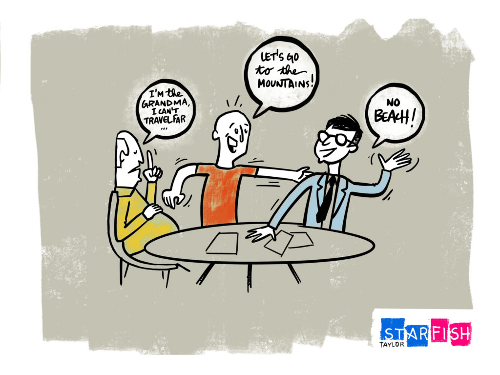
This Family Vacation icebreaker is all about compromise (similar to another one of our Secret Service icebreaker . When there are numerous people being held at bay and only one vessel to carry them all to their final destination – or “paradise” in the case of this icebreaker – we must learn how to extract their differing desires and balance them with their universal needs. Every group will be given a different family, comprised of various generations, needs, and personalities. Thus in a workshop of 30 people, we will have 6-8 different “families” that each team needs to find that perfect holiday for.
Imagine This is Your Family 35-year-old husband who likes to golf; A wife who enjoys fly fishing; Twin 7 year old daughters who are allergic to grass; A 75-year-old Mother-in-Law who refuses to fly and gets carsick!
In this example, you can see you are dealing with three different generations, one of whom is a stubborn or perhaps ultra fragile Mother-in-Law. The husband and wife enjoy land and sea. And all we know of their twin daughters is that they’re allergic to grass. We want you to break down the family, point out the differences, take note of any restrictions or specific preferences, then build the family back up using their common denominators…what compromises must be made? How can you appease the minimal amount of needs to gain the maximum amount of satisfaction?
Family Vacation Icebreaker Recipe
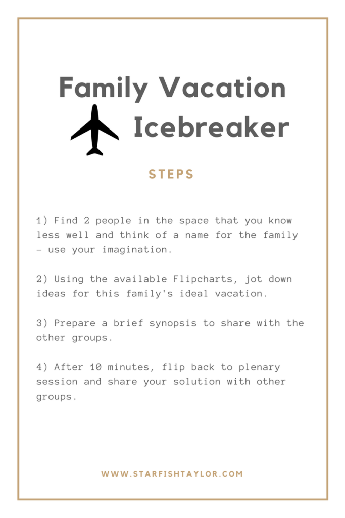
From Comprising Needs to Creating Ideals We’ve found that this is a great icebreaker to use in medium-sized workshops where compromise is the core reason to meet together, as teams tend to brew up some funny, out-of-the-box solutions to the [sometimes] demanding needs of contrasting generations. Some people extract inspiration from personal experiences, whereas others rely on their imagination. Nevertheless, everyone can relate to each other at some point…”been there, done that”, “I almost had that exact trip!”, “that combination sounds like a nightmare, but that’s a brilliant way of managing all of those elements”…and share some laughs, which ultimately sets the tone for the remainder of the workshop. Jovial energy and solid reference points. And if the reason you are holding the workshop is to juggle different business needs, such as building the MVP of your latest customer experience wonder, or merging two companies together, then this icebreaker also gets the group thinking about compromise!
Learn More About Our Tips, Tricks & Hacks If we’ve convinced you that icebreakers aren’t so bad after all, take a few minutes to read more about how they can truly transform your meetings from bold to brilliant . You can also learn more about our recipes for successful workshops and meetings by subscribing to our Tips, Tricks and Hacks newsletter here .
Post Views: 4,428