Rock Paper Scissors Icebreaker: Energizing the Masses - Starfish Taylor /*
You can add your own CSS here.
Click the help icon above to learn more.
*/
/*#header.text-dark {
background: rgba(255, 2 55, 255, 0.9);
}
#header .header-bg {
background: rgba(255, 255, 255, 0.9);
}*/
.so-widget-sow-post-carousel .sow-carousel-wrapper {
width: 100%;
}
.so-widget-sow-post-carousel .sow-carousel-container {
width: 100% !important;
max-width: 100% !important;
}
.so-widget-sow-post-carousel-default-971e41e9e54d .sow-carousel-wrapper ul.sow-carousel-items li.sow-carousel-item {
width: 255px;
margin: 0 10px;
box-shadow: 0 8px 18px 0 rgba(192, 192, 192, 0.5);
background: #fff;
border: 1px solid #ccc !important;
padding: 20px 10px;
min-height: 300px;
}
.sow-carousel-wrapper ul.sow-carousel-items li.sow-carousel-item h3 {
line-height: 30px !important;
}
.so-widget-sow-post-carousel-default-971e41e9e54d .sow-carousel-wrapper ul.sow-carousel-items li.sow-carousel-item .sow-carousel-thumbnail a, .so-widget-sow-post-carousel-default-971e41e9e54d .sow-carousel-wrapper ul.sow-carousel-items li.sow-carousel-item .sow-carousel-thumbnail a span.overlay {
width: auto !important;
}
.sow-carousel-wrapper ul.sow-carousel-items li.sow-carousel-item h3 a {
font-size: 22px;
}
.single-post .category-portfolio .five.columns {
display: none;
}
.single-post .category-portfolio .row .eleven {
width: 100%;
/* text-align: center; */
}
.single-post .category-portfolio .feature-img.page-banner {
display: none !important;
}
.single-post .category-portfolio .panel-grid .port-had h1.sow-headline {
color: #000!important;
}
.tag-graphic-facilitation .gfield input, .tag-graphic-facilitator .gfield input {
width: 100% !important;
}
.single-post .category-portfolio .panel-grid h2.sow-headline, .single-post .category-portfolio .panel-grid h1.sow-headline {
color: #000!important;
}
.single-post .category-graphics .panel-grid h2.sow-headline{color: #d11d5b !important;}
@font-face {
font-family: 'Lato';
font-display: auto;
}
/*body { color: #383838 !important; font-family: 'Lato'; font-size: 1em; font-style: normal; font-stretch: normal; font-weight: 400 !important; letter-spacing: 0.2px; line-height: 1.38 !important;}*/
ol li { border-top: none !important; border-bottom: none !important; text-align: left; font-family: Lato; font-size: 18px !important; font-weight: normal; font-style: normal; font-stretch: normal;
line-height: 1.38; letter-spacing: 0.2px; color: #383838; }
h4 { color:#ff037c;}
h4 a { color:#c5114f !important;;}
h4 a:hover { color:#273d98 !important;;}
h2 { margin:0px 0px;}
p { color: #383838 !important; font-family: 'Lato'; font-size: 18px !important; font-style: normal; font-stretch: normal; font-weight: 400 !important; letter-spacing: 0.2px; line-height: 1.38 !important; text-align: left;}
.full-width h1.headline {
display:none !important;
}
.headline.img-headline { text-transform:uppercase;}
/*.full-width.post-area.full-width {
max-width:1168px;
}*/
.hm-sub-heading { font-size: 20px; font-family: 'Lato'; font-style: normal; font-stretch: normal; font-weight: 400 !important; line-height: 1.6; letter-spacing: 0.3px; color: #616161; text-align: left;}
.bar-heading { color: #d11d5b; text-align: center; font-family: DroidSerif; font-size: 28px; font-weight: bold; font-style: normal; font-stretch: normal; line-height: 0.93; letter-spacing: 0.31px; text-align: center; }
.bar-sub-heading { text-align: center; font-size: 20px; color: #383838 !important; font-family: 'Lato'; font-weight: normal; font-style: normal; font-stretch: normal; line-height: 1.6 !important; letter-spacing: 0.3px; }
table {font-family: open sans,Arial,Helvetica,sans-serif;}
table td { border: 1px solid #e4e4e4; text-align: center;}
.slideshow .headline { padding-bottom:0px !important; margin:0 auto !important; font-size: 4.6em; padding-top:12%;}
.slideshow .information { margin-top: 10px !important; }
li#post-1911 div.excerpt h2 { letter-spacing: -2px; padding-top: 30px; padding-bottom: 30px;}
/*.container a:hover, .container a:focus, .container a:active, .footer-widgets a:hover, footer-widgets a:focus, footer-widgets a:active, #wrap .widget ul.menu li a:hover, #wrap .widget ul.menu li ul.sub-menu li a:hover, #wrap .widget ul.menu .current_page_item a, #wrap .widget ul.menu .current-menu-item a {
color: #d01d5b !important;
}*/
.container a, .container a:link, .container a:visited, .footer-widgets a, .footer-widgets a:link, .footer-widgets a:visited, #wrap .widget ul.menu li a {
color: #273d98;
}
/*#wrap .menu li li a:focus, #wrap .menu li li a:hover, #wrap .menu li li a:active {
color: #ffffff !important;
background-color:#D31C5C !important;
}
#wrap .menu li li a, #wrap .menu li li a:link, #wrap .menu li li a:hover {
color: #fff !important;
}*/
#wrap .menu li li a {
color: #333 !important; /*Sumenu link color stands here*/
}
#wrap .menu li li a:hover, #wrap .menu li li a:active {
color: #fff !important; /*Sumenu link color stands here*/
background-color:#D31C5C !important;
}
#pg-4-3 > .panel-row-style { padding: 5% 5% 5% 5%; }
/*#wrap .menu li li a:focus, #wrap .menu li li a:hover, #wrap .menu li li a:active {
color: #333333 !important;
}*/
#pl-4 .so-panel { margin-bottom: 0px; }
#pl-2327 .so-panel { margin-bottom: 0px; }
/* max-width changed from 960 to 1168 by Peter 20/Mar */
/*a.feature-img.radius-top {
padding-top: 18px;
}*/
.cl-flipbox-front {
padding:15px !important;
height:auto !important;
}
div.cl-flipbox-back-h a span {
font-size: 12px;
}
div.flexslider, div.loading {
background:rgba(38, 60, 152, .8) !important;
}
h4.cl-flipbox-front-title {
margin:0px !important;
font-size: 1.2em;
}
div#masthead p.site-title {
display:none !important;
}
div#pg-4-8 p, div#pg-17-3 p, div#pg-19-2 p {
line-height:18px !important;
}
div#pg-4-10 textarea {
height:100px !important;
}
div.cl-popup-box-content div.panel-grid-cell {
width: calc(33.3333% - ( 0.66666666666667 * 10px ) );
}
div#page-21 li.category-portfolio {
border-top:none !important;
border-bottom:none !important;
}
div#pl-4 .widget li, div#pl-4 .widget li:last-child {
border-bottom:none !important;
}
div#page-21 a.feature-img {
padding-top:none !important;
}
div#page-21 div.sd-content li {
border-top:none !important;
}
div.panel-widget-style-for-21-0-0-0 {
/*margin-top:100px !important;*/
margin-top:0 auto !important;
}
.contact-form input[type=submit] {
-ms-box-sizing: border-box;
-moz-box-sizing: border-box;
-webkit-box-sizing: border-box;
box-sizing: border-box;
font-size: 1em;
padding: 1em 2em;
background: #d21c5c;
background: -webkit-gradient(linear, left bottom, left top, color-stop(0, #a51648), color-stop(1, #d21c5c));
background: -ms-linear-gradient(bottom, #a51648, #d21c5c);
background: -moz-linear-gradient(center bottom, #a51648 0%, #d21c5c 100%);
background: -o-linear-gradient(#d21c5c, #a51648);
filter: progid:DXImageTransform.Microsoft.gradient(startColorstr='#d21c5c', endColorstr='#a51648', GradientType=0);
border: 1px solid;
border-color: #971442 #8e133e #811139 #8e133e;
color: #ffffff !important;
-webkit-border-radius: 0.25em;
-moz-border-radius: 0.25em;
border-radius: 0.25em;
-webkit-box-shadow: inset 0 1px 0 rgba(255,255,255,0.2), 0 1px 2px rgba(0,0,0,0.065);
-moz-box-shadow: inset 0 1px 0 rgba(255,255,255,0.2), 0 1px 2px rgba(0,0,0,0.065);
box-shadow: inset 0 1px 0 rgba(255,255,255,0.2), 0 1px 2px rgba(0,0,0,0.065);
text-shadow: 0 1px 0 rgba(0, 0, 0, 0.05);
}
.pushbutton-wide{ width:50% !important; margin:0 auto;}
ul.slides a.more-link {
-ms-box-sizing: border-box;
-moz-box-sizing: border-box;
-webkit-box-sizing: border-box;
box-sizing: border-box;
font-size: 1em;
display:inline-block;
margin:0 auto;
/*padding: 1em 2em 1em 2em;*/
/*background: #ff9900;*/
background: #ff9b08;
background: -webkit-gradient(linear,left bottom,left top,color-stop(0,#d47e00),color-stop(1,#ff9b08));
background: -ms-linear-gradient(bottom,#d47e00,#ff9b08);
background: -moz-linear-gradient(center bottom,#d47e00 0%,#ff9b08 100%);
background: -o-linear-gradient(#ff9b08,#d47e00);
/*filter: progid:DXImageTransform.Microsoft.gradient(startColorstr='#ff9900', endColorstr='#cc7a00', GradientType=0);*/
filter: progid:DXImageTransform.Microsoft.gradient(startColorstr='#ff9b08',endColorstr='#d47e00',GradientType=0);
border: 1px solid;
border-top-color: currentcolor;
border-right-color: currentcolor;
border-bottom-color: currentcolor;
border-left-color: currentcolor;
/*border-color: #bd7100 #b36b00 #a36200 #b36b00;*/
border-color: #c57500 #ba6f00 #ab6600 #ba6f00;
color: #ffffff !important;
text-align:center;
font-family: open sans,Arial,Helvetica,sans-serif;
font-weight: 400;
line-height: 1.9;
text-decoration: none !important;
-webkit-border-radius: .25em;
-moz-border-radius: .25em;
border-radius: .25em;
-webkit-box-shadow: inset 0 1px 0 rgba(255,255,255,.2),0 1px 2px rgba(0,0,0,.065);
-moz-box-shadow: inset 0 1px 0 rgba(255,255,255,.2),0 1px 2px rgba(0,0,0,.065);
box-shadow: inset 0 1px 0 rgba(255,255,255,.2),0 1px 2px rgba(0,0,0,.065);
text-shadow: 0 1px 0 rgba(0,0,0,.05);
height:42px;
/*padding-top:10px;*/
}
ul.slides a.more-link:hover { color:#343434 !important; text-decoration: none !important;
background: #ff9f12;
background: -webkit-gradient(linear,left bottom,left top,color-stop(0,#de8400),color-stop(1,#ff9f12));
background: -ms-linear-gradient(bottom,#de8400,#ff9f12);
background: -moz-linear-gradient(center bottom,#de8400 0%,#ff9f12 100%);
background: -o-linear-gradient(#ff9f12,#de8400);
filter: progid:DXImageTransform.Microsoft.gradient(startColorstr='#ff9f12',endColorstr='#de8400',GradientType=0);
border-color: #cf7b00 #c57500 #b56c00 #c57500;
}
.so-widget-sow-button-atom-a77237adc0a1 .ow-button-base a:hover {
color: #343434 !important; text-decoration: none !important;
}
.so-widget-sow-button-atom-a77237adc0a1 .ow-button-base a.ow-button-hover:hover {
background: #ff9f12;
background: -webkit-gradient(linear,left bottom,left top,color-stop(0,#de8400),color-stop(1,#ff9f12));
background: -ms-linear-gradient(bottom,#de8400,#ff9f12);
background: -moz-linear-gradient(center bottom,#de8400 0%,#ff9f12 100%);
background: -o-linear-gradient(#ff9f12,#de8400);
filter: progid:DXImageTransform.Microsoft.gradient(startColorstr='#ff9f12',endColorstr='#de8400',GradientType=0);
border-color: #cf7b00 #c57500 #b56c00 #c57500;
color:#343434 !important; text-decoration: none !important;
}
.text-white p {
text-shadow: 0 1px 0 rgba(0, 0, 0, 0.05);
color: rgba(255,255,255,1) !important;
}
.textwidget .contact-form input[type=email], .textwidget .contact-form input[type=text], .textwidget .contact-form input[type=url], .textwidget .contact-form textarea, .contact-form input[type=submit] {
width:100%;
}
body.home .post-area.wide {
padding-top:0px;
}
div#pl-746 h3.widget-title {
font-size:1.1em;
font-weight:bold;
}
body.blog h1.img-headline {
top:65% !important;
}
/*h1.sow-headline, div.page-banner h1.img-headline {
font-size:2.2em;
overflow: hidden;
text-overflow: ellipsis;
height: 1.5em;
}*/
div#pl-28 {
/*margin-top: -45px;*/
}
div.sharedaddy {
margin-top: 20px;
}
.widget li, .widget li:last-child {
border-top:none !important;
border-bottom:none !important;
}
a.feature-img.page-banner::before {
background-color:rgba(0, 0, 0, 0) !important;
}
/*
You can add your own CSS here.
Click the help icon above to learn more.
*/
.full-width h1.headline {
display:none !important;
}
.full-width.post-area.full-width {
max-width:1168px;
/* max-width changed from 960 to 1168 by Peter 20/Mar */
}
/*a.feature-img.radius-top {
padding-top: 18px;
}*/
.cl-flipbox-front {
padding:15px !important;
height:auto !important;
}
div.cl-flipbox-back-h a span {
font-size: 12px;
}
div.flexslider, div.loading {
background:rgba(38, 60, 152, .8) !important;
}
h4.cl-flipbox-front-title {
margin:0px !important;
font-size: 1.2em;
}
div#masthead p.site-title {
display:none !important;
}
div#pg-4-8 p, div#pg-17-3 p, div#pg-19-2 p {
line-height:18px !important;
}
div#pg-4-10 textarea {
height:100px !important;
}
div.cl-popup-box-content div.panel-grid-cell {
width: calc(33.3333% - ( 0.66666666666667 * 10px ) );
}
div#page-21 li.category-portfolio {
border-top:none !important;
border-bottom:none !important;
}
div#pl-4 .widget li, div#pl-4 .widget li:last-child {
border-bottom:none !important;
}
div#page-21 a.feature-img {
padding-top:none !important;
}
div#page-21 div.sd-content li {
border-top:none !important;
}
div.panel-widget-style-for-21-0-0-0 {
/*margin-top:100px !important;*/
margin-top:0 auto !important;
}
div.sow-cta-wrapper div.so-widget-sow-button-flat-e72a51798a2b {
width:100%;
}
.contact-form input[type=submit] {
-ms-box-sizing: border-box;
-moz-box-sizing: border-box;
-webkit-box-sizing: border-box;
box-sizing: border-box;
font-size: 1em;
padding: 1em 2em;
background: #d21c5c;
background: -webkit-gradient(linear, left bottom, left top, color-stop(0, #a51648), color-stop(1, #d21c5c));
background: -ms-linear-gradient(bottom, #a51648, #d21c5c);
background: -moz-linear-gradient(center bottom, #a51648 0%, #d21c5c 100%);
background: -o-linear-gradient(#d21c5c, #a51648);
filter: progid:DXImageTransform.Microsoft.gradient(startColorstr='#d21c5c', endColorstr='#a51648', GradientType=0);
border: 1px solid;
border-color: #971442 #8e133e #811139 #8e133e;
color: #ffffff !important;
-webkit-border-radius: 0.25em;
-moz-border-radius: 0.25em;
border-radius: 0.25em;
-webkit-box-shadow: inset 0 1px 0 rgba(255,255,255,0.2), 0 1px 2px rgba(0,0,0,0.065);
-moz-box-shadow: inset 0 1px 0 rgba(255,255,255,0.2), 0 1px 2px rgba(0,0,0,0.065);
box-shadow: inset 0 1px 0 rgba(255,255,255,0.2), 0 1px 2px rgba(0,0,0,0.065);
text-shadow: 0 1px 0 rgba(0, 0, 0, 0.05);
}
.text-white p {
text-shadow: 0 1px 0 rgba(0, 0, 0, 0.05);
color: rgba(255,255,255,1) !important;
}
.textwidget .contact-form input[type=email], .textwidget .contact-form input[type=text], .textwidget .contact-form input[type=url], .textwidget .contact-form textarea, .contact-form input[type=submit] {
width:100%;
}
body.home .post-area.wide {
padding-top:0px;
}
div#pl-746 h3.widget-title {
font-size:1.1em;
font-weight:bold;
}
body.blog h1.img-headline {
top:65% !important;
}
div.sharedaddy {
margin-top: 20px; margin-left:48px;
}
/*.siteorigin-widget-tinymce ul li { list-style-type: square !important; }
.textwidget ul li { list-style-type: square !important;}*/
.widget li { display:list-item; list-style: inherit; margin: 6px 15px 0;}
.widget ul, .widget li { list-style-type: disc; }
/*.widget ul, .widget li { list-style-type: circle !important; padding-left:20px; }*/
#panel-2327-2-1-2 ul li { list-style-type:none; list-style-image: url('https://www.starfishtaylor.com/wp-content/uploads/2018/04/ok-sign-png.png'); }
#panel-2327-4-1-3 ol li { list-style-type:number !important;}
#panel-2327-12-1-0 ol li { list-style-type:number !important;}
/*.widget li, .widget li:last-child { border-top:none !important; border-bottom:none !important; text-align: left; font-family: Lato; font-size: 16px; font-weight: normal; font-style: normal; font-stretch: normal; line-height: 1.38; letter-spacing: 0.2px; color: #383838; }*/
a.feature-img.page-banner h2 {
text-shadow:2px 2px 15px rgba(0, 0, 0, 0.8) !important;
}
div#page-318 div.feature-img.page-banner h1 {
display: none;
}
div#page-318 div.feature-img.page-banner::before {
background-color:rgba(0, 0, 0, 0) !important;
}
li#post-1911 div.excerpt h2{
letter-spacing:-2px;
padding-top:30px;
font-size:30px;
}
li#post-1911 div.excerpt h4{
font-size:18px;
}
div.feature-img.page-banner h1 {
font-size:3em;
padding-top:50px;
}
/* ----------- iPhone 4 and 4S ----------- */
/* Portrait and Landscape */
@media only screen
and (min-device-width: 320px)
and (max-device-width: 480px)
and (-webkit-min-device-pixel-ratio: 2) {
.headline.img-headline { font-size:45px !important;}
}
/* Portrait */
@media only screen
and (min-device-width: 320px)
and (max-device-width: 480px)
and (-webkit-min-device-pixel-ratio: 2)
and (orientation: portrait) {
.headline.img-headline { font-size:45px !important;}
}
/* Landscape */
@media only screen
and (min-device-width: 320px)
and (max-device-width: 480px)
and (-webkit-min-device-pixel-ratio: 2)
and (orientation: landscape) {
.headline.img-headline { font-size:45px !important;}
}
/* ----------- iPhone 5, 5S, 5C and 5SE ----------- */
/* Portrait and Landscape */
@media only screen
and (min-device-width: 320px)
and (max-device-width: 568px)
and (-webkit-min-device-pixel-ratio: 2) {
.headline.img-headline { font-size:45px !important;}
}
/* Portrait */
@media only screen
and (min-device-width: 320px)
and (max-device-width: 568px)
and (-webkit-min-device-pixel-ratio: 2)
and (orientation: portrait) {
.headline.img-headline { font-size:45px !important;}
}
/* Landscape */
@media only screen
and (min-device-width: 320px)
and (max-device-width: 568px)
and (-webkit-min-device-pixel-ratio: 2)
and (orientation: landscape) {
.headline.img-headline { font-size:45px !important;}
}
/* ----------- iPhone 6, 6S, 7 and 8 ----------- */
/* Portrait and Landscape */
@media only screen
and (min-device-width: 375px)
and (max-device-width: 667px)
and (-webkit-min-device-pixel-ratio: 2) {
.headline.img-headline { font-size:45px !important;}
}
/* Portrait */
@media only screen
and (min-device-width: 375px)
and (max-device-width: 667px)
and (-webkit-min-device-pixel-ratio: 2)
and (orientation: portrait) {
.headline.img-headline { font-size:45px !important;}
}
/* Landscape */
@media only screen
and (min-device-width: 375px)
and (max-device-width: 667px)
and (-webkit-min-device-pixel-ratio: 2)
and (orientation: landscape) {
.headline.img-headline { font-size:45px !important;}
}
/* ----------- iPhone 6+, 7+ and 8+ ----------- */
/* Portrait and Landscape */
@media only screen
and (min-device-width: 414px)
and (max-device-width: 736px)
and (-webkit-min-device-pixel-ratio: 3) {
.headline.img-headline { font-size:45px !important;}
}
/* Portrait */
@media only screen
and (min-device-width: 414px)
and (max-device-width: 736px)
and (-webkit-min-device-pixel-ratio: 3)
and (orientation: portrait) {
.headline.img-headline { font-size:45px !important;}
}
/* Landscape */
@media only screen
and (min-device-width: 414px)
and (max-device-width: 736px)
and (-webkit-min-device-pixel-ratio: 3)
and (orientation: landscape) {
.headline.img-headline { font-size:45px !important;}
}
/* ----------- iPhone X ----------- */
/* Portrait and Landscape */
@media only screen
and (min-device-width: 375px)
and (max-device-width: 812px)
and (-webkit-min-device-pixel-ratio: 3) {
.headline.img-headline { font-size:45px !important;}
}
/* Portrait */
@media only screen
and (min-device-width: 375px)
and (max-device-width: 812px)
and (-webkit-min-device-pixel-ratio: 3)
and (orientation: portrait) {
.headline.img-headline { font-size:45px !important;}
}
/* Landscape */
@media only screen
and (min-device-width: 375px)
and (max-device-width: 812px)
and (-webkit-min-device-pixel-ratio: 3)
and (orientation: landscape) {
.headline.img-headline { font-size:45px !important;}
}
@media handheld, only screen and (max-width: 319px) {
.home-slider .slideshow .slides li, .home-slider .slideshow .loading {
min-height: 400px;
}
.slideshow .headline { font-size: 3.4em;}
}
@media handheld, only screen and (max-width: 479px) {
.home-slider .slideshow .slides li, .home-slider .slideshow .loading {
min-height: 400px;
}
.slideshow .headline { font-size: 3.4em;}
}
@media handheld, only screen and (max-width: 767px) {
.home-slider .slideshow .content { padding:0;}
#header .header-bg {
background:rgba(255,255,255,0) !important;
}
p.site-title {
display:none;
}
span.header-bg {
display:none !important;
}
#pg-4-3 > .panel-row-style { padding: 10% 5% 10% 5%; }
}
@media handheld, only screen and (max-width: 1024px) {
li#post-1911 div.excerpt {
display: block !important;
}
li#post-1911 h2.headline {
font-size:36px;
padding-top:30px;
}
ul.slides a.more-link {
/* display:block;
width:30%;
left:35%;
right:35%;
padding:10px 10px 10px 10px;*/
margin: 0;
}
li#post-1911 div.excerpt h2{
display:block !important;
letter-spacing:-1px;
padding-top:30px;
font-size:20px;
}
li#post-1911 div.excerpt h4{
font-size:14px;
}
div#panel-4-0-0-0 h2 {
font-size:30px;
}
#pg-4-3 > .panel-row-style { padding: 10% 5% 10% 5%; }
}
@media handheld, only screen and (max-width: 766px) {
li#post-1911 div.excerpt {
display: block !important;
}
li#post-1911 h2.headline {
font-size:28px;
padding-top:30px;
}
ul.slides a.more-link {
/*display:block;
width:30%;
left:35%;
right:35%;
padding:10px 10px 10px 10px;*/
margin:0;
}
li#post-1911 div.excerpt h2{
display:block !important;
letter-spacing:-1px;
padding-top:30px;
font-size:15px;
}
li#post-1911 div.excerpt h4{
font-size:10px;
}
div#panel-4-0-0-0 h2 {
font-size:26px;
}
#pg-4-3 > .panel-row-style { padding: 10% 5% 10% 5%; }
}
@media handheld, only screen and (max-width: 640px) {
li#post-1911 div.excerpt {
display: block !important;
}
li#post-1911 h2.headline {
font-size:16px;
padding-top:20px;
}
ul.slides a.more-link {
/*display:block;
width:70%;
left:15%;
font-size:14px;*/
margin:0;
}
li#post-1911 div.excerpt h2{
display:block !important;
letter-spacing:0px;
padding-top:25px;
padding-bottom:10px;
margin-bottom:0px;
font-size:12px;
}
li#post-1911 div.excerpt h4{
font-size:10px;
}
div#panel-4-0-0-0 h2 {
font-size:22px;
}
#pg-4-3 > .panel-row-style { padding: 10% 5% 10% 5%; }
}
.Mask { /* width: 457px; height: 257px;*/ object-fit: contain; border-radius: 2px; background-color: #ffffff; box-shadow: 0 8px 18px 0 rgba(192, 192, 192, 0.5); }
.shape-ok { list-style-type:none; list-style-image: url('https://www.starfishtaylor.com/wp-content/uploads/2018/06/shape-ok.png'); font-family: Lato; font-size: 20px; font-weight: 600; font-stretch: normal; font-style: normal; line-height: 1.6; letter-spacing: 0.3px; }
/*.menu-footer-menu-container { width:100%;}
.footer-menu { width: 100%; overflow: hidden;}
#menu-footer-menu .footer-menu ul { border-bottom:2px #eeeeee; }
#menu-footer-menu .footer-menu ul li { border-bottom:2px #cccccc; }
#menu-footer-menu .footer-menu ul li a { color:#d11d5b; }
#menu-footer-menu .footer-menu ul li a:hover { color:#273d98; }*/
/*.menu-footer-menu-container .footer-menu ul { color:#383838; text-align:center; display:inline !important;}
#menu-footer-menu ul li { float: left;}
.footer-menu ul li a { color:#d11d5b;}
.footer-menu ul li a:hover{ color:#273d98;}*/
.abt { float:left; width:16%; text-align:left; }
.abt a { padding: 8px 0 8px 0; margin-top:7px; display:block; width:100%; text-decoration:none; }
.abt a:hover { color:#d11d5b; }
.servi { float:left; width:19%; text-align:left; }
.servi a { padding: 8px 0 8px 0; margin-top:7px; display:block; width:100%; text-decoration:none; }
.servi a:hover { color:#d11d5b; }
.portfoli { float:left; width:14%; text-align:left; }
.portfoli a { padding: 8px 0 8px 0; margin-top:7px; display:block; width:100%; text-decoration:none;}
.portfoli a:hover { color:#d11d5b; }
.blogres { float:left; width:19%; text-align:left; }
.blogres a { padding: 8px 0 8px 0; margin-top:7px; display:block; width:100%; text-decoration:none;}
.blogres a:hover { color:#d11d5b; }
.contac { float:left; width:15%; text-align:left; }
.contac a { padding: 8px 0 8px 0; margin-top:7px; display:block; width:100%; text-decoration:none;}
.contac a:hover { color:#d11d5b; }
.socialio { float:left; width:17%; text-align:left; }
.socialio a { padding:2px; margin-top:7px; display:block; }
.socialio a:hover { color:#d11d5b; }
.lio-ico { float:left; width:100%; text-align:left; }
.lio-ico a { padding: 0px 24px 2px 0; margin-top:7px; display:inline; }
.lio-ico a:hover { color:#d11d5b; }
#facebook { left: 0px; width: 24px; background: url('https://www.starfishtaylor.com/wp-content/uploads/2020/02/social-sprites.png') 0 0; background-repeat: no-repeat; }
#twitter { left: 24px; width: 24px; background: url('https://www.starfishtaylor.com/wp-content/uploads/2020/02/social-sprites.png') -24px 0; background-repeat: no-repeat; }
#linkedin { left: 48px; width: 24px; background: url('https://www.starfishtaylor.com/wp-content/uploads/2020/02/social-sprites.png') -48px 0; background-repeat: no-repeat; }
#instagram { left: 72px; width: 24px; background: url('https://www.starfishtaylor.com/wp-content/uploads/2020/02/social-sprites.png') -72px 0; background-repeat: no-repeat; }
#youtube { left: 96px; width: 24px; background: url('https://www.starfishtaylor.com/wp-content/uploads/2020/02/social-sprites.png') -96px 0; background-repeat: no-repeat; }
.footer-information {
padding: 48px 70px;
}
/*.social-nav { width:100%;}
.social-nav, ul {text-align:center;}
.social-nav, ul li { float:left;}
.social-nav, ul li a { color:#d11d5b;}
.social-nav, ul li a:hover { color:#273d98;}*/
/*.social-nav { width:100%;}
.social-nav, .facebook { background: url("https://www.starfishtaylor.com/wp-content/uploads/2018/06/facebook-mn.png") no-repeat fixed center;}
.social-nav, .facebook a:hover { background: url("https://www.starfishtaylor.com/wp-content/uploads/2018/06/facebook-hv.png") no-repeat fixed center;}
.social-nav, .twitter { background: url("https://www.starfishtaylor.com/wp-content/uploads/2018/06/twitter-mn.png") no-repeat fixed center;}
.social-nav, .twitter a:hover { background: url("https://www.starfishtaylor.com/wp-content/uploads/2018/06/twitter-hv.png") no-repeat fixed center;}
.social-nav, .linkedin { background: url("https://www.starfishtaylor.com/wp-content/uploads/2018/06/linkedin-mn.png") no-repeat fixed center;}
.social-nav, .linkedin a:hover { background: url("https://www.starfishtaylor.com/wp-content/uploads/2018/06/linkedin-hv.png") no-repeat fixed center;}
.social-nav, .instagram { background: url("https://www.starfishtaylor.com/wp-content/uploads/2018/06/instagram-mn.png") no-repeat fixed center;}
.social-nav, .instagram a:hover { background: url("https://www.starfishtaylor.com/wp-content/uploads/2018/06/instagram-hv.png") no-repeat fixed center;}
.social-nav, .youtube { background: url("https://www.starfishtaylor.com/wp-content/uploads/2018/06/youtube-mn.png") no-repeat fixed center;}
.social-nav, .youtube a:hover { background: url("https://www.starfishtaylor.com/wp-content/uploads/2018/06/youtube-hv.png") no-repeat fixed center;}*/
.fa { padding: 5px; font-size: 20px; width: 20px; text-align: center; text-decoration: none; margin: 5px 2px; border-radius: 50%; }
.fa:hover { opacity: 0.7; background:#d11d5b; }
.fa-facebook { background: #575757; color: white; }
.fa-twitter { background: #575757; color: white; }
.fa-twitter::before { content: "\f099"; }
.fa-linkedin { background: #575757; color: white; }
.fa-instagram { background: #575757; color: white; }
.fa-youtube { background: #575757; color: white; }
/*#header.header-large #logo-title { padding-left: 10%; }*/
/*#header.header-large { background: rgba(255, 255, 255, 0.9); }*/
#navigation { text-transform:none; font-family: Lato; font-size: 16px; font-weight: bold; font-style: normal; font-stretch: normal; line-height: normal; letter-spacing: 0.5px; color: #575757; margin-right: 5%; }
.menu a { line-height: normal; letter-spacing: 0.5px; }
.menu ul ul, ul.menu ul { width: 250px; }
#header.text-dark { border-bottom: none; z-index: 1000; }
#header #logo { /*margin-left: 18%;*/ margin-left: 6%;}
#header #logo-title { padding-left: 0px;}
.fl-node-5b1121c1a9f3d .fl-row-content { max-width: 1464px; }
#header.text-dark .menu a:hover,
#header.text-dark .menu a:active,
#header.text-dark .menu a:focus { color:#d11d5b;}
/*.content { max-width: 1920px; padding: 0; }*/
/*.no-thumb { padding-top: 160px !important; }
.full-width.post-area.full-width { max-width: 1168px; }*/
.ttgroup { width:100%; height:auto;}
.ttgroupa { width: 47%; height:auto; min-height:485px; background-color: #ffffff; box-shadow: 0 8px 18px 0 rgba(192, 192, 192, 0.5); margin: 14px 14px; padding: 25px; float: left;}
.ttgroupb { width: 47%; height: auto; min-height:485px; background-color: #ffffff; box-shadow: 0 8px 18px 0 rgba(192, 192, 192, 0.5); margin: 14px 14px; padding: 25px; float: right;}
.tggroup { width:100%; height:auto;}
.tggroupa { width: 457px; height:auto; min-height:485px; background-color: #ffffff; box-shadow: 0 8px 18px 0 rgba(192, 192, 192, 0.5); margin: 14px 14px; padding: 25px; float: left;}
.tggroupb { width: 457px; height: auto; min-height:485px; background-color: #ffffff; box-shadow: 0 8px 18px 0 rgba(192, 192, 192, 0.5); margin: 14px 14px; padding: 25px; float: right;}
.cprt { padding-top:27px; padding-bottom:27px; color:#616161; font-family: Lato; font-size:14px; font-style:normal; font-weight:normal; font-stretch:normal; letter-spacing:0.2px; background-color:#f8f8f8;text-align:center;padding:10px;margin-top:7px;}
form input[type="url"], form input[type="tel"], form input[type="email"], form input[type="text"], form input[type="password"], form input[type="number"] {
width: 100%;
}
.container .gform_wrapper input.button { display: inline-block; background: #d11d5b; position: relative; color: #ffffff; color: rgba(255, 255, 255, 255) !important; font-family: Lato; font-size: 18px; font-weight: bold; font-style: normal; font-stretch: normal; line-height: normal; letter-spacing: 0.3px; text-align: center; text-transform: none; border: 1px solid #c5114f; -webkit-border-radius: 4px; width: 100% !important; }
.container .gform_wrapper input.button:hover { color: #fff !important; text-decoration: none; border: 1px solid #273d98; cursor: pointer; -webkit-appearance: none; background: #273d98; }
select { color: rgba(0, 0, 0, 0.5); width: 100%; }
a.more-link { background:#d11d5b; color: #ffffff !important; font-family: Lato; font-size: 16px; font-weight: normal; font-style: normal; font-stretch: normal; border-radius: 4px; border: 2px solid #d11d5b; text-transform:none; }
.more-link:hover { background:#273d98; color: #ffffff !important; text-decoration: none; border: 2px solid #273d98; }
#searchsubmit { background:#d11d5b; color: #ffffff !important; border: 2px solid #d11d5b; font-family: Lato; font-size: 16px; font-weight: normal; font-style: normal; font-stretch: normal; line-height: 1.8; text-transform: none; border-radius: 4px;}
#searchsubmit:hover { background:#273d98; color: #ffffff !important; text-decoration: none; border: 2px solid #273d98;}
#searchform #s { border: 2px solid #d11d5b; border-radius: 4px;}
.so-widget-sow-button-flat-f8f94d1dab85 .ow-button-base a.ow-button-hover:hover { background: #273d98; text-decoration:none; }
.ow-button-base a { box-sizing: border-box; font-size: 1em; padding: 1em 2em; background: #d11d5b; color: #fff !important; border: 1px solid #d11d5b; border-width: 1px 0; border-radius: .25em; text-shadow: 0 1px 0 rgba(0,0,0,.05); }
.ow-button-base a.ow-button-hover:hover { color: #fff; background:#273d98 !important ; text-decoration:none; }
/*.so-widget-sow-button-flat-bb83e0871698 .ow-button-base a.ow-button-hover:hover {
background: #e02264;
border-bottom-color: #cd1c59;
color: #fff;
}*/
.no-thumb { padding-top: 60px !important; }
.gform_wrapper .top_label input.medium { width: calc(100% - 8px);}
.gform_wrapper .top_label select.medium { width: calc(100% - 8px);}
.sow-cta-base .sow-cta-text .sow-cta-subtitle { text-transform: none; }
.cl-counter { color:#d11d5b; text-align: center; }
.cl-counter-value { font-size: 30px !important; }
.cl-counter-title { font-size: 14px !important; color:#383838; }
h6 { font-family: Lato; font-size: 20px; text-align:center; font-weight: normal; font-style: normal; font-stretch: normal; line-height: 1.6; letter-spacing: 0.3px; color: #616161;}
.sidebar h6, .footer h6 { text-align:left; }
.role { font-family: Lato; font-size: 16px; text-align:center; font-weight: normal !important; font-style: normal !important; font-stretch: normal; line-height: normal !important; letter-spacing: 0.2px; color: #d11d5b !important; }
.role-des { font-family: Lato; font-size: 16px; font-weight: normal; font-style: normal; font-stretch: normal; line-height: 1.38; letter-spacing: 0.2px; color: #616161; text-align:center; }
/*.fl-node-5b2288b13550a { width: 98%; }*/
.article > p:first-child { font-size: 16px !important; }
@media only screen and (max-width:620px) {
/* For mobile phones: */
.abt, .servi, .portfoli, .blogres, .contac, .socialio, .lio-ico {
width:100%; text-align:center;
}
.ttgroupa { width: 100%; text-align:center; box-shadow: none; margin: 0 auto; padding: 10px;}
.ttgroupb { width: 100%; text-align:center; box-shadow: none; margin: 0 auto; padding: 10px;}
}
@media only screen
and (min-device-width: 320px)
and (max-device-width: 480px)
and (-webkit-min-device-pixel-ratio: 2) {
.column-oa { width:100%; height:auto; margin-bottom:20px; float: left !important; }
.column-ob { width:100%; height:auto; margin-top: 30px; float: left !important;}
.column-obc { width:100%; height:40px; float: left !important;}
.column-oc { width:100%; height:auto; float: left !important;}
.row-ohb { padding: 0px 27px 27px 27px; }
.column-od { width:100%; height:auto; margin-top: 30px; float: left !important;}
.more-info { width: 165px !important; margin: 20px auto !important;}
.learn-more-2 { float:none; text-align: center; }
.tggroupa { width: 75%; height: auto; }
.tggroupb { width: 75%; height: auto; }
wlw-form .gform_body { width: 100%; }
.wlw-form .gform_footer { width: 100%; }
.hero-pop-txt { width: 230px; height: auto;}
}
@media only screen
and (min-device-width: 768px)
and (max-device-width: 1024px)
and (-webkit-min-device-pixel-ratio: 1) {
.column-oa { width:100%; height:auto; margin-bottom:20px; float: left !important; }
.column-ob { width:100%; height:auto; margin-top: 30px; float: left !important;}
.column-obc { width:100%; height:40px; float: left !important;}
.column-oc { width:100%; height:auto; float: left !important;}
.row-ohb { padding: 0px 27px 27px 27px; }
.column-od { width:100%; height:auto; margin-top: 30px; float: left !important;}
.more-info { width: 165px !important; margin: 20px auto !important;}
.learn-more-2 { float:none; text-align: center; }
.tggroupa { width: 75%; height: auto; }
.tggroupb { width: 75%; height: auto; float:left; }
wlw-form .gform_body { width: 100%; }
.wlw-form .gform_footer { width: 100%; }
}
.wp-block-button__link { -webkit-border-radius: 4px; }
.wp-block-button__link:hover{ text-decoration:none; background-color: #273d98 !important;}
#pgc-2327-14-1 {background-color: #d11d5b; padding: 3% 0% 3% 0%;}
.excerpt { width: 360px; border-radius: 2px; background-color: #ffffff; object-fit: contain; box-shadow: 0 8px 18px 0 rgba(192, 192, 192, 0.5);}
/*.excerpt, .title { font-family: Lato; font-size: 26px; font-weight: 600; font-style: normal; font-stretch: normal; line-height: 1.54; letter-spacing: 0.4px; color: #383838; }*/
/*.excerpt, .title, p { color: #383838 !important; font-family: 'Lato'; font-size: 1em; font-style: normal; font-stretch: normal; font-weight: 400 !important; letter-spacing: 0.2px; line-height: 1.38 !important; text-align:left; padding: 15px 21px 25px 15px; }*/
/*.excerpt, .title, p { color: #383838 !important; font-family: 'Lato'; font-size: 16px; font-style: normal; font-stretch: normal; font-weight: 400 !important; letter-spacing: 0.2px; line-height: 1.38 !important; text-align:left; }*/
.excerpt h2 { font-family: Lato; font-size: 26px !important; font-weight: 600; font-style: normal; font-stretch: normal; line-height: 1.54; letter-spacing: 0.4px; color: #383838; padding-left:15px; padding-right:21px; }
.excerpt p { font-family: Lato; font-size: 16px; font-weight: normal; font-style: normal; font-stretch: normal; line-height: 1.38; letter-spacing: 0.2px; color: #575757; padding-left:15px; padding-right:21px; }
.excerpt p a { font-family: Lato; font-size: 20px; font-weight: bold; font-style: normal; font-stretch: normal; line-height: normal; letter-spacing: 0.3px; text-align: center; color:#d11d5b !important; }
.excerpt p a:hover { text-decoration: underline; }
.optxt{ color: #616161 !important; font-size: 18px; font-weight: normal !important; line-height: 1.78 !important; letter-spacing: 0.3px;}
/*.sow-carousel-title a.sow-carousel-previous { width:38px; height:25px; background: url("https://www.starfishtaylor.com/wp-content/uploads/2018/06/pre-grey.png") no-repeat fixed center; }
.sow-carousel-title a.sow-carousel-previous:hover { background: url("https://www.starfishtaylor.com/wp-content/uploads/2018/06/pre-pink.png") no-repeat fixed center; }
.sow-carousel-title a.sow-carousel-next { width:38px; height:25px; background: url("https://www.starfishtaylor.com/wp-content/uploads/2018/06/nex-grey.png") no-repeat fixed center; }
.sow-carousel-title a.sow-carousel-next:hover { background: url("https://www.starfishtaylor.com/wp-content/uploads/2018/06/nex-pink.png") no-repeat fixed center; }*/
/*.sow-carousel-wrapper ul.sow-carousel-items li.sow-carousel-item .sow-carousel-thumbnail a:hover { object-fit: contain; opacity: 0.8; border-radius: 2px;
background-image: linear-gradient(306deg, var(--dusk-blue), var(--carolina-blue)); }
.sow-carousel-wrapper ul.sow-carousel-items li.sow-carousel-item .sow-carousel-thumbnail .excerpt:hover { object-fit: contain; border-radius: 2px; background-image: linear-gradient(216deg, var(--dusk-blue), var(--carolina-blue)); }*/
/*.excerptoverlay { position: absolute; top: 0; bottom: 0; left: 0; right: 0; width: 360px; height: 257px; opacity: 0; transition: .5s ease; background-color: #008CBA; }*/
/*.excerptoverlay { position: absolute; top: 0; bottom: 0; left: 0; right: 0; width: 360px; height: 100%; opacity: 0; transition: .5s ease; background-color: #008CBA; }
.excerpt:hover .excerptoverlay { opacity: 0.5; }*/
/*.excerpt:hover .excerpt { background-image: linear-gradient(216deg, var(--dusk-blue), var(--carolina-blue)); }
.excerpt:hover .excerpt h2 { color: #ffffff !important; }
.excerpt:hover .excerpt p { color: #ffffff; }
.excerpt:hover .excerpt p a { color: #ffffff; }*/
/*.text { color: white; font-size: 20px; position: absolute; top: 50%; left: 50%; -webkit-transform: translate(-50%, -50%); -ms-transform: translate(-50%, -50%); transform: translate(-50%, -50%); text-align: center; }*/
.sow-carousel-wrapper ul.sow-carousel-items li.sow-carousel-item .sow-carousel-thumbnail a span.overlay { background: #273d98; !important; }
.sow-carousel-wrapper ul.sow-carousel-items li.sow-carousel-item .sow-carousel-thumbnail a:hover span { opacity: .2 !important; }
/*.sow-carousel-wrapper ul.sow-carousel-items li.sow-carousel-item .excerpt span .overlay { width:360px; height:250px; background: #273d98; display: block; opacity: 0; position: static; transition: all .35s ease;}
.sow-carousel-wrapper ul.sow-carousel-items li.sow-carousel-item .excerpt:hover span .overlay { opacity: .2 !important; }*/
.fl-node-5b2288b1354bb { width: 0% !important;; }
.fl-node-5b2288b13550a { width: 100% !important; }
.fl-node-5b2288b135558 { width: 0% !important;; }
.fl-node-5b22815fd2b49 { width: 0%; }
#gform_wrapper_10 { margin: 0;}
.wlw-form { width: 555px; height: 75px; object-fit: contain; }
.wlw-form .gform_body { float: left; width: 80%; height:60px;}
.wlw-form .gform_footer { clear: none; width: 20%; height:54px; float: left; padding: 0; margin:0; }
.wlw-form .gform_wrapper .gform_footer { padding: 0; margin: 0;}
.gform_wrapper .gform_footer input.button { -webkit-border-radius: 4px; background: #d11d5b; color: #ffffff; font-family: 'Lato'; font-style: normal; letter-spacing: 0.3px; font-stretch: normal; font-size: 18px; font-weight: bold; line-height: normal; padding: 12px 24px; border: 1px solid #c5114f; text-align: center; text-decoration: none; text-shadow: none;}
/*.test {display: inline-block; }*/
.gform_wrapper .gform_footer input.button, .gform_wrapper .gform_footer input[type="submit"] { width: 100px; height:54px;}
.gform_wrapper .gform_footer input.button, .gform_wrapper .gform_footer input[type="text"] { width: 100px; height:54px;}
.gform_wrapper .gform_footer input.button:hover { background: #273d98; color: #ffffff;}
#gform_wrapper_10 .gform_heading{ display:none;}
body .gform_wrapper ul li.gfield { margin-top: 0; padding-top: 0; }
.gform_wrapper ul.gform_fields li.gfield { padding-right: 0; }
.gform_wrapper li.hidden_label input { margin-top: 0px; }
.wlw-form input[type="text"] { padding: 5px 10px; height: 58px; border:none; border-radius: 0px;}
body .gform_wrapper .top_label div.ginput_container { margin-top: 0px; }
/*.wlw-form input[type="text"]{ width: 390px !important; height: 54px; }
.wlw-form input[type="submit"] { width: 165px !important; height: 54px;}*/
/*.sow-carousel-title a.sow-carousel-next { display: block; float: right; overflow: hidden; margin-left: 2px; margin-top: 3px; font-size: 0px; width: 38px; text-align: center; height: 25px; background-color:none !important; background-image: url(https://www.starfishtaylor.com/wp-content/uploads/2018/06/nex-pink.png);}
.sow-carousel-title a.sow-carousel-previous { display: block; float: right; overflow: hidden; margin-left: 2px; margin-top: 3px; font-size: 0px; width: 38px; text-align: center; height: 25px; background: background-color:none !important; background-image: url(https://www.starfishtaylor.com/wp-content/uploads/2018/06/pre-pink.png);}*/
.sow-carousel-title a.sow-carousel-next { color:#d11d5b !important; background: none !important; width:38px !important; height:25px !important; font-size: 18px !important;}
.sow-carousel-title a.sow-carousel-previous { color:#d11d5b !important; background: none !important; width:38px !important; height:25px !important; font-size: 18px !important;}
.sow-carousel-title a:hover.sow-carousel-next { color:#273d98 !important; }
.sow-carousel-title a:hover.sow-carousel-previous { color:#273d98 !important; }
.widget { margin-bottom: 50px; }
blockquote p { font-weight:bold !important; font-style:italic; }
blockquote { color: #383838 !important; font-family: 'Lato'; font-size: 16px; font-style:italic; font-stretch: normal; font-weight: bold !important; letter-spacing: 0.2px; line-height: 1.38 !important; text-align: left; }
.white { color:#ffffff !important;}
.headline { color:#383838 !important; font-size: 52px !important; font-weight: 700 !important; line-height: 1.3 !important; }
.headline.img-headline { color: #fff !important; font-size: 52px; font-weight: 700 !important; line-height: 1.3 !important; text-transform: none !important; }
.at-sft-brd { border-bottom: 1px solid #e7e7e7;}
.del-cus-pd { margin:0px !important; padding:0px!important; }
.widget ul, .widget li .shap-ok { list-style-type:none; padding-left:15px; list-style-image: url('https://www.starfishtaylor.com/wp-content/uploads/2018/06/shape-ok.png'); }
.Mask-2 { /* width: 457px; height: 257px;*/ object-fit: contain; border-radius: 2px; background-color: #ffffff; box-shadow: 0 8px 18px 0 rgba(192, 192, 192, 0.5); padding:30px 20px 30px 20px;}
.oa-head { color: #d11d5b; font-family: Lato,sans-serif; font-weight: 700; font-size: 20px; letter-spacing: .2px; line-height: 1.0 !important; margin-top: 1.5 !important; text-align: left; }
.mr-tp { margin-top:50px;}
.img-vid { background-image: url('https://www.starfishtaylor.com/wp-content/uploads/2019/07/icon-vid-24x18.jpg'); background-repeat: no-repeat; background-size: auto; padding-left:65px; padding-top:0px; padding-bottom:0px;}
.img-cam { background-image: url('https://www.starfishtaylor.com/wp-content/uploads/2019/07/icon-cam-24x18.jpg'); background-repeat: no-repeat; background-size: auto; padding-left:65px; padding-top:0px; padding-bottom:0px; }
.img-fol { background-image: url('https://www.starfishtaylor.com/wp-content/uploads/2019/07/icon-fold-24x18.jpg'); background-repeat: no-repeat; background-size: auto; padding-left:65px; padding-top:0px; padding-bottom:0px; }
.portfolio .post-holder { background: #fff; }
.portfolio .post-holder .excerpt { width: auto; }
.column-oa { float: left; width: 457px; height: 257px; object-fit: contain; border-radius: 2px; background-color: #ffffff; box-shadow: 0 8px 18px 0 rgba(192, 192, 192, 0.5); }
.column-ob { float: left; width: 457px; height: 257px; object-fit: contain; border-radius: 2px; background-color: #ffffff; box-shadow: 0 8px 18px 0 rgba(192, 192, 192, 0.5); }
.column-obc { width:100%; height:91px;}
.column-oc { float: left; width: 457px; height: 257px; object-fit: contain; border-radius: 2px; background-color: #ffffff; box-shadow: 0 8px 18px 0 rgba(192, 192, 192, 0.5); }
.column-od { float: left; width: 457px;; height: 200px; object-fit: contain; border-radius: 2px; }
.op-photo{ float:left; margin:auto; padding-left:25px;}
.op-head{ color:#d11d5b; font-family: Lato, sans-serif; font-weight: 700; font-size: 20px; letter-spacing: 0.2px; text-align: left; margin:auto 25px; padding-left:72px;}
.optxta { color: #616161 !important; font-size: 18px; font-weight: normal !important; line-height: 1.78 !important; letter-spacing: 0.3px; padding:20px !important;}
.row-oa:after { content: ""; display: table; clear: both; }
.row-ob:after { content: ""; display: table; clear: both; }
.row-oh { width:100%; height:44px; padding: 20px 0;}
.row-ohp { padding:0px 27px 27px 27px;}
.row-ohb { padding:27px 52px 0px 27px;}
.row-ohc { padding:5px 40px 0px 27px;}
.learn-more { float: left; padding-left: 27px;}
.learn-more a { width:165px; height:54px; text-align: center; max-width: 100%; display:inline-block; padding: 0px 24px; margin-top: 35px; border: 1px solid #c5114f; -webkit-border-radius: 4px; font-size: 16px; line-height: 16px; color: #fff; background: #d11d5b; text-decoration: none; text-shadow: none; box-sizing: border-box; webkit-transition: all .25s ease-in-out; font-family: 'Lato'; font-style: normal; font-stretch: normal; letter-spacing: 0.2px;}
.learn-more a:hover { background: #273d98; border: 1px solid #1b318c; }
.our-projects { font-family: Lato; font-size: 20px; font-weight: normal; font-stretch: normal; font-style: normal; line-height: 1.6; letter-spacing: 0.3px; color: #383838;}
.action-vid { float: left;}
.action-vid a { width:165px; height:54px; text-align: center; max-width: 100%; display:inline-block; padding: 0px 24px; margin-top: 0px; border: 1px solid #c5114f; -webkit-border-radius: 4px; font-size: 16px; line-height: 16px; color: #fff; background: #d11d5b; text-decoration: none; text-shadow: none; box-sizing: border-box; webkit-transition: all .25s ease-in-out; font-family: 'Lato'; font-style: normal; font-stretch: normal; letter-spacing: 0.2px;}
.action-vid a:hover { background: #273d98; border: 1px solid #1b318c; }
.learn-more-2 { float: left;}
.learn-more-2 a { width:165px; height:54px; text-align: center; max-width: 100%; display:inline-block; padding: 0px 24px; margin-top: 0px; border: 1px solid #c5114f; -webkit-border-radius: 4px; font-size: 16px; line-height: 16px; color: #fff; background: #d11d5b; text-decoration: none; text-shadow: none; box-sizing: border-box; webkit-transition: all .25s ease-in-out; font-family: 'Lato'; font-style: normal; font-stretch: normal; letter-spacing: 0.2px;}
.learn-more-2 a:hover { background: #273d98; border: 1px solid #1b318c; }
.sow-carousel-container { width:1100px !important; max-width:1100px !important ;}
.hero-pop-txt { width: 560px; height: auto;margin: 0 auto !important}
.sumo-form-wrapper button { color:#ffffff !important;}
ul li { font-size:18px !important;}
.article > p:first-child { font-size: 18px !important;}
.post-views { display:none;}
#section-1,#section-2,#section-3,#section-4,#section-5,#section-6,#section-7,#section-8 { display:none;}
.loadb { display:inherit !important;}
button.more-link { background: #d11d5b; color: #ffffff !important; font-family: Lato; font-size: 16px; font-weight: normal; font-style: normal; font-stretch: normal; border-radius: 4px; border: 2px solid #d11d5b; text-transform: none; }
.elementor-11035 .elementor-element.elementor-element-e160739:not(.elementor-motion-effects-element-type-background){
background-color: #ffffff;
background-image: none;
}
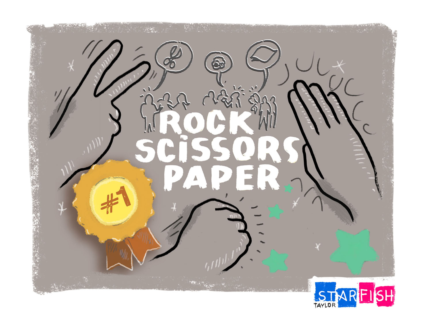
Rock Paper Scissors Icebreaker: Energizing the Masses Despite the somewhat blurred history of what many see as a juvenile hand game, Rock Paper Scissors has been used for millennia all across the globe. When all other means of reason and rationale fail, Rock Paper Scissors has often proved to be the deus ex machina of bar none decision-making. The truth is, while many think of Rock Paper Scissors as a game of randomness and sheer luck there actually exists quite an index of sophisticated strategy. Unlike a flip of the coin, which relies almost entirely on chance.
While luck is certainly a component of RPS, the people involved are the true determinants of how intense or sophisticated the game or “competition” will be. This is one of the reasons why the Rock Paper Scissors Icebreaker is a perfect activity to jumpstart a large, 100+ person workshop or meeting.
How to Play Rock-Paper-Scissors Whether you’re deciding who goes first, who has to take the dog on a walk, or who buys the next round, this game solves problems and makes decisions for a myriad of situations Rock Paper Scissors requires no props and can be played in less than a minute. All you need are your hands, a little luck (and a small dose of strategy, if you like to win.)
The rules are simple: Each player begins by shaking his or her fist 3 times – this step is known as priming in the professional world…or in simple terms, a countdown to the throw. At the end of the priming, each player says, “Shoot!” and simultaneously, with the same hand, either makes a fist (for Rock), lays their hand flat (for Paper), or creates a sideways peace sign [by extending and spreading the index and middle fingers] (for Scissors). This is the throw. The winner is then determined by comparing the players’ throws.
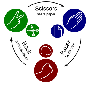
Win Rock Paper Scissors
Three Ways to Win Rock Paper Scissors: Rock crushes scissors Paper covers rock Scissors cuts paper
Recipe for Running the Rock Paper Scissors Icebreaker
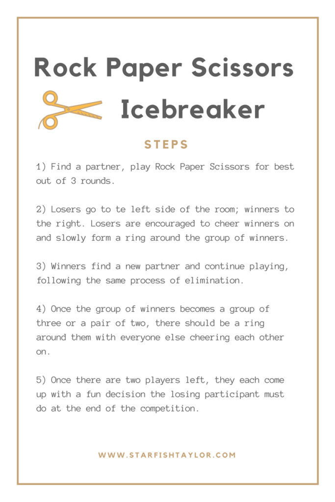
What the Rock Paper Scissors Icebreaker Achieves In a large workshop of 100+ participants, it’s hard to meet new people. On the other hand, as a facilitator, it can be difficult to motivate the masses and create a positive atmosphere before launching the workshop. (FYI: High levels of motivation and a positive atmosphere are essential components to a successful workshop!)
However, by running this icebreaker, everyone gets involved quickly, in a fun and risk-free way. The energy in the room will soar through the roof in a matter of 15 minutes, as everyone cheers on the winning contestants. As the competition becomes smaller and smaller, participants become aware of some of the workshop’s sophisticated strategists, where levels of intuition and layers of psychology are exposed and implemented. Later on during the heart of the workshop, these participants may become some of the key catalysts for strategic problem solving and decision-making.
In the end, what the RPS icebreaker achieves is ongoing solidarity and a buzzing energy that transcends the work atmosphere and work ethic of participants. These factors will ultimately influence the outcomes of your workshop, so it’s important that they are addressed at the beginning!
Learn More About Our Tips, Tricks and Hacks Running a multiple-day workshop and looking for ways to prolong the positive atmosphere and solidarity? Check out our Into the Matrix Icebreaker , which gives everyone a personal lens into each other’s interests and experiences. This is also great for a workshop that involves numerous cultures.
For other great tips, tricks and hacks, subscribe to our blog and monthly newsletter to ensure you aren’t missing any of Starfish Taylor’s latest offerings and services.
Post Views: 11,452