Sustainability in the O&G industry - Starfish Taylor /*
You can add your own CSS here.
Click the help icon above to learn more.
*/
/*#header.text-dark {
background: rgba(255, 2 55, 255, 0.9);
}
#header .header-bg {
background: rgba(255, 255, 255, 0.9);
}*/
.so-widget-sow-post-carousel .sow-carousel-wrapper {
width: 100%;
}
.so-widget-sow-post-carousel .sow-carousel-container {
width: 100% !important;
max-width: 100% !important;
}
.so-widget-sow-post-carousel-default-971e41e9e54d .sow-carousel-wrapper ul.sow-carousel-items li.sow-carousel-item {
width: 255px;
margin: 0 10px;
box-shadow: 0 8px 18px 0 rgba(192, 192, 192, 0.5);
background: #fff;
border: 1px solid #ccc !important;
padding: 20px 10px;
min-height: 300px;
}
.sow-carousel-wrapper ul.sow-carousel-items li.sow-carousel-item h3 {
line-height: 30px !important;
}
.so-widget-sow-post-carousel-default-971e41e9e54d .sow-carousel-wrapper ul.sow-carousel-items li.sow-carousel-item .sow-carousel-thumbnail a, .so-widget-sow-post-carousel-default-971e41e9e54d .sow-carousel-wrapper ul.sow-carousel-items li.sow-carousel-item .sow-carousel-thumbnail a span.overlay {
width: auto !important;
}
.sow-carousel-wrapper ul.sow-carousel-items li.sow-carousel-item h3 a {
font-size: 22px;
}
.single-post .category-portfolio .five.columns {
display: none;
}
.single-post .category-portfolio .row .eleven {
width: 100%;
/* text-align: center; */
}
.single-post .category-portfolio .feature-img.page-banner {
display: none !important;
}
.single-post .category-portfolio .panel-grid .port-had h1.sow-headline {
color: #000!important;
}
.tag-graphic-facilitation .gfield input, .tag-graphic-facilitator .gfield input {
width: 100% !important;
}
.single-post .category-portfolio .panel-grid h2.sow-headline, .single-post .category-portfolio .panel-grid h1.sow-headline {
color: #000!important;
}
.single-post .category-graphics .panel-grid h2.sow-headline{color: #d11d5b !important;}
@font-face {
font-family: 'Lato';
font-display: auto;
}
/*body { color: #383838 !important; font-family: 'Lato'; font-size: 1em; font-style: normal; font-stretch: normal; font-weight: 400 !important; letter-spacing: 0.2px; line-height: 1.38 !important;}*/
ol li { border-top: none !important; border-bottom: none !important; text-align: left; font-family: Lato; font-size: 18px !important; font-weight: normal; font-style: normal; font-stretch: normal;
line-height: 1.38; letter-spacing: 0.2px; color: #383838; }
h4 { color:#ff037c;}
h4 a { color:#c5114f !important;;}
h4 a:hover { color:#273d98 !important;;}
h2 { margin:0px 0px;}
p { color: #383838 !important; font-family: 'Lato'; font-size: 18px !important; font-style: normal; font-stretch: normal; font-weight: 400 !important; letter-spacing: 0.2px; line-height: 1.38 !important; text-align: left;}
.full-width h1.headline {
display:none !important;
}
.headline.img-headline { text-transform:uppercase;}
/*.full-width.post-area.full-width {
max-width:1168px;
}*/
.hm-sub-heading { font-size: 20px; font-family: 'Lato'; font-style: normal; font-stretch: normal; font-weight: 400 !important; line-height: 1.6; letter-spacing: 0.3px; color: #616161; text-align: left;}
.bar-heading { color: #d11d5b; text-align: center; font-family: DroidSerif; font-size: 28px; font-weight: bold; font-style: normal; font-stretch: normal; line-height: 0.93; letter-spacing: 0.31px; text-align: center; }
.bar-sub-heading { text-align: center; font-size: 20px; color: #383838 !important; font-family: 'Lato'; font-weight: normal; font-style: normal; font-stretch: normal; line-height: 1.6 !important; letter-spacing: 0.3px; }
table {font-family: open sans,Arial,Helvetica,sans-serif;}
table td { border: 1px solid #e4e4e4; text-align: center;}
.slideshow .headline { padding-bottom:0px !important; margin:0 auto !important; font-size: 4.6em; padding-top:12%;}
.slideshow .information { margin-top: 10px !important; }
li#post-1911 div.excerpt h2 { letter-spacing: -2px; padding-top: 30px; padding-bottom: 30px;}
/*.container a:hover, .container a:focus, .container a:active, .footer-widgets a:hover, footer-widgets a:focus, footer-widgets a:active, #wrap .widget ul.menu li a:hover, #wrap .widget ul.menu li ul.sub-menu li a:hover, #wrap .widget ul.menu .current_page_item a, #wrap .widget ul.menu .current-menu-item a {
color: #d01d5b !important;
}*/
.container a, .container a:link, .container a:visited, .footer-widgets a, .footer-widgets a:link, .footer-widgets a:visited, #wrap .widget ul.menu li a {
color: #273d98;
}
/*#wrap .menu li li a:focus, #wrap .menu li li a:hover, #wrap .menu li li a:active {
color: #ffffff !important;
background-color:#D31C5C !important;
}
#wrap .menu li li a, #wrap .menu li li a:link, #wrap .menu li li a:hover {
color: #fff !important;
}*/
#wrap .menu li li a {
color: #333 !important; /*Sumenu link color stands here*/
}
#wrap .menu li li a:hover, #wrap .menu li li a:active {
color: #fff !important; /*Sumenu link color stands here*/
background-color:#D31C5C !important;
}
#pg-4-3 > .panel-row-style { padding: 5% 5% 5% 5%; }
/*#wrap .menu li li a:focus, #wrap .menu li li a:hover, #wrap .menu li li a:active {
color: #333333 !important;
}*/
#pl-4 .so-panel { margin-bottom: 0px; }
#pl-2327 .so-panel { margin-bottom: 0px; }
/* max-width changed from 960 to 1168 by Peter 20/Mar */
/*a.feature-img.radius-top {
padding-top: 18px;
}*/
.cl-flipbox-front {
padding:15px !important;
height:auto !important;
}
div.cl-flipbox-back-h a span {
font-size: 12px;
}
div.flexslider, div.loading {
background:rgba(38, 60, 152, .8) !important;
}
h4.cl-flipbox-front-title {
margin:0px !important;
font-size: 1.2em;
}
div#masthead p.site-title {
display:none !important;
}
div#pg-4-8 p, div#pg-17-3 p, div#pg-19-2 p {
line-height:18px !important;
}
div#pg-4-10 textarea {
height:100px !important;
}
div.cl-popup-box-content div.panel-grid-cell {
width: calc(33.3333% - ( 0.66666666666667 * 10px ) );
}
div#page-21 li.category-portfolio {
border-top:none !important;
border-bottom:none !important;
}
div#pl-4 .widget li, div#pl-4 .widget li:last-child {
border-bottom:none !important;
}
div#page-21 a.feature-img {
padding-top:none !important;
}
div#page-21 div.sd-content li {
border-top:none !important;
}
div.panel-widget-style-for-21-0-0-0 {
/*margin-top:100px !important;*/
margin-top:0 auto !important;
}
.contact-form input[type=submit] {
-ms-box-sizing: border-box;
-moz-box-sizing: border-box;
-webkit-box-sizing: border-box;
box-sizing: border-box;
font-size: 1em;
padding: 1em 2em;
background: #d21c5c;
background: -webkit-gradient(linear, left bottom, left top, color-stop(0, #a51648), color-stop(1, #d21c5c));
background: -ms-linear-gradient(bottom, #a51648, #d21c5c);
background: -moz-linear-gradient(center bottom, #a51648 0%, #d21c5c 100%);
background: -o-linear-gradient(#d21c5c, #a51648);
filter: progid:DXImageTransform.Microsoft.gradient(startColorstr='#d21c5c', endColorstr='#a51648', GradientType=0);
border: 1px solid;
border-color: #971442 #8e133e #811139 #8e133e;
color: #ffffff !important;
-webkit-border-radius: 0.25em;
-moz-border-radius: 0.25em;
border-radius: 0.25em;
-webkit-box-shadow: inset 0 1px 0 rgba(255,255,255,0.2), 0 1px 2px rgba(0,0,0,0.065);
-moz-box-shadow: inset 0 1px 0 rgba(255,255,255,0.2), 0 1px 2px rgba(0,0,0,0.065);
box-shadow: inset 0 1px 0 rgba(255,255,255,0.2), 0 1px 2px rgba(0,0,0,0.065);
text-shadow: 0 1px 0 rgba(0, 0, 0, 0.05);
}
.pushbutton-wide{ width:50% !important; margin:0 auto;}
ul.slides a.more-link {
-ms-box-sizing: border-box;
-moz-box-sizing: border-box;
-webkit-box-sizing: border-box;
box-sizing: border-box;
font-size: 1em;
display:inline-block;
margin:0 auto;
/*padding: 1em 2em 1em 2em;*/
/*background: #ff9900;*/
background: #ff9b08;
background: -webkit-gradient(linear,left bottom,left top,color-stop(0,#d47e00),color-stop(1,#ff9b08));
background: -ms-linear-gradient(bottom,#d47e00,#ff9b08);
background: -moz-linear-gradient(center bottom,#d47e00 0%,#ff9b08 100%);
background: -o-linear-gradient(#ff9b08,#d47e00);
/*filter: progid:DXImageTransform.Microsoft.gradient(startColorstr='#ff9900', endColorstr='#cc7a00', GradientType=0);*/
filter: progid:DXImageTransform.Microsoft.gradient(startColorstr='#ff9b08',endColorstr='#d47e00',GradientType=0);
border: 1px solid;
border-top-color: currentcolor;
border-right-color: currentcolor;
border-bottom-color: currentcolor;
border-left-color: currentcolor;
/*border-color: #bd7100 #b36b00 #a36200 #b36b00;*/
border-color: #c57500 #ba6f00 #ab6600 #ba6f00;
color: #ffffff !important;
text-align:center;
font-family: open sans,Arial,Helvetica,sans-serif;
font-weight: 400;
line-height: 1.9;
text-decoration: none !important;
-webkit-border-radius: .25em;
-moz-border-radius: .25em;
border-radius: .25em;
-webkit-box-shadow: inset 0 1px 0 rgba(255,255,255,.2),0 1px 2px rgba(0,0,0,.065);
-moz-box-shadow: inset 0 1px 0 rgba(255,255,255,.2),0 1px 2px rgba(0,0,0,.065);
box-shadow: inset 0 1px 0 rgba(255,255,255,.2),0 1px 2px rgba(0,0,0,.065);
text-shadow: 0 1px 0 rgba(0,0,0,.05);
height:42px;
/*padding-top:10px;*/
}
ul.slides a.more-link:hover { color:#343434 !important; text-decoration: none !important;
background: #ff9f12;
background: -webkit-gradient(linear,left bottom,left top,color-stop(0,#de8400),color-stop(1,#ff9f12));
background: -ms-linear-gradient(bottom,#de8400,#ff9f12);
background: -moz-linear-gradient(center bottom,#de8400 0%,#ff9f12 100%);
background: -o-linear-gradient(#ff9f12,#de8400);
filter: progid:DXImageTransform.Microsoft.gradient(startColorstr='#ff9f12',endColorstr='#de8400',GradientType=0);
border-color: #cf7b00 #c57500 #b56c00 #c57500;
}
.so-widget-sow-button-atom-a77237adc0a1 .ow-button-base a:hover {
color: #343434 !important; text-decoration: none !important;
}
.so-widget-sow-button-atom-a77237adc0a1 .ow-button-base a.ow-button-hover:hover {
background: #ff9f12;
background: -webkit-gradient(linear,left bottom,left top,color-stop(0,#de8400),color-stop(1,#ff9f12));
background: -ms-linear-gradient(bottom,#de8400,#ff9f12);
background: -moz-linear-gradient(center bottom,#de8400 0%,#ff9f12 100%);
background: -o-linear-gradient(#ff9f12,#de8400);
filter: progid:DXImageTransform.Microsoft.gradient(startColorstr='#ff9f12',endColorstr='#de8400',GradientType=0);
border-color: #cf7b00 #c57500 #b56c00 #c57500;
color:#343434 !important; text-decoration: none !important;
}
.text-white p {
text-shadow: 0 1px 0 rgba(0, 0, 0, 0.05);
color: rgba(255,255,255,1) !important;
}
.textwidget .contact-form input[type=email], .textwidget .contact-form input[type=text], .textwidget .contact-form input[type=url], .textwidget .contact-form textarea, .contact-form input[type=submit] {
width:100%;
}
body.home .post-area.wide {
padding-top:0px;
}
div#pl-746 h3.widget-title {
font-size:1.1em;
font-weight:bold;
}
body.blog h1.img-headline {
top:65% !important;
}
/*h1.sow-headline, div.page-banner h1.img-headline {
font-size:2.2em;
overflow: hidden;
text-overflow: ellipsis;
height: 1.5em;
}*/
div#pl-28 {
/*margin-top: -45px;*/
}
div.sharedaddy {
margin-top: 20px;
}
.widget li, .widget li:last-child {
border-top:none !important;
border-bottom:none !important;
}
a.feature-img.page-banner::before {
background-color:rgba(0, 0, 0, 0) !important;
}
/*
You can add your own CSS here.
Click the help icon above to learn more.
*/
.full-width h1.headline {
display:none !important;
}
.full-width.post-area.full-width {
max-width:1168px;
/* max-width changed from 960 to 1168 by Peter 20/Mar */
}
/*a.feature-img.radius-top {
padding-top: 18px;
}*/
.cl-flipbox-front {
padding:15px !important;
height:auto !important;
}
div.cl-flipbox-back-h a span {
font-size: 12px;
}
div.flexslider, div.loading {
background:rgba(38, 60, 152, .8) !important;
}
h4.cl-flipbox-front-title {
margin:0px !important;
font-size: 1.2em;
}
div#masthead p.site-title {
display:none !important;
}
div#pg-4-8 p, div#pg-17-3 p, div#pg-19-2 p {
line-height:18px !important;
}
div#pg-4-10 textarea {
height:100px !important;
}
div.cl-popup-box-content div.panel-grid-cell {
width: calc(33.3333% - ( 0.66666666666667 * 10px ) );
}
div#page-21 li.category-portfolio {
border-top:none !important;
border-bottom:none !important;
}
div#pl-4 .widget li, div#pl-4 .widget li:last-child {
border-bottom:none !important;
}
div#page-21 a.feature-img {
padding-top:none !important;
}
div#page-21 div.sd-content li {
border-top:none !important;
}
div.panel-widget-style-for-21-0-0-0 {
/*margin-top:100px !important;*/
margin-top:0 auto !important;
}
div.sow-cta-wrapper div.so-widget-sow-button-flat-e72a51798a2b {
width:100%;
}
.contact-form input[type=submit] {
-ms-box-sizing: border-box;
-moz-box-sizing: border-box;
-webkit-box-sizing: border-box;
box-sizing: border-box;
font-size: 1em;
padding: 1em 2em;
background: #d21c5c;
background: -webkit-gradient(linear, left bottom, left top, color-stop(0, #a51648), color-stop(1, #d21c5c));
background: -ms-linear-gradient(bottom, #a51648, #d21c5c);
background: -moz-linear-gradient(center bottom, #a51648 0%, #d21c5c 100%);
background: -o-linear-gradient(#d21c5c, #a51648);
filter: progid:DXImageTransform.Microsoft.gradient(startColorstr='#d21c5c', endColorstr='#a51648', GradientType=0);
border: 1px solid;
border-color: #971442 #8e133e #811139 #8e133e;
color: #ffffff !important;
-webkit-border-radius: 0.25em;
-moz-border-radius: 0.25em;
border-radius: 0.25em;
-webkit-box-shadow: inset 0 1px 0 rgba(255,255,255,0.2), 0 1px 2px rgba(0,0,0,0.065);
-moz-box-shadow: inset 0 1px 0 rgba(255,255,255,0.2), 0 1px 2px rgba(0,0,0,0.065);
box-shadow: inset 0 1px 0 rgba(255,255,255,0.2), 0 1px 2px rgba(0,0,0,0.065);
text-shadow: 0 1px 0 rgba(0, 0, 0, 0.05);
}
.text-white p {
text-shadow: 0 1px 0 rgba(0, 0, 0, 0.05);
color: rgba(255,255,255,1) !important;
}
.textwidget .contact-form input[type=email], .textwidget .contact-form input[type=text], .textwidget .contact-form input[type=url], .textwidget .contact-form textarea, .contact-form input[type=submit] {
width:100%;
}
body.home .post-area.wide {
padding-top:0px;
}
div#pl-746 h3.widget-title {
font-size:1.1em;
font-weight:bold;
}
body.blog h1.img-headline {
top:65% !important;
}
div.sharedaddy {
margin-top: 20px; margin-left:48px;
}
/*.siteorigin-widget-tinymce ul li { list-style-type: square !important; }
.textwidget ul li { list-style-type: square !important;}*/
.widget li { display:list-item; list-style: inherit; margin: 6px 15px 0;}
.widget ul, .widget li { list-style-type: disc; }
/*.widget ul, .widget li { list-style-type: circle !important; padding-left:20px; }*/
#panel-2327-2-1-2 ul li { list-style-type:none; list-style-image: url('https://www.starfishtaylor.com/wp-content/uploads/2018/04/ok-sign-png.png'); }
#panel-2327-4-1-3 ol li { list-style-type:number !important;}
#panel-2327-12-1-0 ol li { list-style-type:number !important;}
/*.widget li, .widget li:last-child { border-top:none !important; border-bottom:none !important; text-align: left; font-family: Lato; font-size: 16px; font-weight: normal; font-style: normal; font-stretch: normal; line-height: 1.38; letter-spacing: 0.2px; color: #383838; }*/
a.feature-img.page-banner h2 {
text-shadow:2px 2px 15px rgba(0, 0, 0, 0.8) !important;
}
div#page-318 div.feature-img.page-banner h1 {
display: none;
}
div#page-318 div.feature-img.page-banner::before {
background-color:rgba(0, 0, 0, 0) !important;
}
li#post-1911 div.excerpt h2{
letter-spacing:-2px;
padding-top:30px;
font-size:30px;
}
li#post-1911 div.excerpt h4{
font-size:18px;
}
div.feature-img.page-banner h1 {
font-size:3em;
padding-top:50px;
}
/* ----------- iPhone 4 and 4S ----------- */
/* Portrait and Landscape */
@media only screen
and (min-device-width: 320px)
and (max-device-width: 480px)
and (-webkit-min-device-pixel-ratio: 2) {
.headline.img-headline { font-size:45px !important;}
}
/* Portrait */
@media only screen
and (min-device-width: 320px)
and (max-device-width: 480px)
and (-webkit-min-device-pixel-ratio: 2)
and (orientation: portrait) {
.headline.img-headline { font-size:45px !important;}
}
/* Landscape */
@media only screen
and (min-device-width: 320px)
and (max-device-width: 480px)
and (-webkit-min-device-pixel-ratio: 2)
and (orientation: landscape) {
.headline.img-headline { font-size:45px !important;}
}
/* ----------- iPhone 5, 5S, 5C and 5SE ----------- */
/* Portrait and Landscape */
@media only screen
and (min-device-width: 320px)
and (max-device-width: 568px)
and (-webkit-min-device-pixel-ratio: 2) {
.headline.img-headline { font-size:45px !important;}
}
/* Portrait */
@media only screen
and (min-device-width: 320px)
and (max-device-width: 568px)
and (-webkit-min-device-pixel-ratio: 2)
and (orientation: portrait) {
.headline.img-headline { font-size:45px !important;}
}
/* Landscape */
@media only screen
and (min-device-width: 320px)
and (max-device-width: 568px)
and (-webkit-min-device-pixel-ratio: 2)
and (orientation: landscape) {
.headline.img-headline { font-size:45px !important;}
}
/* ----------- iPhone 6, 6S, 7 and 8 ----------- */
/* Portrait and Landscape */
@media only screen
and (min-device-width: 375px)
and (max-device-width: 667px)
and (-webkit-min-device-pixel-ratio: 2) {
.headline.img-headline { font-size:45px !important;}
}
/* Portrait */
@media only screen
and (min-device-width: 375px)
and (max-device-width: 667px)
and (-webkit-min-device-pixel-ratio: 2)
and (orientation: portrait) {
.headline.img-headline { font-size:45px !important;}
}
/* Landscape */
@media only screen
and (min-device-width: 375px)
and (max-device-width: 667px)
and (-webkit-min-device-pixel-ratio: 2)
and (orientation: landscape) {
.headline.img-headline { font-size:45px !important;}
}
/* ----------- iPhone 6+, 7+ and 8+ ----------- */
/* Portrait and Landscape */
@media only screen
and (min-device-width: 414px)
and (max-device-width: 736px)
and (-webkit-min-device-pixel-ratio: 3) {
.headline.img-headline { font-size:45px !important;}
}
/* Portrait */
@media only screen
and (min-device-width: 414px)
and (max-device-width: 736px)
and (-webkit-min-device-pixel-ratio: 3)
and (orientation: portrait) {
.headline.img-headline { font-size:45px !important;}
}
/* Landscape */
@media only screen
and (min-device-width: 414px)
and (max-device-width: 736px)
and (-webkit-min-device-pixel-ratio: 3)
and (orientation: landscape) {
.headline.img-headline { font-size:45px !important;}
}
/* ----------- iPhone X ----------- */
/* Portrait and Landscape */
@media only screen
and (min-device-width: 375px)
and (max-device-width: 812px)
and (-webkit-min-device-pixel-ratio: 3) {
.headline.img-headline { font-size:45px !important;}
}
/* Portrait */
@media only screen
and (min-device-width: 375px)
and (max-device-width: 812px)
and (-webkit-min-device-pixel-ratio: 3)
and (orientation: portrait) {
.headline.img-headline { font-size:45px !important;}
}
/* Landscape */
@media only screen
and (min-device-width: 375px)
and (max-device-width: 812px)
and (-webkit-min-device-pixel-ratio: 3)
and (orientation: landscape) {
.headline.img-headline { font-size:45px !important;}
}
@media handheld, only screen and (max-width: 319px) {
.home-slider .slideshow .slides li, .home-slider .slideshow .loading {
min-height: 400px;
}
.slideshow .headline { font-size: 3.4em;}
}
@media handheld, only screen and (max-width: 479px) {
.home-slider .slideshow .slides li, .home-slider .slideshow .loading {
min-height: 400px;
}
.slideshow .headline { font-size: 3.4em;}
}
@media handheld, only screen and (max-width: 767px) {
.home-slider .slideshow .content { padding:0;}
#header .header-bg {
background:rgba(255,255,255,0) !important;
}
p.site-title {
display:none;
}
span.header-bg {
display:none !important;
}
#pg-4-3 > .panel-row-style { padding: 10% 5% 10% 5%; }
}
@media handheld, only screen and (max-width: 1024px) {
li#post-1911 div.excerpt {
display: block !important;
}
li#post-1911 h2.headline {
font-size:36px;
padding-top:30px;
}
ul.slides a.more-link {
/* display:block;
width:30%;
left:35%;
right:35%;
padding:10px 10px 10px 10px;*/
margin: 0;
}
li#post-1911 div.excerpt h2{
display:block !important;
letter-spacing:-1px;
padding-top:30px;
font-size:20px;
}
li#post-1911 div.excerpt h4{
font-size:14px;
}
div#panel-4-0-0-0 h2 {
font-size:30px;
}
#pg-4-3 > .panel-row-style { padding: 10% 5% 10% 5%; }
}
@media handheld, only screen and (max-width: 766px) {
li#post-1911 div.excerpt {
display: block !important;
}
li#post-1911 h2.headline {
font-size:28px;
padding-top:30px;
}
ul.slides a.more-link {
/*display:block;
width:30%;
left:35%;
right:35%;
padding:10px 10px 10px 10px;*/
margin:0;
}
li#post-1911 div.excerpt h2{
display:block !important;
letter-spacing:-1px;
padding-top:30px;
font-size:15px;
}
li#post-1911 div.excerpt h4{
font-size:10px;
}
div#panel-4-0-0-0 h2 {
font-size:26px;
}
#pg-4-3 > .panel-row-style { padding: 10% 5% 10% 5%; }
}
@media handheld, only screen and (max-width: 640px) {
li#post-1911 div.excerpt {
display: block !important;
}
li#post-1911 h2.headline {
font-size:16px;
padding-top:20px;
}
ul.slides a.more-link {
/*display:block;
width:70%;
left:15%;
font-size:14px;*/
margin:0;
}
li#post-1911 div.excerpt h2{
display:block !important;
letter-spacing:0px;
padding-top:25px;
padding-bottom:10px;
margin-bottom:0px;
font-size:12px;
}
li#post-1911 div.excerpt h4{
font-size:10px;
}
div#panel-4-0-0-0 h2 {
font-size:22px;
}
#pg-4-3 > .panel-row-style { padding: 10% 5% 10% 5%; }
}
.Mask { /* width: 457px; height: 257px;*/ object-fit: contain; border-radius: 2px; background-color: #ffffff; box-shadow: 0 8px 18px 0 rgba(192, 192, 192, 0.5); }
.shape-ok { list-style-type:none; list-style-image: url('https://www.starfishtaylor.com/wp-content/uploads/2018/06/shape-ok.png'); font-family: Lato; font-size: 20px; font-weight: 600; font-stretch: normal; font-style: normal; line-height: 1.6; letter-spacing: 0.3px; }
/*.menu-footer-menu-container { width:100%;}
.footer-menu { width: 100%; overflow: hidden;}
#menu-footer-menu .footer-menu ul { border-bottom:2px #eeeeee; }
#menu-footer-menu .footer-menu ul li { border-bottom:2px #cccccc; }
#menu-footer-menu .footer-menu ul li a { color:#d11d5b; }
#menu-footer-menu .footer-menu ul li a:hover { color:#273d98; }*/
/*.menu-footer-menu-container .footer-menu ul { color:#383838; text-align:center; display:inline !important;}
#menu-footer-menu ul li { float: left;}
.footer-menu ul li a { color:#d11d5b;}
.footer-menu ul li a:hover{ color:#273d98;}*/
.abt { float:left; width:16%; text-align:left; }
.abt a { padding: 8px 0 8px 0; margin-top:7px; display:block; width:100%; text-decoration:none; }
.abt a:hover { color:#d11d5b; }
.servi { float:left; width:19%; text-align:left; }
.servi a { padding: 8px 0 8px 0; margin-top:7px; display:block; width:100%; text-decoration:none; }
.servi a:hover { color:#d11d5b; }
.portfoli { float:left; width:14%; text-align:left; }
.portfoli a { padding: 8px 0 8px 0; margin-top:7px; display:block; width:100%; text-decoration:none;}
.portfoli a:hover { color:#d11d5b; }
.blogres { float:left; width:19%; text-align:left; }
.blogres a { padding: 8px 0 8px 0; margin-top:7px; display:block; width:100%; text-decoration:none;}
.blogres a:hover { color:#d11d5b; }
.contac { float:left; width:15%; text-align:left; }
.contac a { padding: 8px 0 8px 0; margin-top:7px; display:block; width:100%; text-decoration:none;}
.contac a:hover { color:#d11d5b; }
.socialio { float:left; width:17%; text-align:left; }
.socialio a { padding:2px; margin-top:7px; display:block; }
.socialio a:hover { color:#d11d5b; }
.lio-ico { float:left; width:100%; text-align:left; }
.lio-ico a { padding: 0px 24px 2px 0; margin-top:7px; display:inline; }
.lio-ico a:hover { color:#d11d5b; }
#facebook { left: 0px; width: 24px; background: url('https://www.starfishtaylor.com/wp-content/uploads/2020/02/social-sprites.png') 0 0; background-repeat: no-repeat; }
#twitter { left: 24px; width: 24px; background: url('https://www.starfishtaylor.com/wp-content/uploads/2020/02/social-sprites.png') -24px 0; background-repeat: no-repeat; }
#linkedin { left: 48px; width: 24px; background: url('https://www.starfishtaylor.com/wp-content/uploads/2020/02/social-sprites.png') -48px 0; background-repeat: no-repeat; }
#instagram { left: 72px; width: 24px; background: url('https://www.starfishtaylor.com/wp-content/uploads/2020/02/social-sprites.png') -72px 0; background-repeat: no-repeat; }
#youtube { left: 96px; width: 24px; background: url('https://www.starfishtaylor.com/wp-content/uploads/2020/02/social-sprites.png') -96px 0; background-repeat: no-repeat; }
.footer-information {
padding: 48px 70px;
}
/*.social-nav { width:100%;}
.social-nav, ul {text-align:center;}
.social-nav, ul li { float:left;}
.social-nav, ul li a { color:#d11d5b;}
.social-nav, ul li a:hover { color:#273d98;}*/
/*.social-nav { width:100%;}
.social-nav, .facebook { background: url("https://www.starfishtaylor.com/wp-content/uploads/2018/06/facebook-mn.png") no-repeat fixed center;}
.social-nav, .facebook a:hover { background: url("https://www.starfishtaylor.com/wp-content/uploads/2018/06/facebook-hv.png") no-repeat fixed center;}
.social-nav, .twitter { background: url("https://www.starfishtaylor.com/wp-content/uploads/2018/06/twitter-mn.png") no-repeat fixed center;}
.social-nav, .twitter a:hover { background: url("https://www.starfishtaylor.com/wp-content/uploads/2018/06/twitter-hv.png") no-repeat fixed center;}
.social-nav, .linkedin { background: url("https://www.starfishtaylor.com/wp-content/uploads/2018/06/linkedin-mn.png") no-repeat fixed center;}
.social-nav, .linkedin a:hover { background: url("https://www.starfishtaylor.com/wp-content/uploads/2018/06/linkedin-hv.png") no-repeat fixed center;}
.social-nav, .instagram { background: url("https://www.starfishtaylor.com/wp-content/uploads/2018/06/instagram-mn.png") no-repeat fixed center;}
.social-nav, .instagram a:hover { background: url("https://www.starfishtaylor.com/wp-content/uploads/2018/06/instagram-hv.png") no-repeat fixed center;}
.social-nav, .youtube { background: url("https://www.starfishtaylor.com/wp-content/uploads/2018/06/youtube-mn.png") no-repeat fixed center;}
.social-nav, .youtube a:hover { background: url("https://www.starfishtaylor.com/wp-content/uploads/2018/06/youtube-hv.png") no-repeat fixed center;}*/
.fa { padding: 5px; font-size: 20px; width: 20px; text-align: center; text-decoration: none; margin: 5px 2px; border-radius: 50%; }
.fa:hover { opacity: 0.7; background:#d11d5b; }
.fa-facebook { background: #575757; color: white; }
.fa-twitter { background: #575757; color: white; }
.fa-twitter::before { content: "\f099"; }
.fa-linkedin { background: #575757; color: white; }
.fa-instagram { background: #575757; color: white; }
.fa-youtube { background: #575757; color: white; }
/*#header.header-large #logo-title { padding-left: 10%; }*/
/*#header.header-large { background: rgba(255, 255, 255, 0.9); }*/
#navigation { text-transform:none; font-family: Lato; font-size: 16px; font-weight: bold; font-style: normal; font-stretch: normal; line-height: normal; letter-spacing: 0.5px; color: #575757; margin-right: 5%; }
.menu a { line-height: normal; letter-spacing: 0.5px; }
.menu ul ul, ul.menu ul { width: 250px; }
#header.text-dark { border-bottom: none; z-index: 1000; }
#header #logo { /*margin-left: 18%;*/ margin-left: 6%;}
#header #logo-title { padding-left: 0px;}
.fl-node-5b1121c1a9f3d .fl-row-content { max-width: 1464px; }
#header.text-dark .menu a:hover,
#header.text-dark .menu a:active,
#header.text-dark .menu a:focus { color:#d11d5b;}
/*.content { max-width: 1920px; padding: 0; }*/
/*.no-thumb { padding-top: 160px !important; }
.full-width.post-area.full-width { max-width: 1168px; }*/
.ttgroup { width:100%; height:auto;}
.ttgroupa { width: 47%; height:auto; min-height:485px; background-color: #ffffff; box-shadow: 0 8px 18px 0 rgba(192, 192, 192, 0.5); margin: 14px 14px; padding: 25px; float: left;}
.ttgroupb { width: 47%; height: auto; min-height:485px; background-color: #ffffff; box-shadow: 0 8px 18px 0 rgba(192, 192, 192, 0.5); margin: 14px 14px; padding: 25px; float: right;}
.tggroup { width:100%; height:auto;}
.tggroupa { width: 457px; height:auto; min-height:485px; background-color: #ffffff; box-shadow: 0 8px 18px 0 rgba(192, 192, 192, 0.5); margin: 14px 14px; padding: 25px; float: left;}
.tggroupb { width: 457px; height: auto; min-height:485px; background-color: #ffffff; box-shadow: 0 8px 18px 0 rgba(192, 192, 192, 0.5); margin: 14px 14px; padding: 25px; float: right;}
.cprt { padding-top:27px; padding-bottom:27px; color:#616161; font-family: Lato; font-size:14px; font-style:normal; font-weight:normal; font-stretch:normal; letter-spacing:0.2px; background-color:#f8f8f8;text-align:center;padding:10px;margin-top:7px;}
form input[type="url"], form input[type="tel"], form input[type="email"], form input[type="text"], form input[type="password"], form input[type="number"] {
width: 100%;
}
.container .gform_wrapper input.button { display: inline-block; background: #d11d5b; position: relative; color: #ffffff; color: rgba(255, 255, 255, 255) !important; font-family: Lato; font-size: 18px; font-weight: bold; font-style: normal; font-stretch: normal; line-height: normal; letter-spacing: 0.3px; text-align: center; text-transform: none; border: 1px solid #c5114f; -webkit-border-radius: 4px; width: 100% !important; }
.container .gform_wrapper input.button:hover { color: #fff !important; text-decoration: none; border: 1px solid #273d98; cursor: pointer; -webkit-appearance: none; background: #273d98; }
select { color: rgba(0, 0, 0, 0.5); width: 100%; }
a.more-link { background:#d11d5b; color: #ffffff !important; font-family: Lato; font-size: 16px; font-weight: normal; font-style: normal; font-stretch: normal; border-radius: 4px; border: 2px solid #d11d5b; text-transform:none; }
.more-link:hover { background:#273d98; color: #ffffff !important; text-decoration: none; border: 2px solid #273d98; }
#searchsubmit { background:#d11d5b; color: #ffffff !important; border: 2px solid #d11d5b; font-family: Lato; font-size: 16px; font-weight: normal; font-style: normal; font-stretch: normal; line-height: 1.8; text-transform: none; border-radius: 4px;}
#searchsubmit:hover { background:#273d98; color: #ffffff !important; text-decoration: none; border: 2px solid #273d98;}
#searchform #s { border: 2px solid #d11d5b; border-radius: 4px;}
.so-widget-sow-button-flat-f8f94d1dab85 .ow-button-base a.ow-button-hover:hover { background: #273d98; text-decoration:none; }
.ow-button-base a { box-sizing: border-box; font-size: 1em; padding: 1em 2em; background: #d11d5b; color: #fff !important; border: 1px solid #d11d5b; border-width: 1px 0; border-radius: .25em; text-shadow: 0 1px 0 rgba(0,0,0,.05); }
.ow-button-base a.ow-button-hover:hover { color: #fff; background:#273d98 !important ; text-decoration:none; }
/*.so-widget-sow-button-flat-bb83e0871698 .ow-button-base a.ow-button-hover:hover {
background: #e02264;
border-bottom-color: #cd1c59;
color: #fff;
}*/
.no-thumb { padding-top: 60px !important; }
.gform_wrapper .top_label input.medium { width: calc(100% - 8px);}
.gform_wrapper .top_label select.medium { width: calc(100% - 8px);}
.sow-cta-base .sow-cta-text .sow-cta-subtitle { text-transform: none; }
.cl-counter { color:#d11d5b; text-align: center; }
.cl-counter-value { font-size: 30px !important; }
.cl-counter-title { font-size: 14px !important; color:#383838; }
h6 { font-family: Lato; font-size: 20px; text-align:center; font-weight: normal; font-style: normal; font-stretch: normal; line-height: 1.6; letter-spacing: 0.3px; color: #616161;}
.sidebar h6, .footer h6 { text-align:left; }
.role { font-family: Lato; font-size: 16px; text-align:center; font-weight: normal !important; font-style: normal !important; font-stretch: normal; line-height: normal !important; letter-spacing: 0.2px; color: #d11d5b !important; }
.role-des { font-family: Lato; font-size: 16px; font-weight: normal; font-style: normal; font-stretch: normal; line-height: 1.38; letter-spacing: 0.2px; color: #616161; text-align:center; }
/*.fl-node-5b2288b13550a { width: 98%; }*/
.article > p:first-child { font-size: 16px !important; }
@media only screen and (max-width:620px) {
/* For mobile phones: */
.abt, .servi, .portfoli, .blogres, .contac, .socialio, .lio-ico {
width:100%; text-align:center;
}
.ttgroupa { width: 100%; text-align:center; box-shadow: none; margin: 0 auto; padding: 10px;}
.ttgroupb { width: 100%; text-align:center; box-shadow: none; margin: 0 auto; padding: 10px;}
}
@media only screen
and (min-device-width: 320px)
and (max-device-width: 480px)
and (-webkit-min-device-pixel-ratio: 2) {
.column-oa { width:100%; height:auto; margin-bottom:20px; float: left !important; }
.column-ob { width:100%; height:auto; margin-top: 30px; float: left !important;}
.column-obc { width:100%; height:40px; float: left !important;}
.column-oc { width:100%; height:auto; float: left !important;}
.row-ohb { padding: 0px 27px 27px 27px; }
.column-od { width:100%; height:auto; margin-top: 30px; float: left !important;}
.more-info { width: 165px !important; margin: 20px auto !important;}
.learn-more-2 { float:none; text-align: center; }
.tggroupa { width: 75%; height: auto; }
.tggroupb { width: 75%; height: auto; }
wlw-form .gform_body { width: 100%; }
.wlw-form .gform_footer { width: 100%; }
.hero-pop-txt { width: 230px; height: auto;}
}
@media only screen
and (min-device-width: 768px)
and (max-device-width: 1024px)
and (-webkit-min-device-pixel-ratio: 1) {
.column-oa { width:100%; height:auto; margin-bottom:20px; float: left !important; }
.column-ob { width:100%; height:auto; margin-top: 30px; float: left !important;}
.column-obc { width:100%; height:40px; float: left !important;}
.column-oc { width:100%; height:auto; float: left !important;}
.row-ohb { padding: 0px 27px 27px 27px; }
.column-od { width:100%; height:auto; margin-top: 30px; float: left !important;}
.more-info { width: 165px !important; margin: 20px auto !important;}
.learn-more-2 { float:none; text-align: center; }
.tggroupa { width: 75%; height: auto; }
.tggroupb { width: 75%; height: auto; float:left; }
wlw-form .gform_body { width: 100%; }
.wlw-form .gform_footer { width: 100%; }
}
.wp-block-button__link { -webkit-border-radius: 4px; }
.wp-block-button__link:hover{ text-decoration:none; background-color: #273d98 !important;}
#pgc-2327-14-1 {background-color: #d11d5b; padding: 3% 0% 3% 0%;}
.excerpt { width: 360px; border-radius: 2px; background-color: #ffffff; object-fit: contain; box-shadow: 0 8px 18px 0 rgba(192, 192, 192, 0.5);}
/*.excerpt, .title { font-family: Lato; font-size: 26px; font-weight: 600; font-style: normal; font-stretch: normal; line-height: 1.54; letter-spacing: 0.4px; color: #383838; }*/
/*.excerpt, .title, p { color: #383838 !important; font-family: 'Lato'; font-size: 1em; font-style: normal; font-stretch: normal; font-weight: 400 !important; letter-spacing: 0.2px; line-height: 1.38 !important; text-align:left; padding: 15px 21px 25px 15px; }*/
/*.excerpt, .title, p { color: #383838 !important; font-family: 'Lato'; font-size: 16px; font-style: normal; font-stretch: normal; font-weight: 400 !important; letter-spacing: 0.2px; line-height: 1.38 !important; text-align:left; }*/
.excerpt h2 { font-family: Lato; font-size: 26px !important; font-weight: 600; font-style: normal; font-stretch: normal; line-height: 1.54; letter-spacing: 0.4px; color: #383838; padding-left:15px; padding-right:21px; }
.excerpt p { font-family: Lato; font-size: 16px; font-weight: normal; font-style: normal; font-stretch: normal; line-height: 1.38; letter-spacing: 0.2px; color: #575757; padding-left:15px; padding-right:21px; }
.excerpt p a { font-family: Lato; font-size: 20px; font-weight: bold; font-style: normal; font-stretch: normal; line-height: normal; letter-spacing: 0.3px; text-align: center; color:#d11d5b !important; }
.excerpt p a:hover { text-decoration: underline; }
.optxt{ color: #616161 !important; font-size: 18px; font-weight: normal !important; line-height: 1.78 !important; letter-spacing: 0.3px;}
/*.sow-carousel-title a.sow-carousel-previous { width:38px; height:25px; background: url("https://www.starfishtaylor.com/wp-content/uploads/2018/06/pre-grey.png") no-repeat fixed center; }
.sow-carousel-title a.sow-carousel-previous:hover { background: url("https://www.starfishtaylor.com/wp-content/uploads/2018/06/pre-pink.png") no-repeat fixed center; }
.sow-carousel-title a.sow-carousel-next { width:38px; height:25px; background: url("https://www.starfishtaylor.com/wp-content/uploads/2018/06/nex-grey.png") no-repeat fixed center; }
.sow-carousel-title a.sow-carousel-next:hover { background: url("https://www.starfishtaylor.com/wp-content/uploads/2018/06/nex-pink.png") no-repeat fixed center; }*/
/*.sow-carousel-wrapper ul.sow-carousel-items li.sow-carousel-item .sow-carousel-thumbnail a:hover { object-fit: contain; opacity: 0.8; border-radius: 2px;
background-image: linear-gradient(306deg, var(--dusk-blue), var(--carolina-blue)); }
.sow-carousel-wrapper ul.sow-carousel-items li.sow-carousel-item .sow-carousel-thumbnail .excerpt:hover { object-fit: contain; border-radius: 2px; background-image: linear-gradient(216deg, var(--dusk-blue), var(--carolina-blue)); }*/
/*.excerptoverlay { position: absolute; top: 0; bottom: 0; left: 0; right: 0; width: 360px; height: 257px; opacity: 0; transition: .5s ease; background-color: #008CBA; }*/
/*.excerptoverlay { position: absolute; top: 0; bottom: 0; left: 0; right: 0; width: 360px; height: 100%; opacity: 0; transition: .5s ease; background-color: #008CBA; }
.excerpt:hover .excerptoverlay { opacity: 0.5; }*/
/*.excerpt:hover .excerpt { background-image: linear-gradient(216deg, var(--dusk-blue), var(--carolina-blue)); }
.excerpt:hover .excerpt h2 { color: #ffffff !important; }
.excerpt:hover .excerpt p { color: #ffffff; }
.excerpt:hover .excerpt p a { color: #ffffff; }*/
/*.text { color: white; font-size: 20px; position: absolute; top: 50%; left: 50%; -webkit-transform: translate(-50%, -50%); -ms-transform: translate(-50%, -50%); transform: translate(-50%, -50%); text-align: center; }*/
.sow-carousel-wrapper ul.sow-carousel-items li.sow-carousel-item .sow-carousel-thumbnail a span.overlay { background: #273d98; !important; }
.sow-carousel-wrapper ul.sow-carousel-items li.sow-carousel-item .sow-carousel-thumbnail a:hover span { opacity: .2 !important; }
/*.sow-carousel-wrapper ul.sow-carousel-items li.sow-carousel-item .excerpt span .overlay { width:360px; height:250px; background: #273d98; display: block; opacity: 0; position: static; transition: all .35s ease;}
.sow-carousel-wrapper ul.sow-carousel-items li.sow-carousel-item .excerpt:hover span .overlay { opacity: .2 !important; }*/
.fl-node-5b2288b1354bb { width: 0% !important;; }
.fl-node-5b2288b13550a { width: 100% !important; }
.fl-node-5b2288b135558 { width: 0% !important;; }
.fl-node-5b22815fd2b49 { width: 0%; }
#gform_wrapper_10 { margin: 0;}
.wlw-form { width: 555px; height: 75px; object-fit: contain; }
.wlw-form .gform_body { float: left; width: 80%; height:60px;}
.wlw-form .gform_footer { clear: none; width: 20%; height:54px; float: left; padding: 0; margin:0; }
.wlw-form .gform_wrapper .gform_footer { padding: 0; margin: 0;}
.gform_wrapper .gform_footer input.button { -webkit-border-radius: 4px; background: #d11d5b; color: #ffffff; font-family: 'Lato'; font-style: normal; letter-spacing: 0.3px; font-stretch: normal; font-size: 18px; font-weight: bold; line-height: normal; padding: 12px 24px; border: 1px solid #c5114f; text-align: center; text-decoration: none; text-shadow: none;}
/*.test {display: inline-block; }*/
.gform_wrapper .gform_footer input.button, .gform_wrapper .gform_footer input[type="submit"] { width: 100px; height:54px;}
.gform_wrapper .gform_footer input.button, .gform_wrapper .gform_footer input[type="text"] { width: 100px; height:54px;}
.gform_wrapper .gform_footer input.button:hover { background: #273d98; color: #ffffff;}
#gform_wrapper_10 .gform_heading{ display:none;}
body .gform_wrapper ul li.gfield { margin-top: 0; padding-top: 0; }
.gform_wrapper ul.gform_fields li.gfield { padding-right: 0; }
.gform_wrapper li.hidden_label input { margin-top: 0px; }
.wlw-form input[type="text"] { padding: 5px 10px; height: 58px; border:none; border-radius: 0px;}
body .gform_wrapper .top_label div.ginput_container { margin-top: 0px; }
/*.wlw-form input[type="text"]{ width: 390px !important; height: 54px; }
.wlw-form input[type="submit"] { width: 165px !important; height: 54px;}*/
/*.sow-carousel-title a.sow-carousel-next { display: block; float: right; overflow: hidden; margin-left: 2px; margin-top: 3px; font-size: 0px; width: 38px; text-align: center; height: 25px; background-color:none !important; background-image: url(https://www.starfishtaylor.com/wp-content/uploads/2018/06/nex-pink.png);}
.sow-carousel-title a.sow-carousel-previous { display: block; float: right; overflow: hidden; margin-left: 2px; margin-top: 3px; font-size: 0px; width: 38px; text-align: center; height: 25px; background: background-color:none !important; background-image: url(https://www.starfishtaylor.com/wp-content/uploads/2018/06/pre-pink.png);}*/
.sow-carousel-title a.sow-carousel-next { color:#d11d5b !important; background: none !important; width:38px !important; height:25px !important; font-size: 18px !important;}
.sow-carousel-title a.sow-carousel-previous { color:#d11d5b !important; background: none !important; width:38px !important; height:25px !important; font-size: 18px !important;}
.sow-carousel-title a:hover.sow-carousel-next { color:#273d98 !important; }
.sow-carousel-title a:hover.sow-carousel-previous { color:#273d98 !important; }
.widget { margin-bottom: 50px; }
blockquote p { font-weight:bold !important; font-style:italic; }
blockquote { color: #383838 !important; font-family: 'Lato'; font-size: 16px; font-style:italic; font-stretch: normal; font-weight: bold !important; letter-spacing: 0.2px; line-height: 1.38 !important; text-align: left; }
.white { color:#ffffff !important;}
.headline { color:#383838 !important; font-size: 52px !important; font-weight: 700 !important; line-height: 1.3 !important; }
.headline.img-headline { color: #fff !important; font-size: 52px; font-weight: 700 !important; line-height: 1.3 !important; text-transform: none !important; }
.at-sft-brd { border-bottom: 1px solid #e7e7e7;}
.del-cus-pd { margin:0px !important; padding:0px!important; }
.widget ul, .widget li .shap-ok { list-style-type:none; padding-left:15px; list-style-image: url('https://www.starfishtaylor.com/wp-content/uploads/2018/06/shape-ok.png'); }
.Mask-2 { /* width: 457px; height: 257px;*/ object-fit: contain; border-radius: 2px; background-color: #ffffff; box-shadow: 0 8px 18px 0 rgba(192, 192, 192, 0.5); padding:30px 20px 30px 20px;}
.oa-head { color: #d11d5b; font-family: Lato,sans-serif; font-weight: 700; font-size: 20px; letter-spacing: .2px; line-height: 1.0 !important; margin-top: 1.5 !important; text-align: left; }
.mr-tp { margin-top:50px;}
.img-vid { background-image: url('https://www.starfishtaylor.com/wp-content/uploads/2019/07/icon-vid-24x18.jpg'); background-repeat: no-repeat; background-size: auto; padding-left:65px; padding-top:0px; padding-bottom:0px;}
.img-cam { background-image: url('https://www.starfishtaylor.com/wp-content/uploads/2019/07/icon-cam-24x18.jpg'); background-repeat: no-repeat; background-size: auto; padding-left:65px; padding-top:0px; padding-bottom:0px; }
.img-fol { background-image: url('https://www.starfishtaylor.com/wp-content/uploads/2019/07/icon-fold-24x18.jpg'); background-repeat: no-repeat; background-size: auto; padding-left:65px; padding-top:0px; padding-bottom:0px; }
.portfolio .post-holder { background: #fff; }
.portfolio .post-holder .excerpt { width: auto; }
.column-oa { float: left; width: 457px; height: 257px; object-fit: contain; border-radius: 2px; background-color: #ffffff; box-shadow: 0 8px 18px 0 rgba(192, 192, 192, 0.5); }
.column-ob { float: left; width: 457px; height: 257px; object-fit: contain; border-radius: 2px; background-color: #ffffff; box-shadow: 0 8px 18px 0 rgba(192, 192, 192, 0.5); }
.column-obc { width:100%; height:91px;}
.column-oc { float: left; width: 457px; height: 257px; object-fit: contain; border-radius: 2px; background-color: #ffffff; box-shadow: 0 8px 18px 0 rgba(192, 192, 192, 0.5); }
.column-od { float: left; width: 457px;; height: 200px; object-fit: contain; border-radius: 2px; }
.op-photo{ float:left; margin:auto; padding-left:25px;}
.op-head{ color:#d11d5b; font-family: Lato, sans-serif; font-weight: 700; font-size: 20px; letter-spacing: 0.2px; text-align: left; margin:auto 25px; padding-left:72px;}
.optxta { color: #616161 !important; font-size: 18px; font-weight: normal !important; line-height: 1.78 !important; letter-spacing: 0.3px; padding:20px !important;}
.row-oa:after { content: ""; display: table; clear: both; }
.row-ob:after { content: ""; display: table; clear: both; }
.row-oh { width:100%; height:44px; padding: 20px 0;}
.row-ohp { padding:0px 27px 27px 27px;}
.row-ohb { padding:27px 52px 0px 27px;}
.row-ohc { padding:5px 40px 0px 27px;}
.learn-more { float: left; padding-left: 27px;}
.learn-more a { width:165px; height:54px; text-align: center; max-width: 100%; display:inline-block; padding: 0px 24px; margin-top: 35px; border: 1px solid #c5114f; -webkit-border-radius: 4px; font-size: 16px; line-height: 16px; color: #fff; background: #d11d5b; text-decoration: none; text-shadow: none; box-sizing: border-box; webkit-transition: all .25s ease-in-out; font-family: 'Lato'; font-style: normal; font-stretch: normal; letter-spacing: 0.2px;}
.learn-more a:hover { background: #273d98; border: 1px solid #1b318c; }
.our-projects { font-family: Lato; font-size: 20px; font-weight: normal; font-stretch: normal; font-style: normal; line-height: 1.6; letter-spacing: 0.3px; color: #383838;}
.action-vid { float: left;}
.action-vid a { width:165px; height:54px; text-align: center; max-width: 100%; display:inline-block; padding: 0px 24px; margin-top: 0px; border: 1px solid #c5114f; -webkit-border-radius: 4px; font-size: 16px; line-height: 16px; color: #fff; background: #d11d5b; text-decoration: none; text-shadow: none; box-sizing: border-box; webkit-transition: all .25s ease-in-out; font-family: 'Lato'; font-style: normal; font-stretch: normal; letter-spacing: 0.2px;}
.action-vid a:hover { background: #273d98; border: 1px solid #1b318c; }
.learn-more-2 { float: left;}
.learn-more-2 a { width:165px; height:54px; text-align: center; max-width: 100%; display:inline-block; padding: 0px 24px; margin-top: 0px; border: 1px solid #c5114f; -webkit-border-radius: 4px; font-size: 16px; line-height: 16px; color: #fff; background: #d11d5b; text-decoration: none; text-shadow: none; box-sizing: border-box; webkit-transition: all .25s ease-in-out; font-family: 'Lato'; font-style: normal; font-stretch: normal; letter-spacing: 0.2px;}
.learn-more-2 a:hover { background: #273d98; border: 1px solid #1b318c; }
.sow-carousel-container { width:1100px !important; max-width:1100px !important ;}
.hero-pop-txt { width: 560px; height: auto;margin: 0 auto !important}
.sumo-form-wrapper button { color:#ffffff !important;}
ul li { font-size:18px !important;}
.article > p:first-child { font-size: 18px !important;}
.post-views { display:none;}
#section-1,#section-2,#section-3,#section-4,#section-5,#section-6,#section-7,#section-8 { display:none;}
.loadb { display:inherit !important;}
button.more-link { background: #d11d5b; color: #ffffff !important; font-family: Lato; font-size: 16px; font-weight: normal; font-style: normal; font-stretch: normal; border-radius: 4px; border: 2px solid #d11d5b; text-transform: none; }
.elementor-11035 .elementor-element.elementor-element-e160739:not(.elementor-motion-effects-element-type-background){
background-color: #ffffff;
background-image: none;
}
Sustainability in the O&G industry Starfish Taylor designed and facilitated a sustainability workshop for the Society of Petroleum Engineers (SPE) to bring together industry members to tackle the question of how to get on the right side of history.
The Question : “How do we generate trust, enable engagement, stimulate innovation, and bring about pathways to sustainable solutions to make sure the oil and gas industry is on the right side of history?
Johana Dunlop, an SPE board member and Director of Sustainability and HSE, approached Starfish Taylor about designing and facilitating a sustainability workshop. The sustainability workshop—dubbed the Gaia Summit—would be designed around SPE’s objectives to bring together stakeholders and industry experts to discuss how to be more proactive and collaborative in meeting sustainability challenges. Starfish Taylor worked alongside the Gaia Summit Steering Committee and designed the sustainability workshop through a series of Design Meetings.
“Design meetings are a series of interviews with stakeholders, to understand and document Success Indicators, Risks, Expectations.”
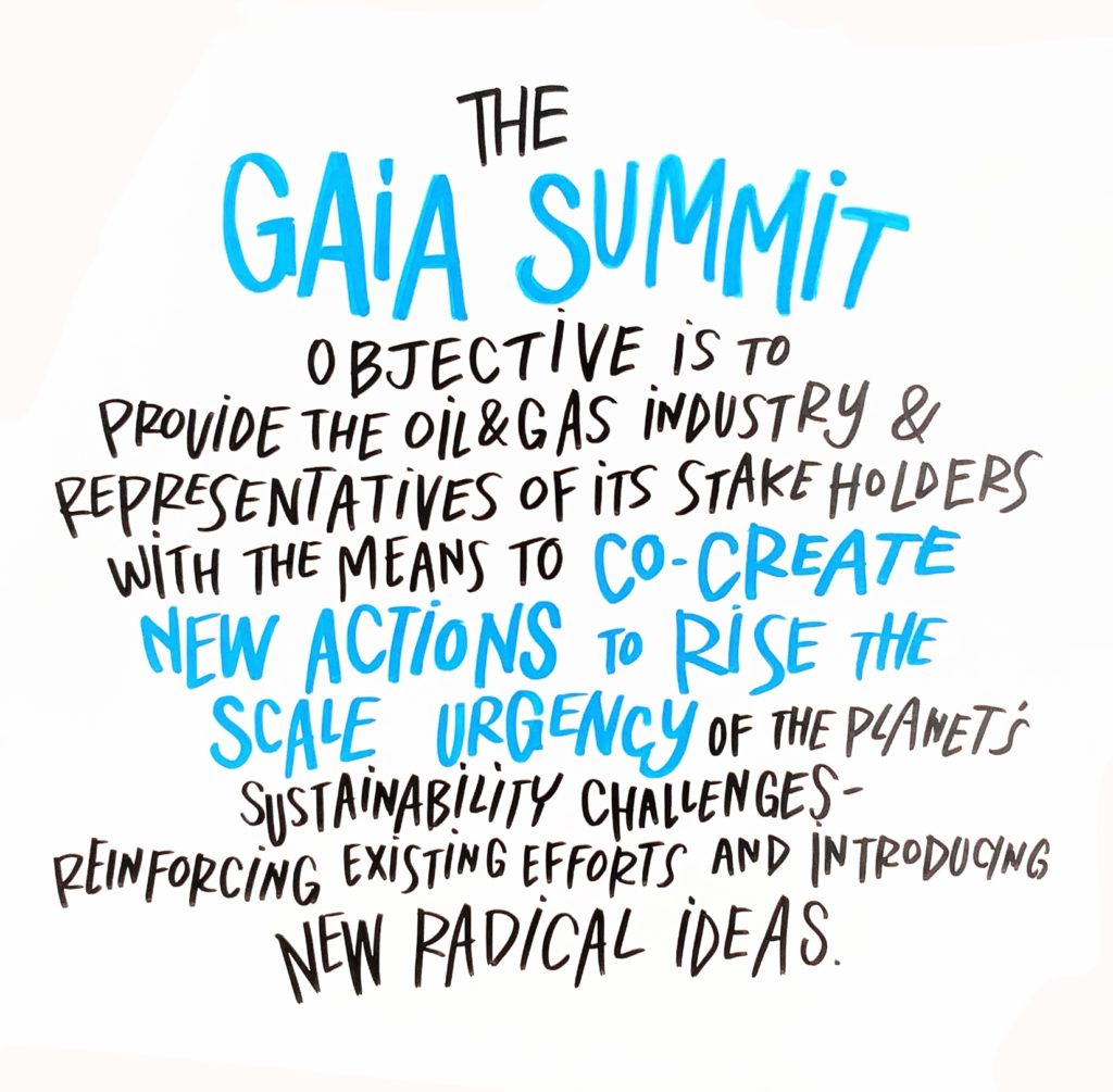
We use Graphic Scribes to “draw” vs death-by-powerpoint Our Design Starfish Taylor co-built a workshop design that delivered on SPE’s objectives.
To do this, Starfish Taylor relied on the careful, custom tailoring we provide for each client alongside the consistency of our proven Nutcracker method. We worked closely alongside SPE and the GAIA committee to understand their goals and vision for the Gaia Summit. Oil, gas, and sustainability are demanding topics, so we conducted a series of interviews with stakeholders, to better understand and document Success Indicators , Risks , and Expectations . These interviews gave Starfish Taylor a baseline of information. Based on the interviews and design process, Starfish Taylor made suggestions to SPE to create an effective workshop.
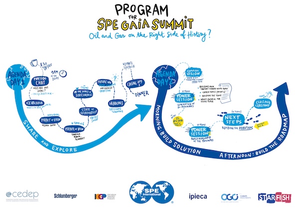
Gaia Summit Agenda for Sustainability The Event Starfish Taylor facilitated SPE’s sustainability workshop over two days.
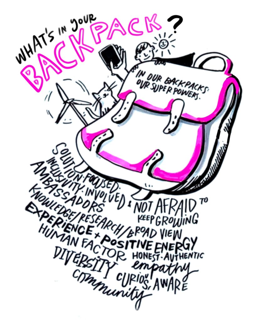
Day 1 was about sharing experience, exploring sustainability, and becoming comfortable listening to ideas and points of view from other people. Our model for SPE was focused on bringing participants together and facilitating conversation throughout the workshop space. Our design team worked to incorporate as many points of view and ideas—“balloons in the air”—as possible. This involved a workshop schedule aimed at finding alignment in vision. For SPE’s Gaia Summit, we used an icebreaker, points of view, a fireside chat, and an external visionary speaker, the engaging Dr. Subramanian Rangan . Through simple but probing questions, our design model ensures participants and facilitators start to see the elements of what should be tackled, the big ideas emerging, ideas people agree on, and roadblocks. Day 1 was building in parallel: building information, ideas, different complementary aspects—building towards the endpoint, but without letting participants stop and think they have the answers. The answers are for Day 2 .
Day 2 was about finding solutions and building the pathways to the right side of history. At the end of Day 1 , the Gaia Steering Committee and Starfish Taylor met to agree on the big category topics. We then presented those topics back to the group at the beginning of Day 2 . The group then agreed that these were the pathways that needed to be built out during the rest of Day 2 . Our design model used power sessions to flush out the visions and the pathways to that vision. Participants then focused on building the pathways and the roadmap , actions , and milestones to follow those pathways into the future. This meant drawing on all the information and experiences that had been brought to the forefront on Day 1 . At the Gaia Summit for SPE, participants produced six execution pathways and four principles.
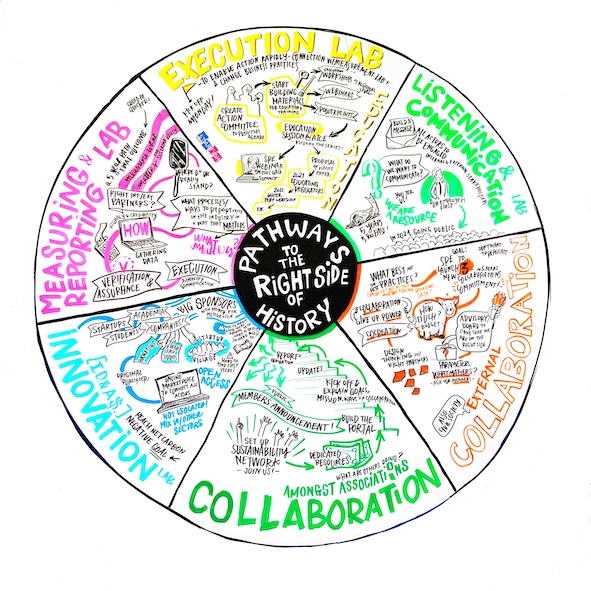
Produced “live” by our Graphic Scribe, Carlotta Cataldi The Results Starfish Taylor delivered on SPE’s goals.
We
helped SPE bring together stakeholders, industry representatives, and
sustainability experts to ensure the oil and gas industry is on the right side
of history. The Gaia Summit took considerable steps to incorporate proactive,
collaborative pathways to sustainability. Starfish Taylor also provided SPE all
the media, graphics, and materials from the workshop. We have followed up with
SPE’s sponsors to ensure everything needed was provided at the workshop, and
also to prepare additional information for the journey ahead.
I’ve seen a lot of different facilitation approaches, and have facilitated events myself. I’ve not seen any approaches that are as creative, engaging, fun, and impactful as what Starfish Taylor is doing. They are in a league of their own! From their use of music and visual story-boarding to keeping the dialogue moving forward and organizing the day, to the innovative techniques deployed to solicit and structure insights from participants, to the professional and polished feel they bring to the whole event, every detail was carefully thought through and executed with grace! I highly recommend Starfish Taylor for your next event.
Josh Etkind N. America Deepwater Decom & Abandonment Manager, BOM , Shell
VIDEO
Captured at the Gaia Summit Post Views: 4,598